Cherish the days when some top-shelf designer delivers a keynote address and releases his slidedeck online. Here today is Matthew Ericson, Deputy Graphics Director at the New York Times (maybe you’ve heard of it?) and his presentation, “Visualizing Data for the Masses: Information Graphics at The New York Times.” [70 mb, zipped pdf]
From Information Aesthetics:
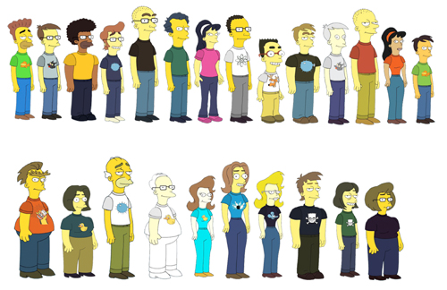
He explained how a 30-person team creates the impressive infographics and visualizations we see on the newspaper every week. Matt emphasized their role as journalists (instead of illustrators) and explained how they get from raw data to finished graphical pieces that make information understandable for more than a million readers.
One Cool Thing
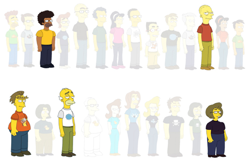
Check out how this design super-stud introduces the thirty members of his team.
Okay, so the Simpsons avatar thing has made the rounds, but that isn’t what’s so sick here. What’s awesome is how he plays with opacity to draw his audience’s eyes to individual members and departments.
Nice, nice move.
The Full Content Conjecture
Ericson’s slides are heavy with image, not information. Out of 120 slides, only 17 are textual, and between them, there are only 39 words.
That’s an average of two words per slide over seventeen slides over an entire keynote. I’m a terrible audience, an inveterate fidgeter, a doodler, and deeply critical to boot, but that eye-candy orgy would’ve kept me raptInfoVis was in Sacramento and I knew about it. What was I thinking?.
Now it’s real tempting for a math-minded fella like myself to come up with some sort of rigid ratio, a litmus test like the 10/20/30 rule to determine if you’re balanced too heavily or lightly on images but I’ve got a conjecture that’s sturdier:
- If I can look at your slidedeck and determine the full content of your presentation, it’s carrying too much information.
If your slidedeck reads like a script, bullet points marking off your progress while you read them, you’re a) inducing multimedia dissonance cognitive overload and b) using a low-resolution medium (PowerPoint) to display high-resolution data (text)Recall Tufte: “[An 11 by 17 inch] piece of paper shows the content-equivalent of 50 to 250 typical PP slides.”.
You have only a few hundred thousand pixels up there and they prefer to consume pictures, charts, and words, in that order.
So:
- Use your voice to tell a story.
- Use your handouts to convey information.
- Use your slides to draw a picture of the story.
Corollary To The Full Content Conjecture
- Bloggers are dangerous presenters.
Bloggers are as excited about posting their slidedecks to Slideshare after their keynotes as they are about the keynotes themselves. The audience gets shortchanged in this transaction ’cause for the keynote to function effectively online, where there is no voice to tell the story, the blogger compensates with bullet points.
Vicki Davis recently released some slides from a presentation of her cool Flat Classroom Project.
Moving through the presentation online, I found it pretty easy to determine its content since she used bullet points and text to literalize most of it.
Scanning her slides, I realized that the problem is one of approach. The best way to approach a speaking engagement is as a storytelling engagement. So you toss the meat and potatoes of your speech (URLs, bullet points, references) onto a well-designed handout. You toss illustrations onto a screen behind you.
And then you tell a story.
This is why I cast my most recent presentation with an imaginary stock-photo protagonist.
Because stories stick where bullet points do not.
I imagine that if asked to recall the most successful intervals of her presentation, Vicki would cite the moments when she was telling stories about kids collaborating across continents and the tools they used.
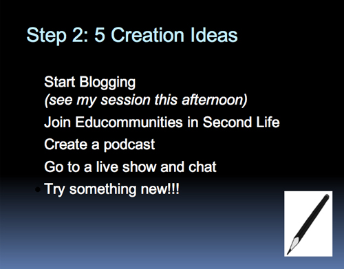
Whereas (for example) a slide like this …
… is the storytelling equivalent of this:
I’ve internalized my own preferences so fully on this matter that if I suspect even for a second that a slide is functioning as a script, a crutch to keep me on message (which is to say, if I find myself glancing back each time I click open a new bullet point) I delete the slide on instinct and double up my efforts at notecarding or memorizing. Anything less and I’m transferring my burden to my audience, to say nothing of poor storytelling.
An Exception:
An exception to the Full Content Conjecture:
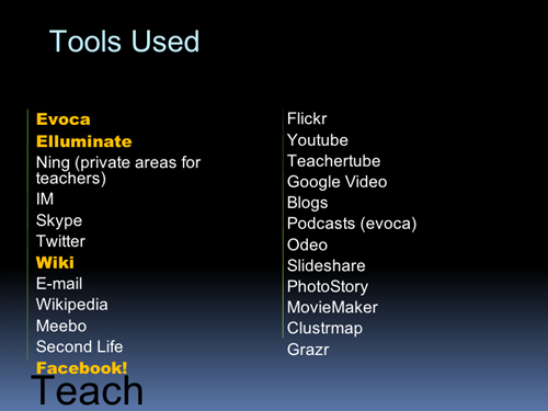
Vicki drowns this slide in bullets to a really nice effect. This is a lot like Ethan Bodnar’s prizewinning entry in the Four Slide Sales Pitch contest awhile back, a slide meant to be looked at, not read.
If I was presenting, I’d toss that list plus URLs plus a brief statement of purpose for each into a handout, which would complement and compel her visuals. Her story would then be unfettered by information and she would be free to tell a cool story: kids are connecting with each other around the world.
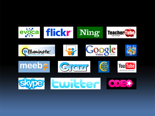
Also, I would’ve built this slide:
In Keynote I can build an animation that with one click pops each logo up sequentially over a matter of two, three, seven seconds – however long I need to tell the story. (Quicktime of what I’m talking about) Regardless, this example of visual storytelling remains a strong point in Vicki’s presentation, and is worth emulating in your own.
Related:
-
Duarte, designer of Al Gore’s Oscar- and Nobel prize-winning Keynote presentation, has a strong portfolio which they share online. (Click through.) If you aren’t pursuing the best, how can you dodge the mediocre?
- How to Present Well: Introduction
- How to Present Well: Find the Through-Line
- How to Present Well: Think Less. Type More.
- How to Present Well: Build Your Handouts
- How to Present Well: Start Over
- How to Present Well: Build Your Slides