Month: January 2008

Total 44 Posts

You Just Put Your Lips Together

Regarding this new contest, Ken writes:

What if I’m all ‘thinking about design’, but saddled with an inability to convert thought to creation?

Mr. K replies with the implicit mantra of this contest and of my Information Design course:

Don’t do it to win – do it to do it. I suspect the problem isn’t whether you can do it at all, but whether you can do it well enough that you’d feel comfortable showing it to anyone else (much less the world). You’re not going to get to that point if you don’t take the first step.

So throw the data into excel. Have it draw a graph. Decide what you hate about the graph, and fix that. Already you’ll be ahead of 80% of the data presenters out there.

A few founts of information, if it helps get this process moving for you:

Contest: Your Annual Report

[Update: the final contestants & the winners]

The judges are pleased to bring you this blog’s second design contest. May you find this assignment, first and foremost, an opportunity for reflection and self-diagnosis at the end of 2007. The prizes and competition are secondary and incidental. They exist only to push forward the amateur designer who seems most inclined towards professional design.

Instructions

  1. Design information in four ways to represent 2007 as you experienced it. This can mean:
    • four separate PowerPoint slides with one design apiece,
    • one JPEG with four designs gridded onto it,
    • an Excel spreadsheet inset with four charts,
    • etc.

    Feel free to use pies, bars, dots, bubbles, sparklines, stacks, or designs of your own construction.

  2. Submit your designs. Either:
  3. Post your reflections either:
    • in the comments here, or
    • at your own blog.

Illustrative Examples

  1. This slide, representing my music intake over 2007, comprises two designs, a bar chart and an ordered list:
  2. This page, representing Nicholas Felton’s travel habits in 2005, comprises four designs.

Deadline

  • Sunday, January 13, 23h59, Pacific Standard Time

Judges

Prize

Legal

  • You own your slides, though we’ll post them here (attributed) and, in all likelihood, pick several apart.

How We Got Here

  1. The 2006 Feltron Annual Report, Nicholas Felton
  2. The 2005 Feltron Annual Report, Nicholas Felton
  3. Who Is Nicholas Felton?, Dan Meyer
  4. Information Design: Syllabus, Dan Meyer
  5. The New Division of Labor, Levy and Murnane
  6. The contest organizer’s raving conviction that assignments like these will be essential to math and language education in the 21st century.
  7. The contest organizer’s nagging suspicion that, in ten years time, his raving conviction will look either eerily prescient or (more likely) totally obvious.

Who Is Nicholas Felton?

You and your family sent out a Christmas postcard. Jose Vilson blogged his year-end reflection. Corporations and businesses also play your game, issuing annual reports to their shareholders, detailing their rises and falls, quantifying successes and qualifying failures, telling the stories of their fiscal years through pictures, words, and charts.

Nicholas Felton is an individual, a graphic designer, but he takes the corporate route, obsessively tracking his vital statistics throughout the calendar year,

  • where he ate,
  • where he traveled,
  • media he consumed,
  • media he produced,
  • text messages he sent,
  • e-mails he received,
  • etc.,

issuing one of the design world’s most bespoke articles at each year’s end.

You are a shareholder in his life and flipping through his annual report is not an optional assignment for dy/dan readers. The 2006 edition, for example, includes information design grails such as this page of pie charts, ordered and unordered lists, detailing the food he ate over 2006:

or this scatter plot of drinks he consumed throughout the year:

Nicholas Felton stands alongside Andrew Kuo as a patron saint of my Information Design course. Both make their idiosyncratic preferences and activities accessible to large populations through a) articulate self-reflection and b) precise mathematical structures.

So do you see it? Do you SEE how this brings us all together? Math & Language? Old School & New School? Do you have another math class on your master schedule that’ll spawn as many writers and designers as engineers and statisticians?

All you School 2.0, future of learning, 21st-century educator-types, please, please, come back. I’ve found the flag I can fly for you. This flag. And I need you to get crazy about it with me.

Information Design: Syllabus

Course Description

Students will learn to take the data barrage and test it against the visual canon – graphs, bars, pies, stacks, and lines. They’ll invent their own visuals, improvising on the classics to deliver information and self-expression in the same package. They’ll visualize data so well and so often that by the end of the course they’ll wear glasses they can’t feel and which others can’t see, glasses of the strongest possible prescription, ones which make truth and untruth so obvious they’ll have to share it.

Illustrative Anecdote

Imagine an unparsed spreadsheet of effectively infinite length. One million monkeys with one million typewriters drinking one million triple-shot lattes couldn’t make this happen in their lifetimes. It’s the FAA’s tracking data on every flight arriving in and departing from the U.S.

Yet force it through just the right visual sieve and patterns emerge. Within the patterns, something true.

Illustrative Quote

Demand for nonroutine analytic skills has increased sharply.

Levy and Murnane’s The New Division of Labor.

Assignment List

Suggested Reading

It’s something new everyday. Some of these have made already the rounds:

Required Reading

The information designers listed under Suggested Reading do sturdy, innovative work within the present canon of information design. Most take pie charts, Venn diagrams, or dot plots and spin them into something fresh. That’s our first semester benchmark: sturdy work within time-tested forms.

But there’s only one model for where we’re going, only one info designer who communicates and quantifies his personal obsessions through clear, unique design. It ain’t Tufte with his Sparklines. It ain’t Sagmeister neither.

Who Is Andrew Kuo?

I can’t imagine how many wrong turns it’d take for someone from the edubloc to find herself in Andrew Kuo’s neighborhood. He’s a degenerate, a gentleman, a music critic, and a design savant who casts off some of the ‘net’s freshest design work on his generic-themed Blogger blog (ranked somewhere in the 100,000 range) like it’s nothing big.

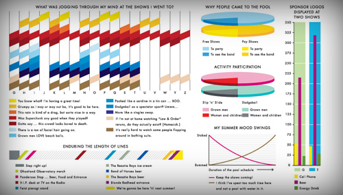
For example, his review of New York’s McCarren Park Pool Music Concert and its accompanying, dizzying infographic:

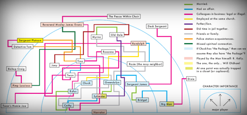
Or consider his character mapping of R. Kelly’s Trapped in the Closet opus, which lives outside the realm of recognizable infographics, but which imposes a preposterous sum of information onto a two-dimensional JPEG:

My students and I will pack lanterns and dried food for a week and go on a spelunking field trip inside his head, seeking out the source of the funniest and most functional infographics the 21st century has seen to date.

The Final Exam

Andrew Kuo is the final exam: take your deeply personal preferences and make them deeply accessible to anyone.

Andrew Kuo is why students will love this course: Information Design is nothing apart from their passions, likes, and dislikes.

Which math class on your master schedule can claim that?