Year: 2008

Total 265 Posts

dy/av post-mortem

Dean Shareski posted an interview over at his Ideas and Thoughts covering my summer-long vodcasting series, dy/av. Since the guy is like Lesley Stahl with a Skype mic, I went back through the archives to prep myself. I cringed at moments I didn’t expect and found some moments more durable than others.

More of my public navel gazing:

Defining The Structure

I knew I wanted the episodes to land between two and three minutes (though even that proved too long for some of y’all), to feature three words in the title, to close with my blog’s plucky little tagline in voiceover, and I wanted to shoot in a 16×9 aspect ratio (think HDTV, not your old 4×3 TV tube) because the thinner rectangle lets you balance your composition in fun ways, packing useful elements into both sides of the screen.

For example:

The structure evolved in the editing room. For better or worse, I started adding a short, silent cutaway before the final line, an effort at ratcheting up the drama before the close.

Cringeworthy

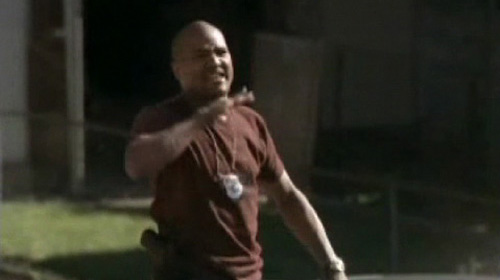
Throughout the ten episodes, I felt too somber and too portentous by nine-tenths. Nowhere is that more apparent than in the seventh episode, which I shot on two different days. One day I’m more or less my ornery, ebullient self, the other I’m kind of staring and speaking at the camera like I think I’m Jesus. I only kept a consistent, accurate tone in the ninth episode, which, of course, was the last episode with any monologue.

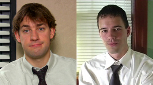
Oh, and the cutaway in the office episode where I try to conjure Jim Halpert just didn’t work.

Audience Interaction

I shot the behind-the-scenes episode three times, each reshoot modified by your inquiries into the process. Aside from that, the production time (averaging out at 14-ish hours per episode) prohibits the kind of post/comment/followup feedback blog posts enjoy. Once I shot an episode, only a monster incentive would reset the process.

My Least Favorite Episode

The behind-the-scenes episode, the visual core of which (the parallel shots of creating lessons and creating vodcasts) disintegrated halfway through. The last thirty seconds are particularly painful for me to watch as I murmur several passages which would’ve been better served by simple a blog post.

Favorite Flourishes

In carver’s classroom management, I mention how “I always, always took discipline personally.” I visually italicized the second “always,” with a slo-mo shot of Carver on top of the police cruiser chopping at the air, a shot you’d already seen at regular speed.

It lasts less than a second and underlines everything I believe about the strength of video.

Oh: the eyebrow in episode seven.

Also: “graham crackers and wiki hour.”

The Hardest Part About Editing Videos You’ve Spent Months Brainstorming, Writing, And Shooting

Forcing yourself to watch and listen to your story through the eyes and ears of someone totally unfamiliar with it, a hypothetical viewer. I found it really easy to cut too much, having grown deathly bored hearing myself say “My name is Dan and I like to teach.”Zadie Smith sez: write it and put it in a drawer.

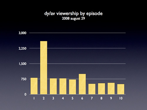
The Least Watched Episode

dy/av : 007 : the motiongraphics episode, which was also my favorite, illustrating my connection to the content I have spent my professional life teaching.

The Most Watched Episode

The most watched episode was dy/av : 002 : the next-gen lecturer, the popularity of which surprised and, frankly, annoyed the hell outta me. I paced the ten episodes according to which ones I felt would play like gangbusters and which I felt would lull an audience appropriately. Turns out I have no idea what any of you people are into.

Watching it again, I’m really happy with how I edited the classroom conversation into the video, a conversation which includes so many aspects of teaching I’ll cherish long after I stop teaching.
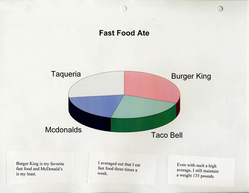
Nielsen Ratings

My Most Flameworthy Assertion In Dean’s Interview

“Video at its best is better than writing at its best.”

Essential Vodcasting Skills

Dean asked me to define the skills essential to this vodcasting gig. There is only one. It is common to good speechwriting, good storytelling, and good teaching: increase the bandwidth. More throughput. Say more, just as clearly, with less.

For video that requires two specific skills:

  1. Use the blade. Edit the dead air from your shots. Cut the passages that don’t serve the point of your video. It’s just like the delete key with blogging, only harder. (In fact, if you can’t wield the delete key adequately in your blogging, rethink video.)
  2. Layer video. Is there something so special about how you look when you talk that you need to show yourself talking? Show something else โ€“ something informative, illustrative, or (for humor) contradictory โ€“ while your voice fills the background.

You can find my best throughput in the coffehouse scene from episode ten, where I split two complementary angles while at the same time layering audio from the next scene for a smooth transition.

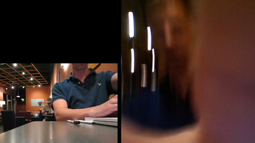
It’s my best work of ten episodes.

Interview: Nicholas Felton

Nicholas Felton is a graphic designer working in New York City who, every year since 2005, has produced an annual report โ€“ everything from where he traveled to what he drank โ€“ using infographics which I’m pretty sure he stole from my math classes. His work inspired this blog’s annual report contest, which you’ll see again at the end of 2008. His annual report also inspired my classroom assignment, The Feltron Project. After struggling with my students to reproduce his accomplishment, I had several questions, which Felton was gracious enough to answer.

Dan Meyer: Can you describe your workflow, from (eg) a day’s subway ride to its appearance as an infograph in your final report? What hardware and software shows up along the way?

Nicholas Felton: As I’m in front of my computer for most of the day, I use the mac’s calendar application to keep track of all the day-to-day statistics. I arrive in the office, and immediately note anything of importance from the night before and the current morning. If I am away from the machine, or I am accumulating too many specific notes to keep track of, I will use the notepad in my mobile phone to write them down, or email them to myself. If I’m travelling, I tend to use my sketchbook to keep tabs on everything, which I will later enter into the calendar. For more infrequent activities, I also keep running lists in excel or on backpackit.com.

Throughout 2007, I also kept monthly maps of Brooklyn and Manhattan on which I traced the streets I walked each day.

DM: How much math goes into the final product? My best guess, for the record, is that you use Excel to turn (eg.) pie chart percentages into degrees and then pull that information into InDesign or Illustrator.

NF: A lot, a lot, a lot of adding. A lot of dividing by 365. A lot of multiplying by 360.

Nearly everything goes through a spreadsheet before it goes into the report, but none of the math is terribly complicated…. mostly calculating percents and angles (I should use excel, but I do this with a calculator). I have used an online tool that will output the diameter and radius of a circle if you provide the area, which has proved useful, but I don’t believe I’ve applied it to my annual reports.

DM: My students were somewhat shocked you spend only 20.6 minutes per day (as reported in your 2007 Annual Report) recording these piles of data. What corners have you cut to save time?

NF: Actually, that measurement was 20.6 measurements each day in 2007. I don’t know what it’s corollary in minutes would be, but certainly less than 20. My best guess is that I only spent between 5 and 10 minutes a day on notation. But 2007 was the most complex year of datalogging thus far, and I ultimately found that I had too much… which bogged down the tabulation and design process. This year I’ve decided to refocus my data collecting in a way that only requires a couple minutes on most days, but occasionally gets much much more complicated.

DM: How much of your final report comprises data you have PASSIVELY collected, data generated from last.fm’s music service, for example? What other sources do you use?

NF: Unfortunately, not enough data comes from passive sources yet… probably less than 10% of last year’s report was captured in that way. As you mention, last.fm keeps tabs on all my listening through itunes and my ipod. I let netflix keep track of the movies I rent, and flickr tracks how many people have viewed my photos. I have also purchased weather records for New York City, which I augment with out of town records for the last 2 years in order to help determine my average temperature as well as the maximum and minimum.

DM: My students didn’t have much trouble making infographs but the designs didn’t stray much beyond Microsoft templates. What essential advice would you give a high school freshman for creating a compelling design?

NF: Reduce, reduce, reduce. I find that you can eliminate nearly all the elements that Microsoft wants to include in a graph with considered editing and placement. In most cases, I can get away with eliminating a key or an entire axis altogether.

DM: My students are quick to accuse anyone of your dedication of having “no life” or “too much time on his hands.” Aside from the obvious intrinsic value you get from this project, do your reports benefit you tangibly? What do you get out of this?

NF: For the record, I prefer to consider myself curious or inquisitive, rather than the victim of dull circumstances. The truth is that the more I do, the more interesting I find the reports to be. Like everyone, I tend to be a creature of habit, so it’s the outliers of activity that interest me. I am indebted to the project for a host of benefits. Without the report, I wouldn’t have a very good reason for counting how many coffees I drank in a year, which truly intrigues me. The additional acclaim the report has received is terrific and has helped me forge a name for myself in a crowded field of talented graphic designers, leading to more commissions, as well as a refocussed dedication to continuing the project.

DM: Can you preview any new statistics you’re tracking for your 2009 Annual Report?

NF: I’d rather surprise you in January…

[photo by Ellen Warfield]

Feltron Post-Mortem

a/k/a My Qualified Disaster
a/k/a The Trouble With Tech

previously on dy/dan

We started with four variables (text messages, beers per day, etc.) which we tracked for 2.5 months in quad-ruled notebooks attempting to transform the quotidian details of our lives into extraordinary infodesigns a lá Nicholas Felton.

This was a departure for me. A tech-driven, student-led, design-infused mathematical project. Things went wrong.

This is a comprehensive autopsy of our Feltron Project. I post it here, in its entirety, a) for my own review next year, b) for your criticism. If you aren’t in the mood for the full, bone-by-bone dissection, please scan down to the section headed What Really Happened. These are problems I don’t know how to solve.

The Lesson Plan

a/k/a What Was Supposed To Happen

  1. We selected variables.
  2. We discussed them, making them more interesting (disaggregating “hugs per day” into “boy hugs” and “girl hugs”) and more manageable (tracking “fast food I eat” instead of “what I eat”).
  3. We tracked them for ten weeks, checking ourselves for consistency every two weeks, and then we stopped.
  4. We spent one hour marveling over Nicholas Felton’s annual report, dissecting it for meaning, identifying the mathematical operations (average, maximum, minimum, sum) and the mathematical forms (pie chart, line graph, histogram, stacked bar graph, map) he used.
  5. We spent six hours entering our data into Excel sheets.
  6. We spent two hours teaching and deriving ten facts of our lives using average, maximum, minimum, and sum functions in Excel.
  7. We spent two hours teaching and deriving four graphs of our lives using pies, lines, and bars.
  8. Raw facts and graphs in hand, we spent thirty minutes discussing and distilling Felton’s graphic design savvy into the two principles I thought my freshmen could reproduce with crayons and paper if they had nothing else:
    1. colors, Felton uses a two-color design (shades of black, shades of blue) which, apart from distinguishing his hierarchy (titles in black, data in dark blue, accents in light blue, etc.) keeps down costs when designing for a large print run.
    2. grids, the kind your eyes can’t see but which your brain loves, the kind which imposes order on what would otherwise be a completely disordered data set, so while Felton jumps from music to movies to drinks you know where to find everything.
  9. We spent another two hours in class tying up loose ends in Excel and then a week designing our Feltron Projects.

What Really Happened

a/k/a Help.

  1. Only 55% of my students submitted the final Feltron ProjectControlling for age: 48% of freshmen and 63% of upperclassmen completed the project..
  2. Many of the other 45% stopped tracking early in the project, which meant assigning them review work, new work, or busy work while everyone else worked in Excel.
  3. Those who kept up with the project quickly staggered their progress (based on pre-existing computer ability, typing speed, and attendance) which saw me dashing between desks, explaining and re-explaining the same procedures over and over again.
  4. Our mobile computer lab a) comprised just fifteen laptops, and b) was available for check-out only once a week, c) if that.
  5. Kids lost work. I had them send their Excel files to themselves and then download the attachment the next day. Trouble was kids sent old files to themselves or they named files computer arsenic like “<<xxxx….davidsfeltronz!!!….xxxx.xls>>” which put both Excel and Gmail into simultaneous cardiac arrestFor the record, I originally sought GoogleDocs out for this project but they maxed out at something like fifty rows where we needed hundreds..
  6. I overestimated my students’ computer fluency. Name it: locating saved files, opening programs, using a trackpad, using modifier keys, sending e-mail. These tasks all required constant, patient re-explanation. Missed that mark by a country mileThere were exceptions, naturally, but Digital Immigrants™ outnumbered Natives™ at 15:1, many of which Natives one day, I have little doubt, will grow up to be edubloggers..
  7. None of them had used Excel before. Ever. Many didn’t have it at home. One triumph of this project โ€“ recognized by a lot of students โ€“ is that my kids are now somewhere in the top quintile of Excel users. This will doubtlessly prove useful again in their lives โ€“ not in the when-will-we-ever-use-this-in-real-life? sense, like they won’t be able to find food or shelter without Excel, just that it will open up a lot of interesting opportunities.

What Mattered

a/k/a Grading

  1. Faithful Tracking
  2. Interesting Findings
  3. Clear Design

Students ranked themselves on a ten-point scale across each index. Given how deeply we had immersed ourselves in exemplary work over two-and-a-half months, with only a few exceptions, I gave them exactly the grades they felt they deserved.

What I’ll Do Next Time

a/k/a If There Is A Next Time, Obviously

  1. Host screencasts online demonstrating essential Excel proceduresincl: sorting columns, using formulas (avg, min, max, sum, countif), saving/sending work, creating new sheets, filling down the date..
  2. Strengthen our analysis. A student’s text message graph plunged for a week when her parents confiscated her phone and spiked when she pulled a boyfriend in May. Students positively thrilled to see those connections but we didn’t build any of that analysis into the project grading. Should’ve.
  3. Employ a Kuropatwa-esque rubric to better inform kids what constitutes “clear design” or “faithful tracking.”
  4. Discuss design in greater depth, incl.
    1. showing them what my own Feltron would look like with rangy, mean grids or spasmodic colors;
    2. showing off the good and bad from this year’s class;
    3. comparing/constrating Khoi Vinh’s approach to grids and David Carson’s insane anti-grids;
    4. showing them Aesthetic Apparatus’ beautiful work in just three-or-fewer colors;
    5. compare 3D graphs alongside 2D hoping a lot of students will reconsider the choices they’ve made in life.
  5. Make a more obvious point of my own Feltron Project. Playing along with your students isn’t even optional here. I made sure I ran through the collection process with my students (for empathy, if nothing else) but I should’ve made a larger point of my own struggle and process.
  6. Find collaborators. This was insane. I should not have gone at this aloneAny takers?.

Students On Feltron

Just do a month.

โ€“JG, smart; we’ll multiply a month by 12 to extrapolate for a year.

Everyone should track the same thing because it’d be really cool to see which people are like you.

โ€“BP, also smart; resolved, then, that we’ll select three variables independently of the class and then select a common classroom variable for the fourth.

I like the chalang. It feels like I acopolished something hard and it made me feel good.

โ€“BS, sic sic sic; whose mother, in an IEP meeting, said of his Feltron notebook, “He carries it everywhere.”

Felton On Feltron

Nicholas Felton consented to an e-mail interview on his process which will appear in this space tomorrow.

Gallery

I have installed student work โ€“ everything from awful to exemplary, but mostly exemplary โ€“ into a Flickr set.

Handouts

  1. Feltron Project Outline
  2. Nicholas Felton Analysis Sheet
  3. Excel Chart Illustrations
  4. Excel Formula Sheet
  5. Map Infograph Template
  6. Final Review Sheet

To Conclude

This was a different, necessary kind of insanity for me to finish my fourth year teaching even a little eager for a fifth. The price tag was steep. To accommodate this time-sucking project-based learning, we skipped a third of our logic unit in Geometry and fully jettisoned last year’s Platonic Solids project.

If I weren’t already guzzling away at this barrel of standards-based Kool-Aid, I’d write something agitated and truly inexcusable here about curriculum narrowing or the time cost of NCLB, but I remain convinced we need to settle on a list of necessary skills and then decide horse-in-front-of-cart-style on the best tools and projects to teach themNoted here: Jay Greene’s j’accuse directed at teachers who complain that NCLB exigencies leave them with no time for fun project but who also wile away the last month of school with parties, assorted time wasters, etc. We didn’t start computer lab work with Feltron until after our round of state assessment.. I do not know if this was that.

There are twenty-four hours. No exceptions. I’m uncertain Feltron was the best use of our time.

I put Feltron to rest now, surely the weirdest assignment I’ve concocted in a four-year career. I post this here to solicit the usual gallery of critique and construction but also because, at some point in this whole blogging thing, I forgot how else to end a project if not with rigorous and public self-critique.

The Best Vodcaster Alive

I can’t tell you what an exhilarating experience this has been โ€“ writing, shooting, and editing this slate of ten vodcasts. It’s like turning over a rock and finding a new language, one which gives voice to a lot of thoughts you’ve had banging around in your head, thoughts that have been looking for an exit for a long time.

I’m still trying to navigate this new grammar, trying to avoid the film equivalent of run-on, illiterate sentences. I’m finding the equivalence between shots & edits and sentences & punctuation, finding inspiration in Hillman Curtis, who is the most literate voice in online film today, particularly if we control the selection for a certain DIY ethos. Please watch the first half, if not the whole, of his portrait of artist Lawrence Weiner.

You are in the stream of life whether you like it or not. And if you’re going to be in the stream of life then you have to accept the responsibilities. I would like a few more pleasures but there doesn’t seem to be time. โ€“ Lawrence Weiner, on what it is to be an artist.

Vodcasters like Ze Frank understand that good video is largely about compression, about sharp edits compressing the time between thoughts, events, and locations. (ie. here you’re in Belize, now you’re in Chattanooga) Hillman Curtis gets that great video โ€“ like great writing โ€“ moves to a rhythm, one which must speed and slow.

Curtis understands that, in film, as in writing, you can force the reader to slow.

And think.

And breathe.

By breaking up the text.

Or, in video, by lengthening the shots.

A third of the way through the Lawrence Weiner portrait, Hillman Curtis does just that with a long, slow tracking shot, the rails obvious beneath the camera, laying bare the mechanics of film.

The odds are 5:2 at best but I may score a video production class this upcoming school year in addition to my usual slate of Algebra, Algebra, Algebra. I couldn’t be more excited.

[BTW: didn’t score that class. life goes on.]

dy/av : 010 : the season finale


dy/av : 010 : the season finale from Dan Meyer on Vimeo.

Tags

dyav, autobiographical

iPod Edition

dy/av : 010 : the season finale (640 x 480)

Previous Episodes

dy/av : 009 : don’t be prez
dy/av : 008 : behind the scenes
dy/av : 007 : the motiongraphics episode
dy/av : 006 : carver’s classroom management
dy/av : 005 : how i work
dy/av : 004 : thank you, teaching
dy/av : 003 : on the office
dy/av : 002 : the next-gen lecturer
dy/av : 001 : earn the medium