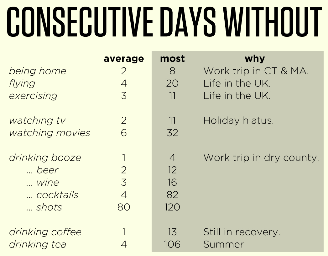
I’m still recording dozens of vital statistics like alcohol, coffee, and media consumption, geographical location, sleep habits, and some others that are no one else’s business, really. For the sake of time, I’m only visualizing one of them. The graph of my coffee consumption tells an interesting story about my 2012, the year my body decided it hated caffeine:
I spend about a minute each day recording statistics on my phone and an hour each month transcribing them to Excel. That takes time. But your devices are collecting a lot of those data passively all the time. If you’d like the excuse to learn data visualization and pivot tables in Excel, here’s your assignment:
Log into your wireless carrier’s web page and download your voice and messaging data for as long as you want but at least the last two years. Then prepare the data in Excel, getting your columns uniform and labeled. Then figure out the top five people you’ve a) called or b) messaged over those years. Do they change? For extra credit, are the people you call most and message most the same people? If not, what accounts for the disparity?
Leave your work in a comment once you’re done. We’re looking forward to it.