Category: design

Total 257 Posts

No-Drop Zones

From the #iPhone-game-as-metaphor-for-curriculum-design hashtag, we have Geared, which I purchased because I’m almost completely obsessed with little spinny things, a purchase which I almost immediately regretted.

Two reasons:

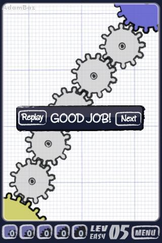
  1. The early levels are ridiculously easy. Not a serious problem in and of itself. The same is true of Flight Plan, which you’ll recall I rather liked.
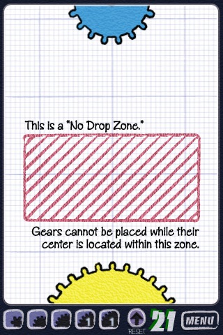
  2. But game play gets harder only over a series of completely nonsensical contrivances. You’re dropping gears into a system, blitzing your way through easy. Then on level 21, as the game flips to medium, you’re confronted with “no-drop zones.” That’s really it. Everything else is the same. You’re arbitrarily excluded from routes you know would otherwise work for reasons that have nothing to do with the function of gears.

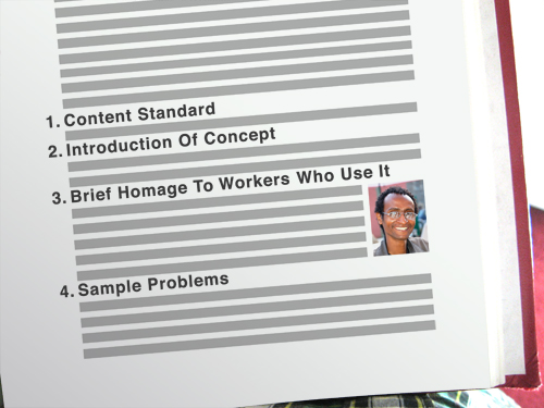
There’s no good reason to criticize an iPhone game from this forum except for the robust metaphor it offers for conceptual growth in math. Few textbooks get this right โ€“ and I include here the ones that do a pretty good job of being less helpful:

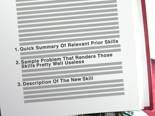
whenever possible, introduce new skills and new knowledge as the solution to the limitations of old skills and old knowledge.

Typical:

Better:

Please argue with me here but I don’t think my freshmen really care if career professionals use math in their jobs. This “career” concept is supremely abstract to most and therefore mostly useless to me as a motivator. I’ve found a much stronger motivator in a palpable sense of forward momentum, in a coherent skill set, in real, uncontrived challenges.

I’m teaching remedial Algebra for a fourth year now and the change I make to my curriculum far more than any other is to add this connective tissue.

You’re comfortable with a dot plot? Fine. Let’s put you in a place where a dot plot is tough to execute โ€“ say, a large data set with no mode and a huge range. That’s annoying. Then bring in the box-and-whiskers, the histogram, or whatever. I try not to introduce the next concept simply because it’s the next chapter in the book or the next bullet point on a list of standards or because it’s “what we’re learning today.” In other words, I try to stay away from the no-drop zones.

Redesigned: Kyle Webb

Kyle Webb drops a WCYDWT video on circle area and perimeter:

Academic Green Circumference and Area Problem from Kyle Webb on Vimeo.

First, let’s pay respect to how fast the video moves, how it sets a scene and establishes a problem in just 14 slides and 57 seconds. Webb knows his audience and its attention span. Also, none of this is stock photography. Every photo selected is of high bandwidth and relates directly to the problem. After 12 seconds, we have three different views of the lawn. After 15 seconds, a panoramic shot. I’ll begin my redesign 23 seconds in, when he mentions the lawn is 75 steps across.

This is really, really close to my textbook’s own installation of the problem. The text would ask a question like “how far is it around?” or something with a real-world spin like “how large would the ice rink be?” (standing in for “what is the area?”) and then it would explicitly define the only variable we need: 75 steps. My students would identify the formula and then solve.

This kind of instructional design puts students in a strong position to resolve problems the textbook draws from the real world but in no position to draw up those problems for themselves. This kind of instructional design also yields predictably lopsided conversation between a teacher and his students.

The fix is simple but difficult: be less helpful.

Let’s start here: is circle area just something math teachers talk about to amuse themselves or do other people care? If they care, why do they care? How do we convey that care to our students? Maybe someone needs to fertilize the lawn. Maybe someone wants to spray paint the dead lawn green in the winter. Without this component, the answer to the question “how far is it around?” is little more than mathematical trivia to many students.

So put them in a position to make a choice, a tough choice that’s true to the context of the problem, a choice that math will eventually simplify.

For instance: “how many bags of fertilizer should I buy to cover the entire lawn?”

Or, a little weirder: “how many cans of spray paint should I buy to cover the entire lawn?”

In both cases, we’re putting every student on, more or less, a level playing field. They are guessing at discrete numbers (ie. “fifty bags โ€“ no โ€“ sixty bags.”) and drawing on their intuition, which, from my experience, is a stronger base coat of for mathematical reasoning than the usual lacquer of calculations, figures, and formula.

This approach also forces students to reconcile the fact that the problem is impossible to solve as written. This is an essential moment. They need more information, but what? What defines a circle? Would it be easier to walk across the lawn’s diameter or around the lawn’s circumference? Which would be more accurate? Why is the radius difficult to measure? Did Kyle really walk through the center of the lawn or does he just think he did?

When you write “75 steps” on a photo, that conversation never happens.

My thanks to Kyle for jogging my thoughts here.

Summer Cinema #2: Paperclip Challenge

Paperclip Challenge from Dan Meyer on Vimeo.

I’ve moved nearly a dozen times since I broke this record in 2004 and the tapes have followed me everywhere: 24 hours of non-stop monotonous paper clipping minus twelve gaps where one of my friends (probably Steve) changed the reels. Five minutes of this footage will make you sorry you ever spoke an unkind word about grass growing or paint drying, which are each several orders of magnitude more exciting than this.

So I compressed those 24 hours into three minutes, which meant transferring the footage from Hi-8 tapes to DV tapes (time cost: 24 hours) and then importing the DV tapes to Final Cut Pro (time cost: 24 hours). There were no shortcuts. The project took weeks.

I have only one creative note worth mentioning here, a footnote to my previous post, Don’t Let Your Students Use Music In Their Video Projects: the soundtrack is entirely ambient noise.

I worry about video teachers who would encourage the student to mute the ambient noise โ€“ the chaos, the laughter, the occasional grim silence, all of which is essential documentary detail โ€“ and instead apply a thick lacquer of Creative-Commons-licensed pop electronica. Something chosen carefully, no doubt. Something propulsive to match what passes for content here. But I’ll point out, again, that a) controlling ambient noise is its own necessary kind of skill, and b) laying a music track beneath a video track without worrying about how the two tracks play with each other โ€“ how the aural ebbs and flows with the visual โ€“ will strike certain segments of your audience as, artistically speaking, soulless.

This particular case is easy. If your audio track doesn’t shift gears or climax or do something at exactly one minute and 21 seconds into this video โ€“ when the sun rises โ€“ you’ve missed the moment and essentially filed for divorce on behalf of your audio and video track, citing irreconcilable differences.

Summer Cinema #1: 40th Anniversary

[The next two posts discuss some of my technical notes from two video projects I completed this summer โ€“ one professional, one personal. If these are too far off the beaten path for your tastes, please check back in next week.]

Ponderosa Lodge 40th Anniversary Montage from Dan Meyer on Vimeo.

My first video project this summer was a montage celebrating the fortieth anniversary of a local camp. This was complicated. No video existed from the 1970s. I thought, initially, to interweave older photos and newer video but, instead, went strictly with photography.

This was also challenging. There is only so much you can do with still photos. You can cross fade them. You can apply filters. You can edit them to music. You can go the Animoto route. You can go the Ken Burns route. But those techniques do very little to enrich the content. Ken Burns enriches his photos, for instance, with research, narration, and editing. Without those, the motion across the screen would grow tiresome.

I took a familiar path. Several years ago I posted a photo montage that exists somewhere between 2D and 3D. The technique is straightforward.

You take as many photos of the scene as you need plates (or layers). You keep your camera in manual mode so that when you move subjects out of the way (to get an unobstructed shot of the background) the aperture doesn’t change.

In this case, I wanted a layer for each of the brothers and the background. You use the pen tool in Photoshop to cut out each plate from the background and then import the composited file (with three total layers, in this case) into Adobe AfterEffects where you tell your computer, this layer is closer to the camera, this one is farther away, here’s how to move the 3D camera around the scene. Once you outline your scenes, it’s only a question of how much free time you have for the digital carving.

This project was different. I couldn’t go back in time to shoot the two brothers separate from each other and from the background. I spent four hours scanning slides from the 1970s. After I masked the subject from the photo there was … nothing. Just white space. I had to guess at and then recreate the background.

So I got cozy with the clone tool, which is exceptionally easy to use poorly. As often as I could, I set myself up with subjects standing in front of solid colors or simple textures, which are easy to clone.

These two were especially difficult. The sandy ridge behind the campers is almost entirely fake. If you look closely at the pool photo, you’ll notice I had to clone an onlooker’s entire face.

I thought sand would be easier to clone but the light fell across it unevenly and had me pulling out tufts of hair trying to compensate. Stay away from sand.

It’s difficult to stretch a single technique across an entire film. It gets tired. So I waited to deploy that one until the bridge of the audio track kicked in. Beforehand and afterwards, I went for a ghostly, melancholy vibe with subjects drawn into the campground at the start and then drawn out at the end.

Which, again, required a lot of digital carving.

Excellent Math Blogging

These two are fresh. If you subscribe now, you can say you were into them before they got big.

1.

Tony Alteparmakian is a 2009 Leader in Learning enacting Chris Lehmann’s vision of classroom inversion (though I don’t doubt they came to the idea separately). Their idea is that we should send our students home with what used to constitute classroom time โ€“ the lecture โ€“ and spend classroom time on labs and teacher-led enrichment of that material.

Obviously, that vision comes fully loaded with complications but Tony is resolving them one-by-one in a how-to series that has only just started.

Also, I dig his redesigns. It’s hard to argue with slide transformations like these.

Before:

After:

2.

Sean Sweeney is an extra-value meal. In one corner of the edublogosphere you have the edtechnologists, the district IT staff, the ICT professionals, the policy wonks, etc., all asking huge, important questions about merit pay, technology integration, assessment, online schooling, etc., and posing reckless hypotheticals about limitless resources with nothing less than the future of education at stake, and all of it makes me grateful for guys like Sean who are driving 90MPH up the right lane, offering educators something they can use in the classroom right. now.

I’m talking about his quadratic catapult project. Or his Graphing Stories remix. Or his exercise in grocery store estimation. And that’s his output over two weeks.

This is math-instruction-as-artistic-expression and it’s cool as hell to watch.