Becky Blessing was one of my substitute teachers last year. She re-introduced herself at the start of my UC Berkeley presentation and halfway through my WCYDWT? thesis
Becky Blessing was one of my substitute teachers last year. She re-introduced herself at the start of my UC Berkeley presentation and halfway through my WCYDWT? thesis
I do my best not to worsen the problem of uncritical, impatient thought, but my best effort at a solution to the problem is What Can You Do With This? where we pull the world into our classrooms through digital media artifacts.
I have spent the last month trying to determine a framework for capturing and presenting these artifacts effectively, a framework that will differentiate effective and ineffective use, that will explain why some of these artifacts provoke lousy questioning, forcing the teacher to gesture and explain and prod, shooting blanks wildly at the target of real-world relevance, while others are sublime, provoking different routes to different, equally justifiable answers to interesting questions.
I presented my usual PowerPoint dog-and-pony show to UC Berkeley’s math/science teacher cohort on Monday. I had an extra half hour so I decided to test this framework to see if any of my ramblings here make any sense whatsoever.
The short answer is that, yes, off a brief introduction, most everyone could see why your textbook’s halfhearted stab at real-world relevance withers next to a single, compelling image, to which we gradually apply a mathematical framework, only as students request it.
I prefaced it with the Milch audio but I didn’t get around to playing what has become an extremely important piece in this puzzle, the opening shot of a French movie called Caché.
I reckon the majority of my time-strapped readership checked out of that one pretty fast. As drama, it’s kind of boring. As digital media instruction, though, it’s a road map and a full tank of gas.
You realize quickly that the camera won’t move, that there isn’t a soundtrack to establish the mood. (Should I be tense? Eager?) And then certain synapses of your brain start firing. You start constructing meaning from the scene however you can. You scan the margins. You check pedestrians for malicious intent. You notice you’re in an affluent neighborhood. You try to identify the protagonist.
The cameraman, the editor, and the composer are all on a coffee break. It’s on you to ask the difficult questions. It’s on you to find their answers within the scene and defend them. It’s on you to become patient with irresolution.
My top two picks were interchangeable until the very end and my top selection, in the end, reflected my slight preference for minimal design over maximal design.
1. Frieder Knauss
I can add very little to the appreciation circulating on this site except to say that Mr. K manages the hat trick of a) personal retrospection, b) data design, and (the rarity) c) editorial.
That he does this in several thousand fewer pixels than all of his competitors is to his credit, as is the vomit-themed color palette which he somehow sells as an element of his NCLB nausea.
2. Sam Shah
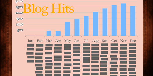
That Sam didn’t place speaks to the overall quality of the entire slate. From fonts to colors to axes and grids, none of his design choices cohere. Yet he tosses them all on the same wall with a stuffed buck and the whole thing looks like some kind of genius aneurysm. The herkyjerky, undistributed, unaligned tabs on his “Blog Hits” slide are a particular high point for me.
An appreciation by Ben Wildeboer:
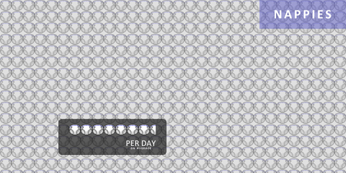
Simon Job knows what he’s doing. First he grabs my attention by plastering his first slide with pictures of his adorable new baby and then goes on to use his four slides to tell a compelling story of his new life with his new daughter. I can sense the major changes his life has undergone after the birth of his first child through the information contained in his annual report- the photo sharing with family & friends, the frequent doctor visits, new sounds in his house, and the unenviable task of changing all those “nappies.” Print out that Nappies slide and post it in every sex ed. classroom and it’d probably do more to prevent teen pregnancy than any method currently in use. The fusion of good, simple design around a coherent storyline made Simon Job’s annual report stick out in my mind above all the rest. Of course, it could just be those adorable baby pictures.
An appreciation by Sam Shah:
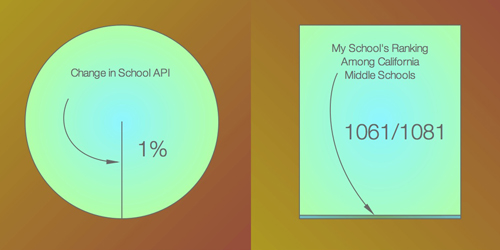
I ranked Mr. K at the absolute top of my list because his slides, simple and minimalist, speak volumes. With just four pieces of data, Mr. K has painted us a picture of a school flailing at the bottom of the rungs. Students are underperforming, the school’s academic perfomance is not improving, and the school is undergoing administrative shifts too. Follow along with me here, for a short minute, because I think there’s something moral about these slides. They aren’t just statistics, but carefully chosen statistics. Mr. K could have written about the number of teachers in his school, or the number of students he teachers, or whatever. Numbers, as a math teacher, abound everywhere. But instead, he gives us this: somewhere underneath these slides is an imperative that things are not okay the way they stand, that things need to change.
Design-wise, Mr. K hit the mark. Using miniscule areas of simple geometric figures highlights, without being obnoxiously in-your-face, where his school and his students lie relative to other schools in California. The fact is simply that using this same technique four times over is synergistic — but only because four such simple and powerful statistics exist. Take a moment and look at each slide individually. They each say something about the place Mr. K spends a preponderance of his time. But as I said, together, they speak as one. And loudly.