Category: algebra

Total 36 Posts

Feltron Post-Mortem

a/k/a My Qualified Disaster
a/k/a The Trouble With Tech

previously on dy/dan

We started with four variables (text messages, beers per day, etc.) which we tracked for 2.5 months in quad-ruled notebooks attempting to transform the quotidian details of our lives into extraordinary infodesigns a lá Nicholas Felton.

This was a departure for me. A tech-driven, student-led, design-infused mathematical project. Things went wrong.

This is a comprehensive autopsy of our Feltron Project. I post it here, in its entirety, a) for my own review next year, b) for your criticism. If you aren’t in the mood for the full, bone-by-bone dissection, please scan down to the section headed What Really Happened. These are problems I don’t know how to solve.

The Lesson Plan

a/k/a What Was Supposed To Happen

  1. We selected variables.
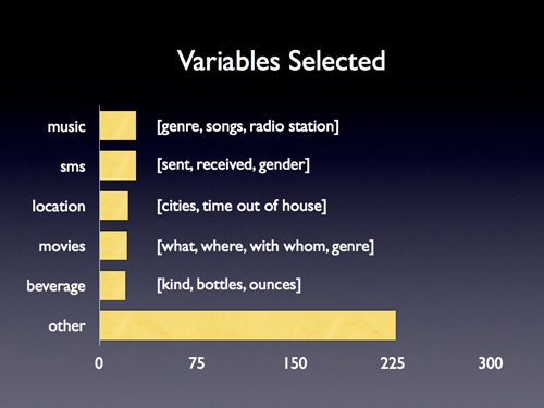
  2. We discussed them, making them more interesting (disaggregating “hugs per day” into “boy hugs” and “girl hugs”) and more manageable (tracking “fast food I eat” instead of “what I eat”).
  3. We tracked them for ten weeks, checking ourselves for consistency every two weeks, and then we stopped.
  4. We spent one hour marveling over Nicholas Felton’s annual report, dissecting it for meaning, identifying the mathematical operations (average, maximum, minimum, sum) and the mathematical forms (pie chart, line graph, histogram, stacked bar graph, map) he used.
  5. We spent six hours entering our data into Excel sheets.
  6. We spent two hours teaching and deriving ten facts of our lives using average, maximum, minimum, and sum functions in Excel.
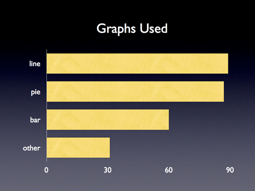
  7. We spent two hours teaching and deriving four graphs of our lives using pies, lines, and bars.
  8. Raw facts and graphs in hand, we spent thirty minutes discussing and distilling Felton’s graphic design savvy into the two principles I thought my freshmen could reproduce with crayons and paper if they had nothing else:
    1. colors, Felton uses a two-color design (shades of black, shades of blue) which, apart from distinguishing his hierarchy (titles in black, data in dark blue, accents in light blue, etc.) keeps down costs when designing for a large print run.
    2. grids, the kind your eyes can’t see but which your brain loves, the kind which imposes order on what would otherwise be a completely disordered data set, so while Felton jumps from music to movies to drinks you know where to find everything.
  9. We spent another two hours in class tying up loose ends in Excel and then a week designing our Feltron Projects.

What Really Happened

a/k/a Help.

  1. Only 55% of my students submitted the final Feltron ProjectControlling for age: 48% of freshmen and 63% of upperclassmen completed the project..
  2. Many of the other 45% stopped tracking early in the project, which meant assigning them review work, new work, or busy work while everyone else worked in Excel.
  3. Those who kept up with the project quickly staggered their progress (based on pre-existing computer ability, typing speed, and attendance) which saw me dashing between desks, explaining and re-explaining the same procedures over and over again.
  4. Our mobile computer lab a) comprised just fifteen laptops, and b) was available for check-out only once a week, c) if that.
  5. Kids lost work. I had them send their Excel files to themselves and then download the attachment the next day. Trouble was kids sent old files to themselves or they named files computer arsenic like “<<xxxx….davidsfeltronz!!!….xxxx.xls>>” which put both Excel and Gmail into simultaneous cardiac arrestFor the record, I originally sought GoogleDocs out for this project but they maxed out at something like fifty rows where we needed hundreds..
  6. I overestimated my students’ computer fluency. Name it: locating saved files, opening programs, using a trackpad, using modifier keys, sending e-mail. These tasks all required constant, patient re-explanation. Missed that mark by a country mileThere were exceptions, naturally, but Digital Immigrants™ outnumbered Natives™ at 15:1, many of which Natives one day, I have little doubt, will grow up to be edubloggers..
  7. None of them had used Excel before. Ever. Many didn’t have it at home. One triumph of this project โ€“ recognized by a lot of students โ€“ is that my kids are now somewhere in the top quintile of Excel users. This will doubtlessly prove useful again in their lives โ€“ not in the when-will-we-ever-use-this-in-real-life? sense, like they won’t be able to find food or shelter without Excel, just that it will open up a lot of interesting opportunities.

What Mattered

a/k/a Grading

  1. Faithful Tracking
  2. Interesting Findings
  3. Clear Design

Students ranked themselves on a ten-point scale across each index. Given how deeply we had immersed ourselves in exemplary work over two-and-a-half months, with only a few exceptions, I gave them exactly the grades they felt they deserved.

What I’ll Do Next Time

a/k/a If There Is A Next Time, Obviously

  1. Host screencasts online demonstrating essential Excel procedures
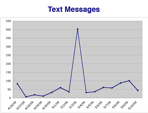
incl: sorting columns, using formulas (avg, min, max, sum, countif), saving/sending work, creating new sheets, filling down the date..
  2. Strengthen our analysis. A student’s text message graph plunged for a week when her parents confiscated her phone and spiked when she pulled a boyfriend in May. Students positively thrilled to see those connections but we didn’t build any of that analysis into the project grading. Should’ve.
  3. Employ a Kuropatwa-esque rubric to better inform kids what constitutes “clear design” or “faithful tracking.”
  4. Discuss design in greater depth, incl.
    1. showing them what my own Feltron would look like with rangy, mean grids or spasmodic colors;
    2. showing off the good and bad from this year’s class;
    3. comparing/constrating Khoi Vinh’s approach to grids and David Carson’s insane anti-grids;
    4. showing them Aesthetic Apparatus’ beautiful work in just three-or-fewer colors;
    5. compare 3D graphs alongside 2D hoping a lot of students will reconsider the choices they’ve made in life.
  5. Make a more obvious point of my own Feltron Project. Playing along with your students isn’t even optional here. I made sure I ran through the collection process with my students (for empathy, if nothing else) but I should’ve made a larger point of my own struggle and process.
  6. Find collaborators. This was insane. I should not have gone at this aloneAny takers?.

Students On Feltron

Just do a month.

โ€“JG, smart; we’ll multiply a month by 12 to extrapolate for a year.

Everyone should track the same thing because it’d be really cool to see which people are like you.

โ€“BP, also smart; resolved, then, that we’ll select three variables independently of the class and then select a common classroom variable for the fourth.

I like the chalang. It feels like I acopolished something hard and it made me feel good.

โ€“BS, sic sic sic; whose mother, in an IEP meeting, said of his Feltron notebook, “He carries it everywhere.”

Felton On Feltron

Nicholas Felton consented to an e-mail interview on his process which will appear in this space tomorrow.

Gallery

I have installed student work โ€“ everything from awful to exemplary, but mostly exemplary โ€“ into a Flickr set.

Handouts

  1. Feltron Project Outline
  2. Nicholas Felton Analysis Sheet
  3. Excel Chart Illustrations
  4. Excel Formula Sheet
  5. Map Infograph Template
  6. Final Review Sheet

To Conclude

This was a different, necessary kind of insanity for me to finish my fourth year teaching even a little eager for a fifth. The price tag was steep. To accommodate this time-sucking project-based learning, we skipped a third of our logic unit in Geometry and fully jettisoned last year’s Platonic Solids project.

If I weren’t already guzzling away at this barrel of standards-based Kool-Aid, I’d write something agitated and truly inexcusable here about curriculum narrowing or the time cost of NCLB, but I remain convinced we need to settle on a list of necessary skills and then decide horse-in-front-of-cart-style on the best tools and projects to teach themNoted here: Jay Greene’s j’accuse directed at teachers who complain that NCLB exigencies leave them with no time for fun project but who also wile away the last month of school with parties, assorted time wasters, etc. We didn’t start computer lab work with Feltron until after our round of state assessment.. I do not know if this was that.

There are twenty-four hours. No exceptions. I’m uncertain Feltron was the best use of our time.

I put Feltron to rest now, surely the weirdest assignment I’ve concocted in a four-year career. I post this here to solicit the usual gallery of critique and construction but also because, at some point in this whole blogging thing, I forgot how else to end a project if not with rigorous and public self-critique.

On Math And Breaking A Guinness World Record

a/k/a Because It Was There

The Ingredients

[left to right]

  1. me, twenty-two years old, anxious.
  2. paperclips, 60,000, sponsored by OfficeDepot in exchange for (full disclosure!) t-shirt advertising.
  3. a cable spool, begged off a Sacramento Municipal Utilities District back lot.
  4. wax paper, lots, to keep layers of paperclips from tangling on the spool halfway through the task, because that is a very very disappointing thing.
  5. a CD-R, burned with one essential Excel spreadsheet.
  6. measuring wheel, ’cause no one cares about your paperclip chain unless you can measure it end-to-end.
  7. a log book, signing me in and out of bathroom breaks.
  8. Starbucks Double Shots™, nine, the most expensive component here, to push me through the 9PM to 6AM corridor.
  9. Digital-8 cassettes, 24 hours worth, because Guinness requires nonstop video coverage.
  10. food

My Best Case

This is my best case for math education.

Not that, “hey kids! if you learn your fractions you, too, can accomplish something of very questionable value, like chaining paperclips together for 24 continuous hours.”

Rather, that math can uncomplicate the complicated, that an understanding of math leads to a richer understanding of the world.

For Example

In 2000, Ms. Jeanine Van der Meiren of Belgium chained together 22,025 paperclips in 24 hours.

If you are innumerate, your best response here is “that’s a lotta paperclips.” Which is how most of my students responded to this prompt the last week of school. But if you are numerate at even a basic level, you have only one option here.

You have to answer the question: how fast is that?

The question is irresistible.

By Hand

Jeanine set the record with 3.9 seconds per clip!

Think about that.

Mime it.

Use your hands.

“Clip two three four … clip two three four …. ”

The numerate math student realizes that the record is really, really slow. If he is also a little socially disordered, his next steps are predetermined.

He has to break it.

In The Classroom

  1. Groups of two or three.
  2. Show them a few pictures and make sure they realize what a few gracious friends can do for you here.
  3. Count how many clips one person can chain in one minute.
  4. Ask: is that rate fast enough to bring Jeanine down? They will take one of three routes to get there (proportions, rates, unit conversion) but most groups will determine that yes, they could.
  5. Discuss the assumption they’ve made, that they could maintain that monotony for 24 hours.
  6. Have another member take a turn for five minutes.
  7. Play it dumb: “Oh man, Alyssa crushed Kyle by 47 paperclips right there!” Kyle will correct your error (indignantly) before you finish the sentence.
  8. Have them answer the question, then: who is faster and by how much?, pointing out that the answer isn’t, “Alyssa is faster by 47 paperclips.” because a paperclip isn’t a measure of speed.

California says you’re done with rates now. Nice.

Stretch This A Little Farther

Suggest that Alyssa is faster than Kyle by .1 second per paperclip. She has trained just a little more and can chain ’em just a little faster. Ask if it matters.

It surprises no one that, yeah, any small gain positively explodes over 24 hoursThis is why I went through boxes of paperclips before the actual attempt, looking for the best way to chain two clips, looking for the best way to position the clips in front of me, looking to shave off any fraction of a second., but the exact increase is kind of shocking.

Now wrap your head around the relevance of rates to your life. If your boyfriend drags your self-esteem down by tiny increments daily, you’re going to stagger away from him after a year.

Get In / Get Out

It’s essential to know when to get out of a good story, joke, or learning moment. There was more to talk about but we didn’t, choosing instead to leave a few ends hanging.

One of those ends was a spreadsheet I cooked up for the occasion using formulas my students all know from our Feltron days.

My former-housemate-now-commenter Steve would enter in a) my clip count and b) the current time, and my Excel sheet would tell me:

  1. my pace over the attempt so far,
  2. my pace over the last 1,000 paperclips,
  3. my expected total clips after 24 hours,
  4. my expected total chain length after 24 hours,
  5. the exact time, given my pace, I could expect to break Jeanine’s record.

See: I don’t know how you attempt this record without those last three. Without math, you’re just clipping in the dark, just sorta sure you’ll bring the record down before the clock expires, just sorta sure your pace isn’t steadily slackening.

What I’m saying is that basic numeracy makes everything a little less confusing and, at the same time, a whole lot more curious.

Which is why I teach.

For The Record

Help Me Get Away With This

Mean, median, and mode are each important, each easily mistaken for the others, and, depending on context, misleading or completely meaningless.

I came across a scenario yesterday which highlighted their differences and limitations a little too perfectly:

  1. Consider every human being in the world.
  2. List each person’s total testicles.
  3. What is the mean, median, and mode of that list, and what do they mean?

Is this even worth the trouble? If you aren’t trying to shock or pander to or titillate your students, are testicles fair game? ‘Cause the implications and extensions are really awesome here.

Like: the average human being has one testicle.

Or: the median number of testicles is either zero or two depending on gender majority.

And: the median and the mode will be the same number except under a few (also awesome) conditions.

How do I avoid panicking my principal here?

[via Jim Ray’s cool tumblog]

Dodging My Tech Coordinator

a/k/a Linear Fun #4: Hit ‘Em

She wants her laptop cart back so I’m ducking her calls, trashing her e-mails, employing idle freshmen to shield me as she walks past.

I don’t know how this happened. I reached for those laptops to show my tech detractors I could, to inoculate myself against charges of Ludditism the next time we went to the mattresses, debating the relevance of the read/write web to math education.

“But Some Of My Best Friends Are Laptops.”

But then, after our first investigation into the flight data, after they selected their own data sets for regression analysis, after we investigated the data from the Department of Motor Vehicles (which y’all positively killed in the comments, thanks) I roughed up an interactive activity in Microsoft Excel:

Punch in a slope and y-intercept. Do your best to hit a set of targets. Get ready to give me several sentences explaining both.

There were positive, zero, negative, rational, and impossible slopes.

This was, like, the fifteenth extension on the mobile lab return deadline I begged off my tech coordinator and I realized this laptop thing was no longer an affectation. I wasn’t posing. It was real, more or less.

The Lonely Criterion

If you’re a tech proponent, coordinator, evangelist, or whatever, I’d like to break my complicated, conflicted, highly emotional experience (seriously: who am I anymore?) into small pieces for you.

  1. I had to accomplish a specific instructional objectiveWe can debate the merits of my state’s content standards, fine, but you can’t ask me to defy my employers, simultaneously setting my students up to fail in their next class, all so BJ Nesbitt won’t think I’m a lousy teacher. I mean, if that’s integral to the master plan, we have some work to do.. My students would a) model some part of their world with a linear equation, and b) explain the significance of the equation’s parameters.
  2. Microsoft Excel (coupled with a web browser) was the best tool to accomplish those objectives. And by “best” I’m balancing more factors than I have time or eloquence to describe but a) student engagement (are their brains working hard?), b) student enjoyment (are they having fun?), c) seat-hours expended (could I use our in-class time better?), d) planning hours expended (could I use my out-of-class time better?), and e) assessment scores (how well can they demonstrate mastery of the objective?) certainly round out the top five.

That is my uncomplicated flowchart, my lonely criterion for working technology into my classroom or not. I can’t imagine it is uniquely mine.

Your Job, Simplified

See, this is great. You don’t have to email your entire faculty a link to Mike Wesch’s latest call to educational actionFor serious: if I never saw another stony-faced child staring grimly at the camera, holding a hand-scrawled sign denouncing her out-of-touch, digital-immigrant teacher for not letting her SMS her iPod playlist to her Facebook group (or whatever) during class it would be too soon.. You don’t have to throw statistics at me. You’ve convinced me that my students need different instruction this century than they did in the last โ€“ check. got that. โ€“ yet you’ve satisfied only one-tenth your job description.

See this is the bummer. Now you have to immerse yourself in my content standards and use tech to help me satisfy the same instructional objectives in some way that’s a) more engaging, b) more fun, c) less time-intensive for my students in-class, d) less time-intensive for me out-of-class, or e) sturdier upon assessmentReally, if you can show me gains along any of those vectors without losing the others, you’ll be my valentine..

But this is also a bummer because, assuming your background wasn’t in every content area your school offers, you have to build a robust network of prolific educators pushing every content area in every direction but down.

And that’s the final bummer for y’all School 2.0 sectarians I’ve hectored these last fifteen months: unless I’m missing several platoons of math teacher bloggers, we’re stuck with each other.

‘Cause I’m starting to enjoy these Internets of yours, and finding a place for them in my classes.

2015 Nov 9. This might be the most belated update ever on this blog. Ms. Mac asks why there isn’t a Desmos Activity Builder-enabled version of this task yet. (Note to my past-self: you now work for an edtech company. Take the day off while you process that turn.) There should be. She made one.

Who Does Florida Think It Is?

a/k/a Linear Fun #3: Driving Across America

Plot total drivers vs. total population (using this table) for every state in the US and you get this graph:

Okay, that dot that’s below the line? That’s New York. That one’s easy. Fewer licensed drivers than you’d expect for the population ’cause only cabbies drive there or something.

But that dot that’s above the line? That’s Florida, and me and my classes will be damned if we can figure out why they’ve got more than their fair share of drivers.

Anybody got anything for us on that?