Who Is Nicholas Felton?

You and your family sent out a Christmas postcard. Jose Vilson blogged his year-end reflection. Corporations and businesses also play your game, issuing annual reports to their shareholders, detailing their rises and falls, quantifying successes and qualifying failures, telling the stories of their fiscal years through pictures, words, and charts.

Nicholas Felton is an individual, a graphic designer, but he takes the corporate route, obsessively tracking his vital statistics throughout the calendar year,

  • where he ate,
  • where he traveled,
  • media he consumed,
  • media he produced,
  • text messages he sent,
  • e-mails he received,
  • etc.,

issuing one of the design world’s most bespoke articles at each year’s end.

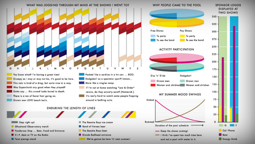
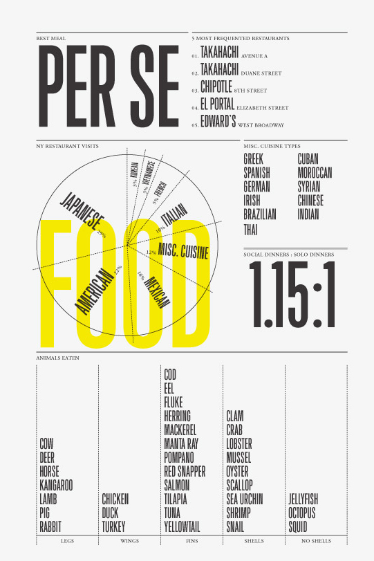
You are a shareholder in his life and flipping through his annual report is not an optional assignment for dy/dan readers. The 2006 edition, for example, includes information design grails such as this page of pie charts, ordered and unordered lists, detailing the food he ate over 2006:

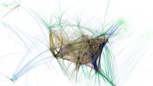
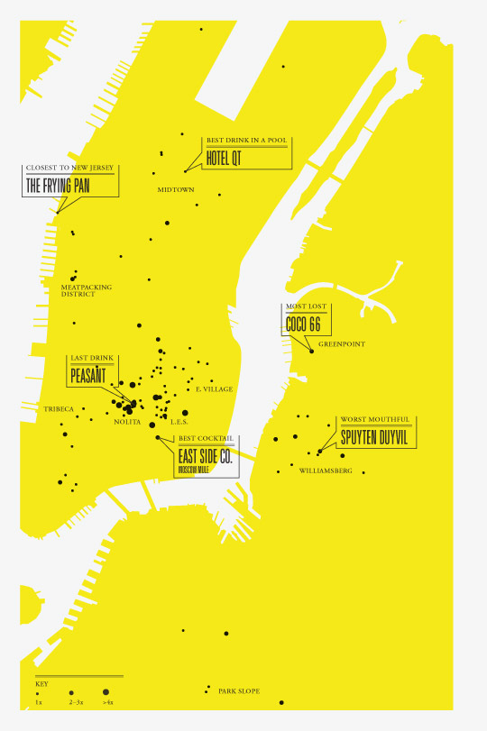
or this scatter plot of drinks he consumed throughout the year:

Nicholas Felton stands alongside Andrew Kuo as a patron saint of my Information Design course. Both make their idiosyncratic preferences and activities accessible to large populations through a) articulate self-reflection and b) precise mathematical structures.

So do you see it? Do you SEE how this brings us all together? Math & Language? Old School & New School? Do you have another math class on your master schedule that’ll spawn as many writers and designers as engineers and statisticians?

All you School 2.0, future of learning, 21st-century educator-types, please, please, come back. I’ve found the flag I can fly for you. This flag. And I need you to get crazy about it with me.

Information Design: Syllabus

Course Description

Students will learn to take the data barrage and test it against the visual canon โ€“ graphs, bars, pies, stacks, and lines. They’ll invent their own visuals, improvising on the classics to deliver information and self-expression in the same package. They’ll visualize data so well and so often that by the end of the course they’ll wear glasses they can’t feel and which others can’t see, glasses of the strongest possible prescription, ones which make truth and untruth so obvious they’ll have to share it.

Illustrative Anecdote

Imagine an unparsed spreadsheet of effectively infinite length. One million monkeys with one million typewriters drinking one million triple-shot lattes couldn’t make this happen in their lifetimes. It’s the FAA’s tracking data on every flight arriving in and departing from the U.S.

Yet force it through just the right visual sieve and patterns emerge. Within the patterns, something true.

Illustrative Quote

Demand for nonroutine analytic skills has increased sharply.

Levy and Murnane’s The New Division of Labor.

Assignment List

Suggested Reading

It’s something new everyday. Some of these have made already the rounds:

Required Reading

The information designers listed under Suggested Reading do sturdy, innovative work within the present canon of information design. Most take pie charts, Venn diagrams, or dot plots and spin them into something fresh. That’s our first semester benchmark: sturdy work within time-tested forms.

But there’s only one model for where we’re going, only one info designer who communicates and quantifies his personal obsessions through clear, unique design. It ain’t Tufte with his Sparklines. It ain’t Sagmeister neither.

Who Is Andrew Kuo?

I can’t imagine how many wrong turns it’d take for someone from the edubloc to find herself in Andrew Kuo’s neighborhood. He’s a degenerate, a gentleman, a music critic, and a design savant who casts off some of the ‘net’s freshest design work on his generic-themed Blogger blog (ranked somewhere in the 100,000 range) like it’s nothing big.

For example, his review of New York’s McCarren Park Pool Music Concert and its accompanying, dizzying infographic:

Or consider his character mapping of R. Kelly’s Trapped in the Closet opus, which lives outside the realm of recognizable infographics, but which imposes a preposterous sum of information onto a two-dimensional JPEG:

My students and I will pack lanterns and dried food for a week and go on a spelunking field trip inside his head, seeking out the source of the funniest and most functional infographics the 21st century has seen to date.

The Final Exam

Andrew Kuo is the final exam: take your deeply personal preferences and make them deeply accessible to anyone.

Andrew Kuo is why students will love this course: Information Design is nothing apart from their passions, likes, and dislikes.

Which math class on your master schedule can claim that?

So Hold Onto Something

This Is Bad

I have eight of my favorite people at my place for the new year, twenty-two more on the way, two game consoles hooked into digital projectors, a bathtub with beer on ice, great weather, but I can’t get my mind out of the classroom.

The Preoccupation

Among the ages I teach, math has changed very little in the last quarter century and certainly at nowhere near the pace of technology or (more importantly) my kids’ creativity.

So for the last year I’ve been building a course from scratch, connecting a lot of loose, fun material, grafting it on the back of your standard Algebra 1 curriculum, infusing the whole thing with visuals from start to finish, and then personalizing it, setting expectations such that, by the end of the course, every student will have the same skill set but entirely different work portfolios depending on personality and preference.

Furthermore, the course lives in the intersection of English and Math. It depends as much on articulate self-reflection as it does on mathematical computation.

My White Whale

I haven’t met another math teacher as consumed by information design as I am, as convinced that it can invigorate a subject that most students find irrelevant, and maybe that’s because I’m the crazy one here, playing a lanky Captain Ahab to a white mathematical whale.

Who Is Nicholas Felton?

But I don’t think so and here, at the year’s end, a guy named Nicholas Felton has offered me the single piece of tape which fastens together hundreds of techniques and web links and my mind won’t. shut. down.

So it’s about to get Very Busy around here. I’ll soon post a loose-limbed course syllabus which will precede an explanation of Nicholas Felton’s enormous (and most likely oblivious) contribution to math education which will precede our winter design contest, which will be at least as fun as the last one and certainly more challenging.

In all of these, your participation is requested.

Parents Got Punk’d

Taylor’s open letter to American parents:

Iโ€™m writing directly to parents because nobody in the administration, the district office, the state DOE or the Federal DOE will listen. As the layers of bureaucracy softly fold over and smother classroom practice, thereโ€™s hardly a sound. So we teacher bloggers are trying to make one. If you donโ€™t listen either, weโ€™re all in serious trouble.

Keep it mind next year.

So Happy Together #2

Make the marriage of your digital projector and laptop a happy one.

One Idea:

Make perfunctory classroom maintenance a little more engaging by adding visuals.

Discussing the complicated, end-of-semester schedule? Screenshot a calendar and illustrate it.

Previous Editions: