Year: 2007

Total 339 Posts

ID104: Objective Stacked Bars

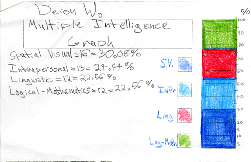
I tried to impress on them the need to make this a bit more scientific. How would we make a stacked bar from hard data? After some consultation with colossal T.A. Katy I figured the best scientific analog to my deeply-unscientific, pretty-circle shtick was Gardner’s Multiple Intelligences Test.

I printed out copies. It’s short. We all took ’em. We talked about what the intelligences meant. (No one knew what “intrapersonal” meant, just for example.) Whenever possible, ask them what they scored on something or what they think about something. That frictional release is 90% of my class management right there.For those still keeping track, my class management breaks down 90% standing at the door and 90% call-and-response. Yes, I teach your children math.

I showed them how to turn their scores โ€“ let’s say a student’s kinesthetic score was 8/26 โ€“ into fractions. My patter would almost always run like this: “If the bar was broken into 26 pieces, this’d be easy. You’d just shade eight of them. But it isn’t. It’s in a package of 100 pieces.” Then I’d show ’em how to set up the proportion.

Stacked Bar Template II (this one has 100 tic marks)It seems almost insane to me now that I didn’t include them at first. My first class, I had them measuring the height of the bar (13 cm.) and figuring that into the proportion. Utterly insane. Painful. It was a fun trip, though, after I re-printed the stacked bars with 100 tic marks.
Multiple Intelligences Test for Kids

ID101: Subjective Stacked Bars

or: The Pretty Circle, part two

Objectives:

A pre-algebra class will learn how to design information in stacked bar graphs and pie charts, converting between the two with proportions.

Ten minutes ago:

We had just finished talking about Miss South Carolina, the pretty circle, and all the other circles.

Subjective Stacked Bars:

I asked them to pick the four circles with which they identified most and balance out a stacked bar graph. Both here and with my Graphing Stories lesson I tried to build as much as possible upon their natural intuition for what is right and fair. If you feel like you’re twice as funny as you are smart, then double the funny bar.

This was a very successful introduction to stacked bar graphs and a good follow-up to the pretty circle sermon.

Exclamation often heard:

There isn’t enough room.

I’ll let you take that one from there.

Stacked Bar Template I

Bye Bye

Off to Saint Cloud, MN, for turkey, cranberries, lutefisk, etc., with Gram-Gram, Pop-Pop, my twin sister, and maybe a coupla cousins.

In case any of y’all need a side of dy/dan with your Thanksgiving dinner (or in case any of y’all live outside the States and the fourth Thursday in November ain’t anything to interrupt life over) I’m setting six entries to auto-post over the next few days.

Those six represent some of my strongest lesson planning this year, a fun, challenging, satisfying set spinning around my obsession numero uno: information design.

Hope you enjoy ’em, try ’em out, and criticize often.

Stay safe out there.

Swagga Talk

Alright, I’m an idiot for posting this, a link which is gonna appeal to a slim niche of dy/dan‘s already-niched readership.

Swagga Talk is a track off Cam’ron’s new Public Enemy mixtape. It’s profane, crude, misogynistic โ€“ standard issue Cam’ron โ€“ and, for any language enthusiasts undeterred by those descriptors, totally irresistible.

With assistance from Hell Rell and 40 Cal, Cam’ron rhymes up a comprehensive dissertation of New York’s street slang.

I know you miss us.
We back New York.
You wanna talk like us
here goes some swagga talk.

It’s authoritative. And awesome.

a kilo is a bird
500 grams is a half a wing
Snow cone on my finger
that’s my ring.
Tweeties is yellow diamonds
smurfs is blue diamonds.
Everybody eatin’
that mean the whole crew shinin’.
If you don’t gang bang
that mean you 550 and neutral.

A diamond ring is a “snow cone”!? Oh, man, that’s great.

(NSFW)

Chart Chooser

Juice Analytics dropped a crazy-useful resource on us today. Tell their Chart Chooser how you want to analyze your data (comparisons, distributions, trendlines, or whatever) and it points you toward your best options, some of them familiar (bar charts, line graphs, etc.) and some you’ve never used (waterfalls, quartiles, groupings).

That’s all well and good but better news? They’ve uploaded PowerPoint and Excel templates for each. Even better news: they all look fantastic.

Excuses are quickly drying up for unclear, uncoordinated information design. Grab ’em while you still can.