Darren Kuropatwa:
I’d genuinely appreciate any suggestions you may have about improving this particular slide deck or my approach in general.
I can’t resist that kind of invitation. Tom Woodward recently performed a complete presentation redesign for Alice Mercer but I don’t have that kind of stamina. I have selected, instead, just one slide. Whether Darren agrees with my notes or not, this kind of exercise is supremely useful for anybody looking to nail down her own aesthetic. (ie. How would you handle Darren’s slide?)
Darren’s Slide
My Revisions
Problems I’ll try to solve:
-
There is a lot of text, most of which should be spoken.
-
There is a lot of information, which should be unpacked over several slides. The marginal cost of extra slides is $fr.ee. We’ll use that.
-
There aren’t any visuals, and visuals are what make projectors and presentation software worth the trouble.
First, when I recommend visuals, I am not recommending this:
or this:
I am recommending a real visual. People recognize high-bandwidth, meaningful imagery when they see it and stock photography isn’t that. I am also recommending that Darren speak the text he has on the screen, striking up a conversation between him and his class.
To review the changes so far:
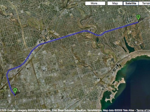
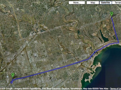
Darren has a visually compelling prompt on his hands (“Which route does Dave take?”) with no visuals. What is the best way to illustrate this? I fired up Google Maps and located Toronto, which is where I assume all Canadians live, and forced two routes from the same location. Take screenshots.
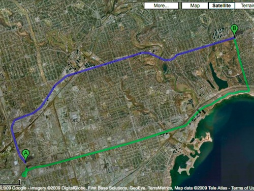
He could put the routes on separate slides or, using some intermediate Photoshop, color-code them on the same slide.
At this point, I’d ask the class to tell me which route Dave should take. Just a guess. No math on the screen. Just a bet. Which is faster? Maybe they know the local topography. Maybe they know the traffic. Maybe they know the two-lane roads. Kids who are timid in mathematical discussions will be emboldened to participate here. They can do this one.
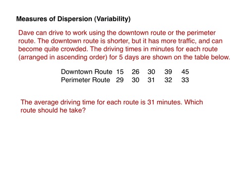
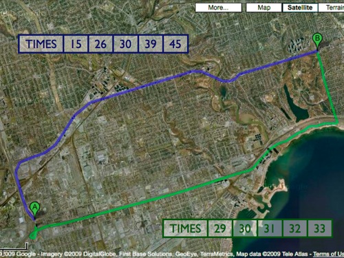
You tell them that Dave drove each route for one work week and timed the trips. You ask them to tell you the best route.
This is where Darren nails it. He knows his students will go straight for mean, which they just learned, but he has forced both means to 31 minutesa fact which Darren tells his students in the text of the problem, a fact which I would withhold and let them discover for themselves. Necessity is the mother of all invention, and they need to see the necessity for measures of dispersion.. This will propel an interesting question, “Okay, so now how do we decide?” Students will mull it over and eventually decide that the blue route is more unpredictable while the green route is more consistent, which will motivate the definition:

Thanks. This sort of exercise helps me define my own aesthetic and reconnects me to what I love about visual literacy in the math classroom so I’m grateful to Darren for his explicit permission to mess with his workPersonally, I think that anytime anybody posts their slides publicly like this, their work should be fair game for reproof, correction, and instruction. Those who think otherwise are squandering the enormous professional development opportunity we have with these blog things..
Photo Credits:
-
Speedster.
-
Mister D.