Apple’s count-up to 25 billion apps struck the same chord for several of us last week. Three of us tried to represent that moment for students with photos and video. I don’t find the question, “Who did a better or worse job?” as interesting as “What were the principles that organized each of our work?”
Mine
[link]
Dan Anderson
[link]
Sean Dardiss
[link]
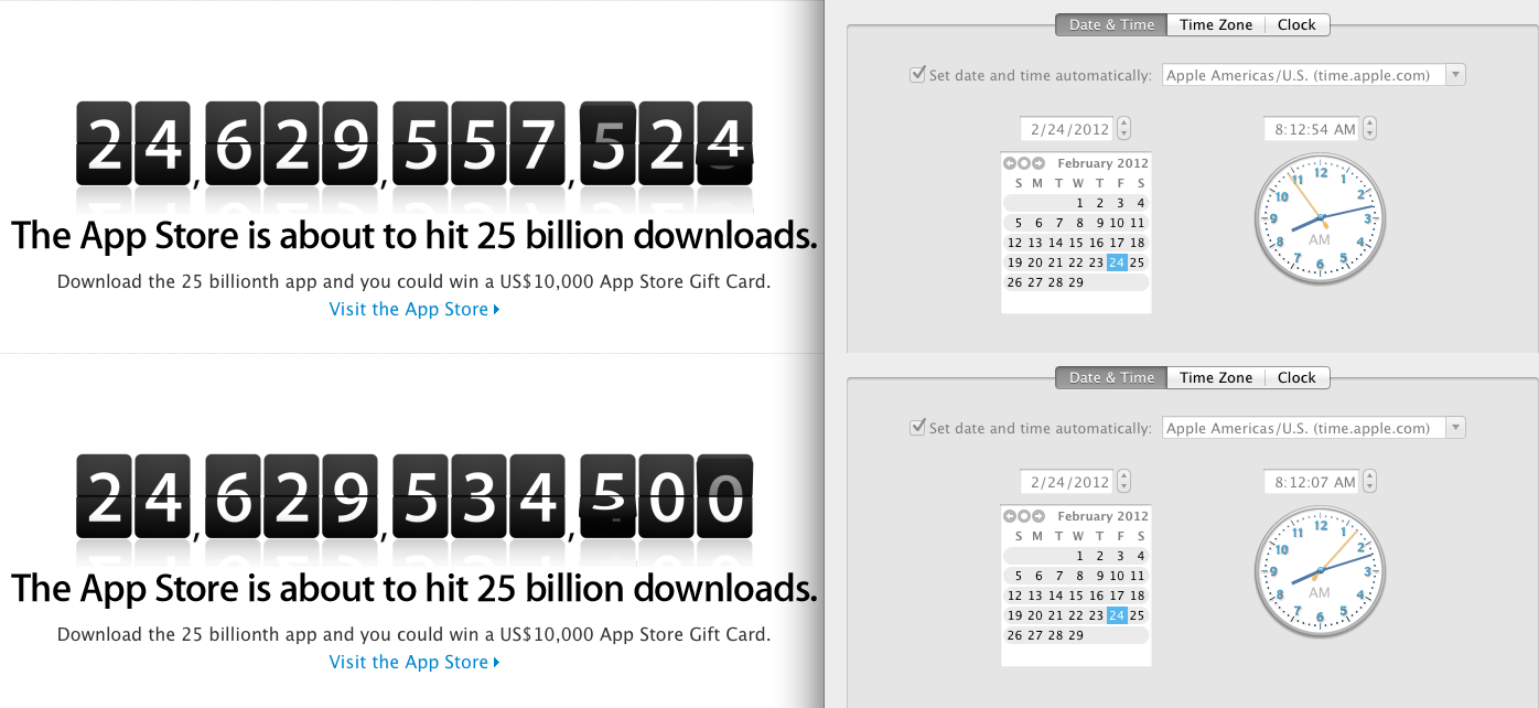
Sean has a timer rolling in the foreground. Dan has superimposed his computer’s clock over the counter. Those design choices interest me. When he first saw the counter, I’m wagering Dan didn’t have his clock open. I’m positive Sean added that timer later in AfterEffects. What were they trying to accomplish with those additions?
A guess? They were trying to make the problem solvable, which is probably the most natural inclination for a math teacher designing a task for a math class.
I want to be explicit about my M.O. here without calling it better or worse than theirs. I’m still trying to figure this out.
- I want to recreate as exactly as possible the moment when Apple’s counter perplexed me, when it dialed the pressure in my head up to eleven and made the question irresistible, “When should I start bombarding the app store with downloads if I want to win $10,000?”
- I want to separate the tools, information, and resources I used to answer that question from the perplexing moment itself.
The first point argues for a recording of the screen just the way it was when I first found the counter. Nothing extra.
The second point argues for postponing – not eliminating – a) data samples, b) a table, c) graphing paper, d) the slope formula, e) a lecture about the point-slope form of a line, etc., until after we’ve settled on a perplexing question that needs those tools, resources, and information.
This is a more accurate representation of how I solved the problem. (I had to decide that a table and a graph would be helpful. I had to decide that a linear equation would be the best model. No one gave me any of that.) It’s also more perplexing to see a problem as it exists in the wild, “posed simply and innocently, not flayed alive by terminology, labels, and notation.”
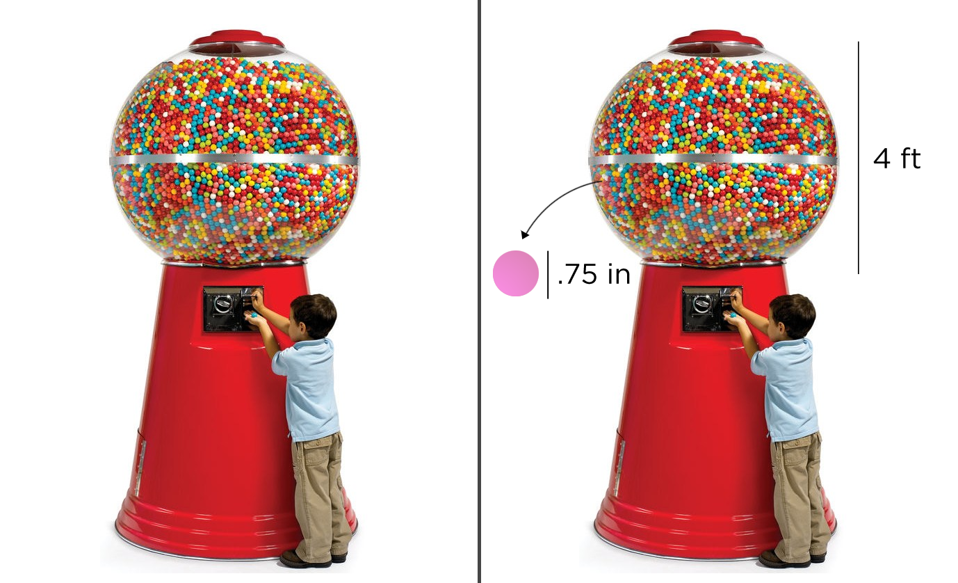
One More Example
I’ve created two visual prompts for the same question, “How many gumballs are in the machine?” (This picture is from Dan Anderson, also.) One version abstracts the problem at the same time that it tries to perplex students. The other postpones that abstraction for just one moment. Both will result in (more or less) the same mathematical analysis. I’m curious which one would perplex students more.
It would be nice to have a website to test out the difference a little more empirically.
Featured Comment
Eric:
I had kids staring at the screen with their iPhones out waiting to download at the beginning of class. It was hilarious. One of the most engaging problems we’ve done all year!