TLDR: Check out Penny Circle, a digital lesson I built with Desmos based on material I had previously developed. Definitely check out the teacher dashboard, which I think is something special.
This is it, the last entry in our summer series of #MakeoverMonday. Thanks for pitching in, everybody.
The Task
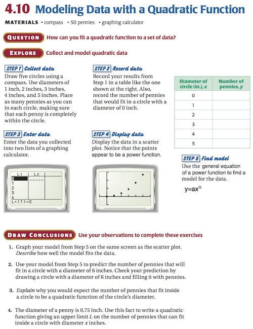
Click for the PDF.
What Desmos And I Did
Lower the literacy demand of the task. The authors rattle off hundreds of words to describe a visual modeling task.
Clarify the point of the task. A great way to lower the literacy demand is to convey the point of the task quickly, concisely, informally, and visually, and then formalize, expand, and verbalize that point as students make sense of it. Here, the point isn’t all that clear and the central question (“How can you fit a quadratic function to a set of data?”) is anything but informal.
Add intellectual need. The task poses modeling as its own end rather than a means to an end. Models are useful tools for lots of reasons. Their algebraic form sometimes tells us interesting things about what we’re modeling (like when we learn the average speed of a commercial aircraft in Air Travel by modeling timetable data). Models also let us predict data we can’t (or don’t want to) collect. We need to target one of those reasons.
The most concrete, intellectually needy question, the one we’re going to pin the entire task on, pops its head up 80% of the way down the page, in question #2, and even then it needs our help.
Lower the floor on the task. We’re going to delay a lot of these abstractions — tables, graphs, and formulas — until after students know the point of the task. We’re going to add intuition also and ask for some guesses.
Motivate the different abstractions. The task bounces the student from a table to a graph to a power function in five steps without a word at any point to describe why one abstraction is more useful than another. Students need to understand those differences. A table is great because it lets us forget about the physical pennies. A graph is great because it shows us the shape of the model. And the algebraic function is great because it lets us compute. If those advantages aren’t clear to students then they’re only moving between abstractions because grownups told them to.
Show the answer. We tell students that math models their world. We should prove it. The textbook does great work here, asking students in question #2 to “check your prediction by drawing a circle with a diameter of 6 inches and filling it with pennies.” Good move. But students have already drawn and filled circles with 1, 2, 3, 4, and 5-inch diameters. I’m guessing they would rather draw and fill a 6-inch circle than do all that math. The circles need to get huge to make the mathematics worth their while.
So here’s our new central question: how many pennies will fill a really big circle? We’re going to pose that question by showing someone filling a smaller circle, then cutting to the same person starting to fill a larger circle. It’ll be a video. It’ll take less than thirty seconds and zero words. It’ll look like this:
We’ll ask students to commit to a guess. We’ll ask for a number they know is too high, and too low, asking them early on to establish boundaries on a “reasonable” answer. The digital, networked platform here lets us quickly aggregate everybody’s guesses, pulling out the highs, lows, and the average.
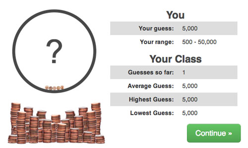
Then we’ll talk about the process of modeling, of looking at little instances of a pattern to predict a larger instance. We’ll have them gather those little instances on their computers, drawing circles and filling them.
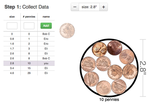
Those instances will be collected in a table which will then be aggregated across the entire class creating, a large, very useful set of data.
(Aside: of course a big question here is “should students be collecting that data live, on their desks, with real pennies?” Let’s not be simple about this. There are pros and cons and I think reasonable people can disagree. For my part, the pennies and circles are basically a two-dimensional experience anyway so we don’t lose a lot moving to a two-dimensional computer screen and we gain a much easier lesson implementation. However, if we were modeling the circumference of a balloon versus the breaths it took to blow it up, I wouldn’t want students pressing a “breathe” button in an online simulator. We’d lose a lot there.)
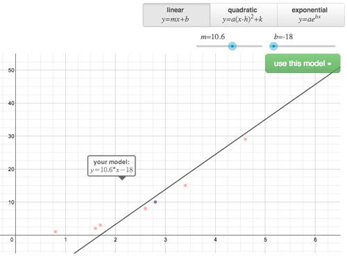
Next we’ll give students a chance to choose a model for the data, whereas the textbook task explicitly tells you to use a quadratic. (Selecting between linear, quadratic, and exponential models is work the CCSS specifically asks students to do.) So we’ll let students see that linears are kind of worthless. Sure a lot of students will choose a quadratic because we’re in the quadratics chapter, but something pretty fun happened when we piloted this task with a Bay Area math department: the entire department chose an exponential model.
Eric Berger, the CTO at Desmos, suspected that people decide between these models by asking themselves a series of yes-or-no questions. Are the data in a straight line? If yes, then choose a linear model. If not, do they curve up on one side of the graph (choose an exponential) or both sides of the graph (choose a quadratic)? That decision tree makes a lot of sense. But the domain here is only positive circle diameters so we don’t see the graph curve on both sides.
Interesting, right?
All this is to say, if you’re a little less helpful here, if you don’t gift-wrap answers like it’s math Christmas, students will show off some very interesting mathematical ideas for you to work with.
Once a student has selected a model, we’ll show her its implications. The exponential model will tell you the big circle holds millions of pennies. We’ll remind the student this is outside her own definition of “reasonable.” She can change or finish.
We’ll show the answer and ask some follow-up questions.
What We Didn’t Do
Change the context. It’s a totally fair point that packing pennies in a circle is a fairly pointless activity, one with no real vocational value. When I pose this task to teachers as an opportunity for task revision, they’ll often suggest changing the context from pennies and circles to a) pepperoni slices and pizza dough or b) cupcakes and circular platters or c) Oreos and circular plates, basically running a find-and-replace on the task, swapping one context for another.
I don’t think that does nothing but I don’t think it does a lot either. It’s adding a coat of varnish to a rotting shed. You’re still left with all the other issues I called out above.
We’ll talk about the teacher dashboard next.
What You Did