Category: 3acts

Total 60 Posts

[3ACTS] Bucky the Badger

W. Stephen Wilson:

The ability to communicate is not essential to understanding mathematics.

The Common Core State Standards for Mathematical Practice:

[Mathematically proficient students] are able to analyze situations by breaking them into cases, and can recognize and use counterexamples. They justify their conclusions, communicate them to others, and respond to the arguments of others.

Feel free to jump straight to the task page.

The jist, if you aren’t the movie-watching type, is that whenever Wisconsin’s football team scores, their mascot has to do push-ups equivalent to Wisconsin’s total score. This screen grab is a useful talking point.

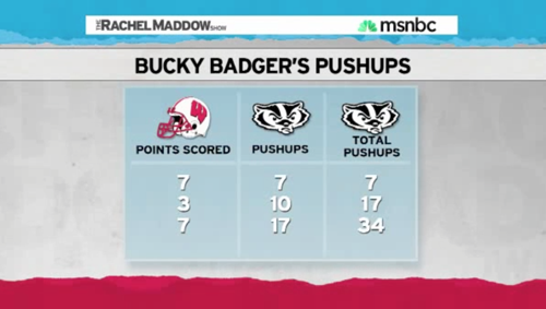
Play the first act, which ends after Maddow announces the final score of the Wisconsin-Indiana game: 83-20. “83 POINTS!

Ask your students to write down a guess. “How many push-ups do you think Bucky did over the entire game?” Ask them to write down a number they think is too high and too low.

Here’s where it gets interesting. Ask them to write down all the information they’ll need to figure out the answer. That question is controversial even among math teachers at workshops I facilitate. Some argue that all you need to know is that Wisconsin scored eleven touchdowns and two field goals. Others argue that you also need to know the order of those touchdowns and field goals. In W. Stephen Wilson’s ideal math classroom, we’re stuck. Communication is inessential to Wilson’s ideal math classroom but communication is essential to any resolution of this dispute.

The mathematical practice standards require an argument. Both sides aren’t right. How will one side persuade the other? At this point, we learn a useful technique for arguing mathematically. One side has said, “Order never matters.” All we need to sink that rule is a single counterexample. One person suggests trying [7, 7, 3] and then [7, 3, 7] – the same scores in different sequence. Another suggests an even less costly test of [7, 3] and [3, 7]. And the matter is settled.

Having established that order matters, another question then arises: “If you’re Bucky, when do you want your team to score its field goals – at the end of the game or the beginning?”

Sidenote #1: Paper Wrecks This Problem

Paper is non-neutral. It changes the student’s task. NCTM posted a similar problem featuring “Push-Up Pete.” [h/t Cathy Campbell, John Scammell]

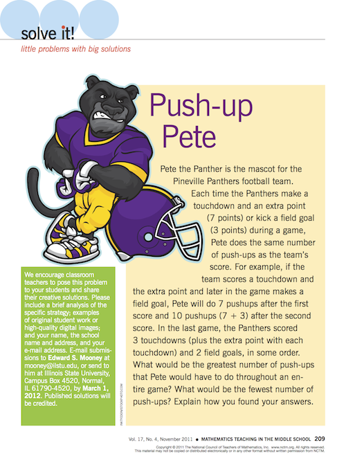
The question that’s rarely asked in print is, “What information will you need?” That information is generally nailed to the floor, written directly on the page. NCTM has revealed in the text of the problem that the order of the scores matters when all the action is in deciding whether or not the order of the scores matters.

Sidenote #2: Opposition To The CCSS Makes For Very Strange Bedfellows

The CCSS aren’t remotely above criticism. It’s bizarre to me, though, how many edtech pundits leapt on that Fordham piece, grateful for any institutional validation of their position against the CCSS. But Wilson and Wurman, the authors, like the punditry’s technological utopianism even less than they do the CCSS. The enemy of your enemy is not your friend.

Featured Comment

Tom:

My best two students disagreed on whether order mattered and I was able to convince (falsely) one of them that order didn’t matter. And sure enough one of my “average” students — who always works her butt off but is rarely rewarded publicly in class for that work — was the only one to figure out and show that order matters.

BREAKING: BLOGGER DESIGNS WEBSITE FOR SHARING NICHE CURRICULUM INTEREST

Let me invite you to check out 101questions, a website I’ve been building since last fall.

Other websites will let you “like” something or call it a “favorite” or “interesting” or give it a thumbs up or a +1. As a teacher, I don’t aspire to any of those things as much I aspire to be perplexing. I want to perplex my students, to put them in a position to wonder a question so intensely they’ll commit to the hard work of getting an answer, whether that’s through modeling, experimenting, reading, taking notes, or listening to an explanation.

A lot of my most perplexing classroom moments have had two elements in common:

  1. A visual. A picture or a (short) video.
  2. A concise question. One that feels natural. One that people can approach first on a gut level, using their intuition.

Let’s call that a first act. There are still two more acts and a lot of work yet to do, but the first act is above and before everything else.

It’s been difficult for me to know in advance whether or not my first acts will perplex my students. Sometimes they confuse my students. Sometimes the warped lens I have on the world indicates something perplexing but it bores my students. For awhile I inoculated myself against that possibility by tossing the photo out to my Twitter followers and asking them “Any questions?

Their responses have been extremely helpful, but limited in some ways that 101questions will fix. I’ll describe those in more detail in another post.

For now, check it out. Ask some questions. Upload a first act. Wait for the questions (or skips) to roll in. Then figure out how you’ll help your students get answers.

I Need A Physics Tutor

I need you to calculate the total time it will take this ceiling fan to come to a stop, and then explain your calculations. I think the keywords are “rotational kinematics” but I’m way out of my depth here. I’ll call this off and post the third act (the answer) when someone gives an answer that’s inside a 10% margin, paired with an explanation. The winner gets the keys to my heart.

Here’s a video that (I hope) will simplify your analysis. [download]

BTW: Let’s get a few guesses in there also. Totally from the gut, informed by experience only. I’m interested to see who gets closer – the analysts or the guessers.

BTW: Don’t hesitate to get your students in on this also.

BTW: Yes, I already gave this a try but I was undone by the fact that I gave both the first and third act in advance which led to a lot of handwaving and glossy explanation.

2011 Mar 9. Frank Noschese gets inside the 10% envelope. His explanation, screencast, and Python script. Here’s the answer video, also.

[3ACTS] March Tasks

I designed two tasks this month:

Some process notes:

  1. It’s a lot to ask someone to click those links and look at a lesson plan. The reader has to decipher the structure of the plan and decode its particular jargon. (ie. “What language does the author use to indicate the point of the task and where on the page can I find it?”) All of that may be necessary at some point in the plan but I’m trying to do my material a favor by isolating what about it is a) most perplexing, b) most visual, c) least verbal, and opening with that. If twenty seconds of video make you curious how many yellow Starbursts are in that huge pile of candy, you’ll be more inclined to wade through my structure and jargon than if I opened with that structure and jargon.
  2. Math tasks imitate life. I imagine math teachers overestimate how often they practically use math in their daily life. It’s easy to say that “math is everywhere,” because it’s true, but most of that math is performed by computer chips that are embedded in everything from your car to your toaster. So whenever you find yourself wielding math like a saber to cut through one of life’s hassles, pull out a camera and capture that moment. Pose the problem to your students as you experienced it.
  3. More where those came from. I’m slowly building up a spreadsheet that lists all these tasks. Something more organized and visually appealing is somewhere in the works, but this will have to do for now.
  4. Behind the scenes. I can’t imagine who’d be interested in the notes I wrote up as I designed these tasks but here are PDFs for Starbursts and Chocolate Milk, for Future Dan if nobody else.

[3ACTS] Joulies

Watch this one minute clip and if you find yourself wondering, “Do Joulies really work?” ask yourself, “What would that kind of temperature graph look like?” and then click on through to the third act of the lesson plan to find out.

A few release notes:

  1. The Goods. My favorite part of the task is how much work the students have to do to translate the inventor’s claims to mathematics. He says, “When coffee is poured into a travel mug with Joulies inside, the coffee cools down to a perfect temperature three times faster than normal. Then, when the coffee would normally cool off, the heat that was captured is released actually keeping your coffee pleasantly warm for twice as long.” ¶ So students have to make an assumption about “perfect temperature.” Is that a range? Is it a single temperature? Then they have to make an assumption about the initial temperature of the liquid and its final temperature. Then they have to create their initial graph. ¶ They get to decide and own all of that. We don’t care. We care about their transformation of their initial graph and whether or not it fits the inventor’s claims.
  2. Formative Assessment. Why did I close the first act video with this frame and not this frame?
  3. The Competition. Sometimes I wonder why we should bother with that level of precision, why we should analyze these videos on a frame-by-frame basis when our competition in the video-based math curriculum space is basically drooling all over itself.
  4. Citation. Marco Arment performed a similar experiment with Joulies. I got the idea to use rocks in the sequel from Jeff Ammons.
  5. Feedback From Pearson. They told me I should consider changing the domain of the temperature graph from six hours to one, because it’s rare to drink the same cup of coffee for six hours, and to be a little kinder to ELL students by using “joulies / no joulies” rather than “joulies / plain.” Other than that, they get what I’m trying to do here and they support it.

Featured Comment

Criticism from Bowen Kerins is one of the big reasons why I bother posting this stuff. Here’s his entire comment:

I think the one-hour timeframe is better than six hours. More importantly, though, you’re running across limitations of video technology by having to make this decision at all.

To me the “best” solution would be to let students decide what their axes limits should be, then see the graph populated. A tablet-PC environment could make this happen. A static video takes this decision out of the hands of students because you’re forced to select this in advance, or to set up a limited number of options. The same is true for the vertical axis – my first reaction to the presentation was “Why does the vertical start at zero degrees Fahrenheit??” And what led to the maximum being 160 degrees?

I’d want students making those choices as well, ideally in an environment where a quick change doesn’t cost them anything. Even when students are asked in advance to create the initial graph, leave the axes totally unlabeled and let them make all the decisions.

I also think this flexibility would lead to students coming to different conclusions about the effectiveness of the Joulies. A one-hour or thirty-minute graph makes it look like the Joulies are doing a pretty good job, while the six-hour graph makes it look like they do nothing most of the time. It could even lead to a cool “how to lie with data” conversation, or at least an important conversation about the nonlinearity of the graph (to meet 8.F.5). Often students think all graphs and functions are linear. The short-term graph of the “no Joulies” seems linear enough… then boom it ain’t!

I’m also a little confused by your student work example – the graphs show that the Joulies version stays in the “perfect” zone for more than twice as long (75 minutes versus 30). So I would not agree with the student’s assessment that they “stay perfect for almost exactly the same amount of time”. The six-hour versus one-hour makes a big difference here, I suppose.

Last, two nitpicks: the video talks of coffee but then presents tea (no big deal but why use tea and not coffee?). And please show me an actual eighth grader with the quality handwriting exhibited in the “student work” ;)