Burying the Lede
Behind the scenes here at dy/dan we’ve been preparing a lesson-by-lesson recap (plus templates plus student samples plus an enormous collection of ‘net resources) of what has been my best unit since the last one.
It’s called Information Design and I’m pretty sure it is the mathematical skill most lacking in our high school graduates.
Not algebra. Not arithmetic. Not trig identities.
They don’t know how to take data and design them. They don’t know which designs (bars, pies, stacks, columns, bubbles, scatters, Sparklines, whatever) work best for a given set of data. They don’t know how to take a chart and form conclusions, evaluate it for bias, or interpret it for others.
They don’t know because no one teaches them outside of Advanced Placement Statistics, a class which is to modern information design what the harpsichord is to the West Coast rap scene.
Exhuming, Dusting Off The Lede
Let me get to it. The following is one of the most scary-awesome information designs I’ve seen in a month. Gives me chills on a glance. Once contextualized, it is a damning indicator of international scandal, of greed, of cybercrime.
[Updated to add: created by Michael Josem of AbsolutePokerCheats.com]
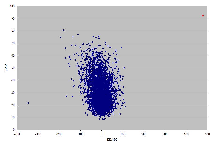
It concerns poker, a game which I only pretend to understand, a game which I only play under extreme coercion or intoxication. But as best as I understand the graph:
Each dot represents a poker player at the online poker supersite Absolute Poker, based out of Costa Rica, specifically the 5000 players who play the most hands.
The vertical axis represents the percentage of hands a player puts money into. A dot at the very top means you play every hand and fold none of them. A dot towards the bottom classifies you as “tight.” You don’t play a hand unless the two hole cards you’re dealt pre-flop are amazing.
The horizontal axis indicates how often you win. To the right you’ve cumulatively won more hands than lost. To the left you’ve lost more hands than won.
Chills again. My ID students and I are gonna burn through class minutes talking about this graph.
For example, where is the worst place to be on the graph? Where is the best? Circle a successful poker player. Circle a losing poker player. How do you know?
And then after all that, we talk about the red dot.
The Red Dot
Do you see it? Top right, playing something like 92% of his hands and winning most of them? That there is Potripper, a poker player who’s been on a tear lately, racking up hundreds of thousands of dollars playing tournaments, playing heads up, playing anyone who’ll give him a game.
He’s also a cheater.
There are other, better places to get the full story on this one. (See the references below.) The important details to my math class are these. Absolute Poker keeps superuser accounts which can see every hole card at the table. Someone within Absolute Poker accessed that account and sat in on every game played by another user, informing that user’s every call, bluff, and raise perfectly, resulting in some extremely wild gambles, gambles like taking a weak hand like king high to the river on a table with plenty of other action, gambles which a sane person would make only if he knew what every person at the table held.
There are methods for keeping such fantastic thievery covert, methods which the thief employed until it became too tempting not to do so.
At which point he started winning too much. Playing too many hands incautiously. Putting money in every pot and walking away with more. His avarice gave a second-place finisher in a recent tournament reason to request the tournament’s hand history, a gazillion-page listing of every hand played.
When you have that much information in your hands, it becomes essential you know how to design it. He and the poker freaks at 2+2 Forums created that gem of an infograph above and ran it through a poker simulator as well which let them watch every hand as if in real time.
The results were extremely indicting. That little red dot there indicates winnings at fifteen standard deviations above the mean. From AbsolutePokerCheats.com:
If any view [sic] is aware of any event in the history of the world that has happened at 15 standard deviations above the mean, please let me know. Our best estimate is that the chances of this happening is somewhat similar to an individual winning a million-to-one lottery six consecutive times.
That red dot is result of one person’s intuition manifested in mathematics. That red dot is the happy place where my enthusiasm for math, design, and technology collide.
References:
-
Absolute Poker Cheats, the most concise collection of facts, charts, and analysis available.
- A factual timeline from 2+2 Forums.
- A speculative timeline from 2+2 Forums.
-
The entire hand history, illustrating the necessity of information design better than anything I’ve written here.
-
The Absolute Poker Cheating Scandal Blown Wide Open, Steven Freaking Levitt.
-
2011 May 17: The Excel spreadsheet of hand histories, forwarded to me by Michael Josem.