Category: information design

Total 51 Posts

ID111: Stacked Bars – Album Covers

I downloaded thirty-or-so old school album covers (like, old school), enough for each member of them class, printed them all out on matte photo paper for $4.50 at a photo boothBumped into some trouble with one printer who cited copyright restrictions. ¶ I tried as pleasantly as I could to explain that what she didn’t know about Fair Use could fill up the Grand Canyon and spill over the sides. Dialogue kinda spiraled down from there. Next I knew some rent-a-cop was ushering me outside. ¶ (Well how would you have handled the situation?), and passed one out to each kid along with a tally sheet.

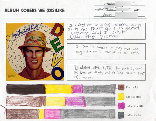
The kid categorized her reaction to her own album cover as one of “Love,” “Like,” “Dislike,” or “Hate.”Hence, old school album covers. I wanted them to react to the design, which everyone could respond to, whereas if they had heard the album, an unbiased, informed opinion would be a tough to ask of every student. The student then wandered from desk to desk, making two marks per album cover. One on her own sheet, which she carried with her, and one on the tally sheet, which stayed at a desk.

Then she got back to her desk and made two stacked bar charts. One for her own design tastes. And one for how well the class regarded her album cover.

I used the same album cover for each of my three algebra periods and had them use the same color legend so the result was a kind-of-slick representation of how the classes differed. (For instance, third period had some extreme reactions to the Devo cover below while the other two periods were more tempered in their enthusiasm.)

Fun questions to ask:

  1. Who loved the most covers?
  2. Who hated the most covers?
  3. Whose cover was the most hated?
  4. Whose cover was the most liked?

Stacked Bar Template I
Album Covers We (Dis)like Handout
The Album Covers We Used (ready for 4×6 printing)

ID107: Stacked Bars – Music Genres

Homework the previous night was to record the genre of the next 25 songs they listened to. I showed ’em how to sort their songs by “Last Played” in iTunes.

They came back the next day and I had them tally up their genres, again, building stacked bars of their music preferences. Everyone used the same color/genre legends and we posted a long strip of music preferences on the back wall.

For reasons I can’t quite recall, I had them come up to my laptop at the front and punch their preferences into a GoogleDocs spreadsheet also. Makes me sound like some School 2.0 badass but I didn’t do anything with it that I can remember.

I did beat it into them over and over again how cool it was we could draw conclusions about our class’ preferences at a quick glance.

Music Analysis Homework
“Music We Like” Wall Poster

ID104: Objective Stacked Bars

I tried to impress on them the need to make this a bit more scientific. How would we make a stacked bar from hard data? After some consultation with colossal T.A. Katy I figured the best scientific analog to my deeply-unscientific, pretty-circle shtick was Gardner’s Multiple Intelligences Test.

I printed out copies. It’s short. We all took ’em. We talked about what the intelligences meant. (No one knew what “intrapersonal” meant, just for example.) Whenever possible, ask them what they scored on something or what they think about something. That frictional release is 90% of my class management right there.For those still keeping track, my class management breaks down 90% standing at the door and 90% call-and-response. Yes, I teach your children math.

I showed them how to turn their scores โ€“ let’s say a student’s kinesthetic score was 8/26 โ€“ into fractions. My patter would almost always run like this: “If the bar was broken into 26 pieces, this’d be easy. You’d just shade eight of them. But it isn’t. It’s in a package of 100 pieces.” Then I’d show ’em how to set up the proportion.

Stacked Bar Template II (this one has 100 tic marks)It seems almost insane to me now that I didn’t include them at first. My first class, I had them measuring the height of the bar (13 cm.) and figuring that into the proportion. Utterly insane. Painful. It was a fun trip, though, after I re-printed the stacked bars with 100 tic marks.
Multiple Intelligences Test for Kids

ID101: Subjective Stacked Bars

or: The Pretty Circle, part two

Objectives:

A pre-algebra class will learn how to design information in stacked bar graphs and pie charts, converting between the two with proportions.

Ten minutes ago:

We had just finished talking about Miss South Carolina, the pretty circle, and all the other circles.

Subjective Stacked Bars:

I asked them to pick the four circles with which they identified most and balance out a stacked bar graph. Both here and with my Graphing Stories lesson I tried to build as much as possible upon their natural intuition for what is right and fair. If you feel like you’re twice as funny as you are smart, then double the funny bar.

This was a very successful introduction to stacked bar graphs and a good follow-up to the pretty circle sermon.

Exclamation often heard:

There isn’t enough room.

I’ll let you take that one from there.

Stacked Bar Template I

Chart Chooser

Juice Analytics dropped a crazy-useful resource on us today. Tell their Chart Chooser how you want to analyze your data (comparisons, distributions, trendlines, or whatever) and it points you toward your best options, some of them familiar (bar charts, line graphs, etc.) and some you’ve never used (waterfalls, quartiles, groupings).

That’s all well and good but better news? They’ve uploaded PowerPoint and Excel templates for each. Even better news: they all look fantastic.

Excuses are quickly drying up for unclear, uncoordinated information design. Grab ’em while you still can.