[BTW: the post-mortem.]
At the start of winter semester, maybe a month ago, I told them they’d have homework every night, even weekends.
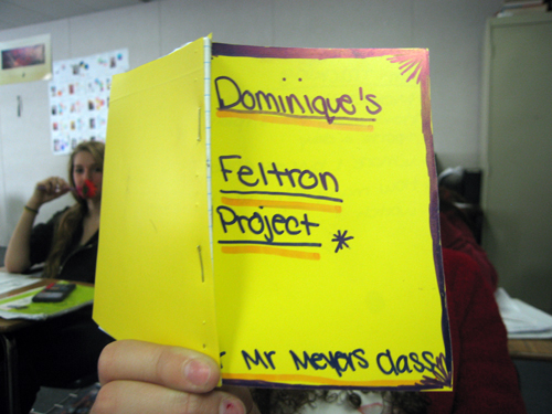
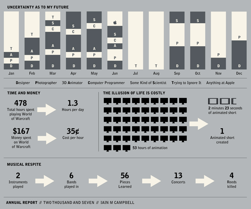
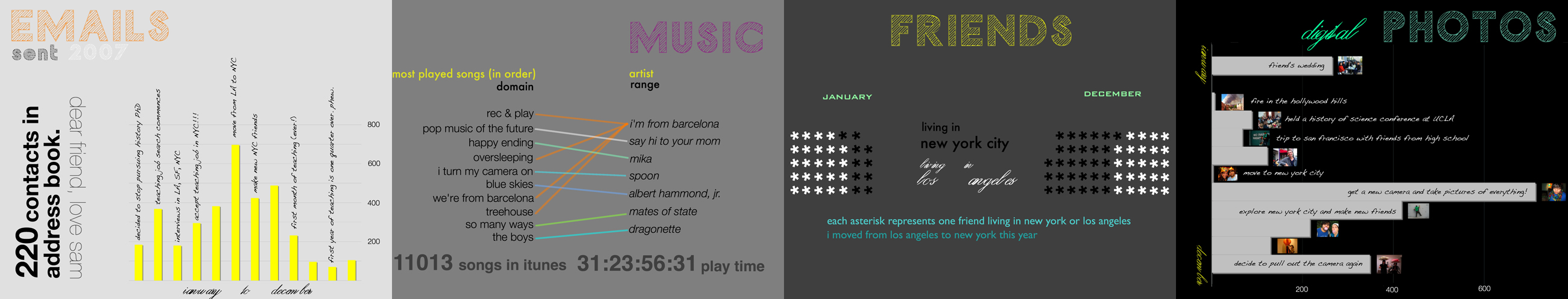
I called it The Feltron Project. I showed ’em mine and asked them to identify the mathematical forms. I told them we were going to take their lives and make math out of them.
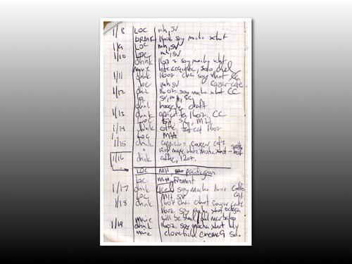
Track Your Life In Four Ways
I told them they had to track four variables this semester. I shared with them my ownAnyone crazy enough to try this with me: it’s essential you play along with your students.:
-
where I’ve been [cities per day]
-
text messages sent / received [quantity per person per day]
-
movies I’ve watched [title per medium (dvd, theater, ipod) per day]
-
coffee drinks i’ve purchased [accessory per drink per location per day]
The Feltron Notebook
While they thought on it, we made Feltron notebooks: graph paper, folded, cut into quarters, and bound with repurposed file folders the last teacher left behind.
I showed them how I designed my own Feltron notebook (Coudal’s Field Notes, natch) to maximize page use.
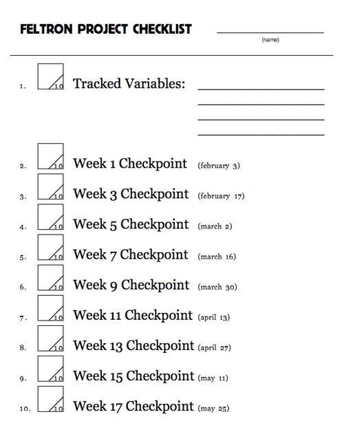
How Do We Grade Your Life?
We discussed grading. What would an A look like? An F? A C? I steered the conversation towards three criteria:
- the interesting-ness of the variables chosen
- their consistent tracking
- their clear & pretty design
We discussed interesting and un-interesting variables. Some students are rocking this thing all semester long, counting calories, tracking everyone they text over a semester, tallying every ounce of everything they drink.
Other students are skating, tracking the number of days they’re late to school, tracking the number of times they sneeze, etc.
We conferenced, each student and I, and I suggested changes, both to add value to their final project and to make the assignment easier for themFor instance, 100 kids decided to track “TV Watched.” “What does that mean?” I’d ask. “Uh.” they’d reply. “So make it min/channel/day or min/show/day, whichever you prefer.”.
Checkpoints
This thing runs on bi-weekly checkpoints [pdf] where I move around the class and verify that everyone’s keeping up.
One Indication This Assignment Wasn’t Stupidly-Conceived
Not one student has taken exception to the workload. Several students, without my prompting, have integrated a notebook update into their daily classroom routine.
The Moment I Fell In Love With The Thing
One freshman decided to track the cigarettes she smoked each day. Not because she wanted to scandalize me or her classmates. She just “always kinda wondered.”
One Month Later
I surveyed 99 students last week: “how much time do you spend updating your Feltron notebook each day?”
The average response was 5.5 minutes with a maximum of 31 minutes and a minimum of 0 minutesNo idea what the minimum’s about..
Next Steps
- I ordered a hard copy of Nicholas Felton’s annual report (to which my assignment pays seeerious homage). We’ll pass pages around and develop a written narrative of his year.
- Then I’ll fabricate entire data sets. eg. some girl’s caffeine intake over the course of a semester. We’ll run through several infodesigns and discuss which ones tell the most effective, truthfulAll better? story. We’ll use other data sets (eg. hours spent studying) to introduce some superficial correlation.
- Uh. That’s all I have.
The Big Questions
- Do we make the graphs in Excel or work out the math by hand? One option gets ’em dirty with the math. One is more useful to their post-grad experience.
- What do I do when a student comes to class a month into the project and claims her dog ate her Feltron notebook? The question, as of first period today, ain’t hypothetical.
The Regret
I should’ve collaborated with someone here. I don’t know another teacher, period, who’s out there sweating the connection between language and math like I am here which makes The Feltron Project something of a blind jump off the high dive when it ain’t altogether obvious that the pool is filled with water, thumbtacks, or nothing.