Alright, with a week remaining, it’s a two-party fight between Alice Mercer:

and Tom Woodward:
The turnout confirms what I suspected going in: this design challenge is prohibitively challenging. Colossal TA Katy awaits your submissions nevertheless.
Alright, with a week remaining, it’s a two-party fight between Alice Mercer:
and Tom Woodward:
The turnout confirms what I suspected going in: this design challenge is prohibitively challenging. Colossal TA Katy awaits your submissions nevertheless.
Here’s a pdf. Also each image below is very clickable.


I reckon I could drop a few thousand words on either end of the process – either the introspective or the technical – and I probably won’t resist too much in the days to come. Suffice it to say right now, though, that both ends were a lot more challenging and a lot more satisfying than anything I’ve done with design in a long time.
Let’s see your years.
Regarding this new contest, Ken writes:
What if I’m all ‘thinking about design’, but saddled with an inability to convert thought to creation?
Mr. K replies with the implicit mantra of this contest and of my Information Design course:
Don’t do it to win – do it to do it. I suspect the problem isn’t whether you can do it at all, but whether you can do it well enough that you’d feel comfortable showing it to anyone else (much less the world). You’re not going to get to that point if you don’t take the first step.
So throw the data into excel. Have it draw a graph. Decide what you hate about the graph, and fix that. Already you’ll be ahead of 80% of the data presenters out there.
A few founts of information, if it helps get this process moving for you:
[Update: the final contestants & the winners]
The judges are pleased to bring you this blog’s second design contest. May you find this assignment, first and foremost, an opportunity for reflection and self-diagnosis at the end of 2007. The prizes and competition are secondary and incidental. They exist only to push forward the amateur designer who seems most inclined towards professional design.
Instructions
Feel free to use pies, bars, dots, bubbles, sparklines, stacks, or designs of your own construction.
Illustrative Examples
Deadline
Judges
Prize
Legal
How We Got Here
You and your family sent out a Christmas postcard. Jose Vilson blogged his year-end reflection. Corporations and businesses also play your game, issuing annual reports to their shareholders, detailing their rises and falls, quantifying successes and qualifying failures, telling the stories of their fiscal years through pictures, words, and charts.
Nicholas Felton is an individual, a graphic designer, but he takes the corporate route, obsessively tracking his vital statistics throughout the calendar year,
issuing one of the design world’s most bespoke articles at each year’s end.
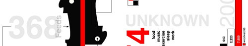
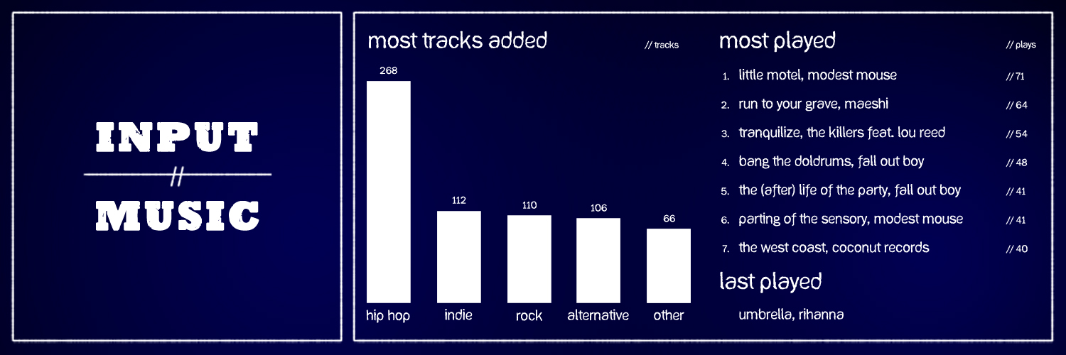
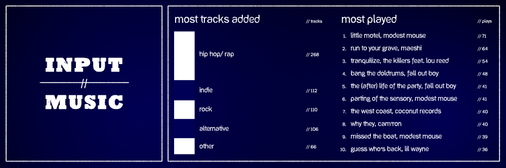
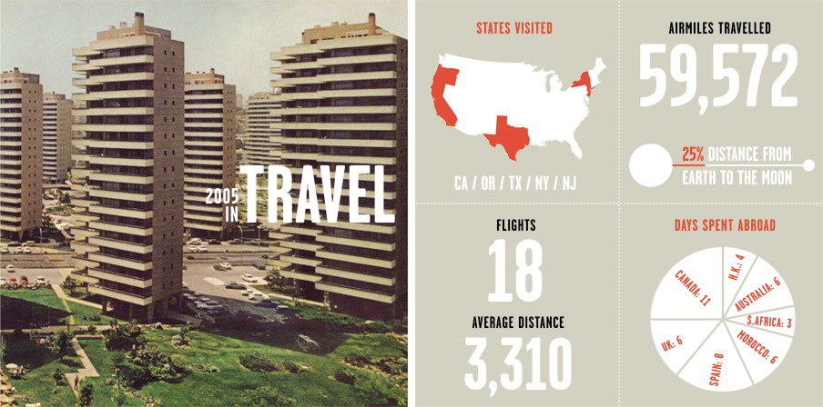
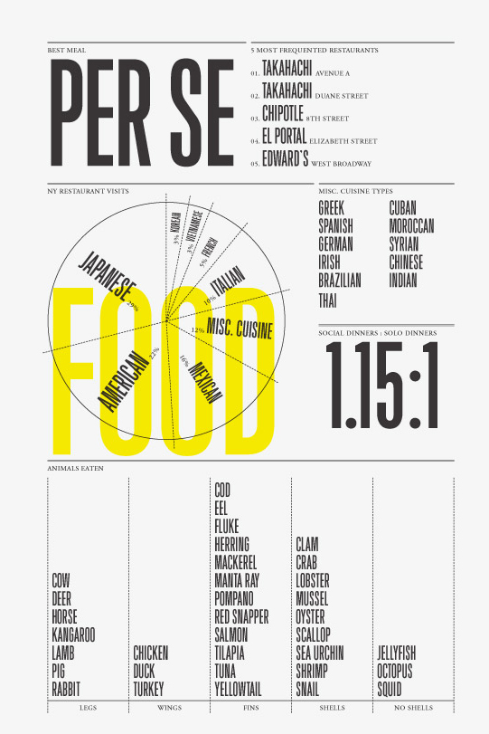
You are a shareholder in his life and flipping through his annual report is not an optional assignment for dy/dan readers. The 2006 edition, for example, includes information design grails such as this page of pie charts, ordered and unordered lists, detailing the food he ate over 2006:
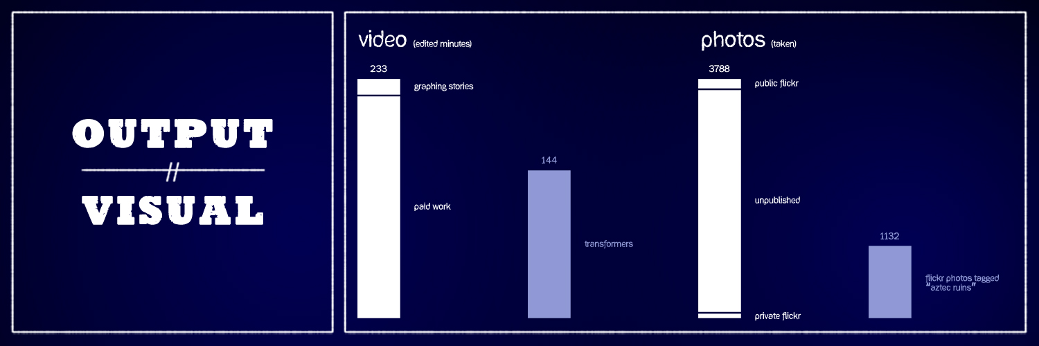
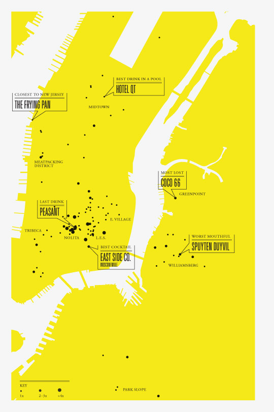
or this scatter plot of drinks he consumed throughout the year:
Nicholas Felton stands alongside Andrew Kuo as a patron saint of my Information Design course. Both make their idiosyncratic preferences and activities accessible to large populations through a) articulate self-reflection and b) precise mathematical structures.
So do you see it? Do you SEE how this brings us all together? Math & Language? Old School & New School? Do you have another math class on your master schedule that’ll spawn as many writers and designers as engineers and statisticians?
All you School 2.0, future of learning, 21st-century educator-types, please, please, come back. I’ve found the flag I can fly for you. This flag. And I need you to get crazy about it with me.