Course Description
Students will learn to take the data barrage and test it against the visual canon – graphs, bars, pies, stacks, and lines. They’ll invent their own visuals, improvising on the classics to deliver information and self-expression in the same package. They’ll visualize data so well and so often that by the end of the course they’ll wear glasses they can’t feel and which others can’t see, glasses of the strongest possible prescription, ones which make truth and untruth so obvious they’ll have to share it.
Illustrative Anecdote
Imagine an unparsed spreadsheet of effectively infinite length. One million monkeys with one million typewriters drinking one million triple-shot lattes couldn’t make this happen in their lifetimes. It’s the FAA’s tracking data on every flight arriving in and departing from the U.S.
Yet force it through just the right visual sieve and patterns emerge. Within the patterns, something true.

Illustrative Quote
Demand for nonroutine analytic skills has increased sharply.
Levy and Murnane’s The New Division of Labor.
Assignment List
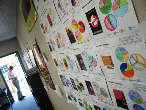
- ID100: Your Annual Report [no link yet, but this year-long assignment is cool enough to keep me teaching at least another year]
- ID101: Subjective Stacked Bars
- ID104: Objective Stacked Bars
- ID107: Stacked Bars – Music Genres
- ID111: Stacked Bars – Album Covers
- ID115: Pie Charts – Movie Posters
- ID120: Stacked Bar / Pie Chart Mash-Up
Suggested Reading
It’s something new everyday. Some of these have made already the rounds:
- The fresh information design of CatalogTree. [via swissmiss]

- An exhaustive list of modern infographic techniques from Smashing Magazine alongside Mashable’s 16 Awesome Data Visualization Tools.

- Anil Dash’s Pixels are the New Pies.

- Gregory Dizzia’s infograph of all his romantic relationships. [maybe a little unsafe for work].

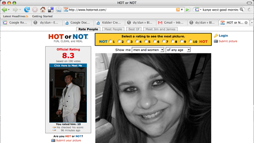
- Proving that information design isn’t just about truth and beauty, that sometimes it’s about a bit of fun, you’ve got Shahee Ilyas’ Flags by Colours and Jessica Hagy’s Indexed. [the first one via Information Aesthetics]

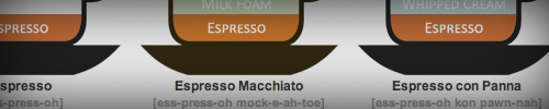
- Lokesh Dhakar’s Illustrated Guide to Coffee Drinks. [previously covered here]
- The New York Times’ Clocking the Candidates. A pie graph illustrating each presidential candidate’s speaking share in the debates.

- Under Consideration’s The Color of Top-Grossing Movies. The poster palettes of box-office hits. Scroll down. Watch the colors transform from cool to fiery as the ratings move from young to restricted. Awesome.

Required Reading
The information designers listed under Suggested Reading do sturdy, innovative work within the present canon of information design. Most take pie charts, Venn diagrams, or dot plots and spin them into something fresh. That’s our first semester benchmark: sturdy work within time-tested forms.
But there’s only one model for where we’re going, only one info designer who communicates and quantifies his personal obsessions through clear, unique design. It ain’t Tufte with his Sparklines. It ain’t Sagmeister neither.
Who Is Andrew Kuo?
I can’t imagine how many wrong turns it’d take for someone from the edubloc to find herself in Andrew Kuo’s neighborhood. He’s a degenerate, a gentleman, a music critic, and a design savant who casts off some of the ‘net’s freshest design work on his generic-themed Blogger blog (ranked somewhere in the 100,000 range) like it’s nothing big.
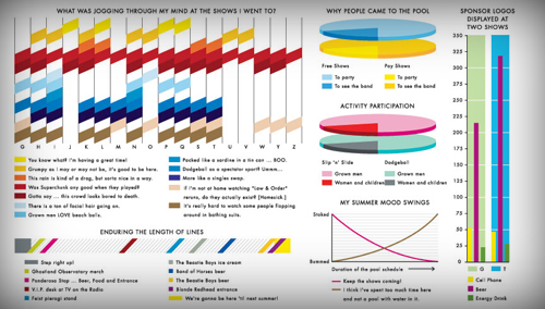
For example, his review of New York’s McCarren Park Pool Music Concert and its accompanying, dizzying infographic:
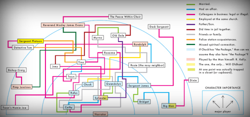
Or consider his character mapping of R. Kelly’s Trapped in the Closet opus, which lives outside the realm of recognizable infographics, but which imposes a preposterous sum of information onto a two-dimensional JPEG:
My students and I will pack lanterns and dried food for a week and go on a spelunking field trip inside his head, seeking out the source of the funniest and most functional infographics the 21st century has seen to date.
The Final Exam
Andrew Kuo is the final exam: take your deeply personal preferences and make them deeply accessible to anyone.
Andrew Kuo is why students will love this course: Information Design is nothing apart from their passions, likes, and dislikes.
Which math class on your master schedule can claim that?