Category: design

Total 257 Posts

Redesigned: Darren Draper

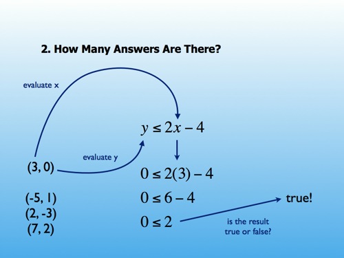
Darren Draper posts a slide for review:

Michelle Baldwin, dissenting from the comments:

In considering Dan Meyer’s arguments, I don’t really agree with him. At all. It’s all about finding the “right” photo to enhance the text.

Is that what presentation is all about? Witty aphorisms and inspiring photos?

You have a thesis. Let’s assume there are very real, really real real-world implications to your thesis. Why not cut to that chase? Why make an abstract matter like edutechnology even more abstract with dramatic photography and 140-character pullquotes from your Twitter feed?

  1. Show me something real.
  2. Give me a space to interact with it.
  3. Let me have your thoughts on it.

In this case, if learning really is social, please show me examples of that social learning. Or show me examples of how dangerous it is when that learning is taken out of a social context. If you find it difficult to connect your thesis to video or screenshots or sound clips (“multimedia,” basically) then it’s possible you are chasing down the wrong thesis or that your thesis doesn’t lend itself to a presentation mediumI caught David Jakes’ Black Coffee presentation on Slideshare last week and was impressed that something like 95% of its 63 slides were screenshots, archival photos, YouTube videos, newspaper clippings, etc., etc. Jakes had done his groundwork..

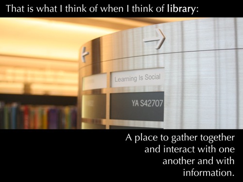
I like that Darren modified the stock photography (adding the “Learning Is Social” placard) to connect it better to his thesis than the average stock photo slide but I wonder if we’re approaching the question, “What is presentation?” along two different vectors.

The Most Dangerous Man In Edublogging

Rhett Allain picks apart the dubious physics of Up, Pixar’s latest kiddie joint:

If you can model the hairs on the head of a man in an animation, donโ€™t you think you could use Newtonian mechanics to plot the position of the GPS? I donโ€™t know, maybe it would have fallen too fast or something. Oh well.

He has graphs and everything.

Slides Then / Slides Now

a/k/a Redesigned: Dan Meyer

Then

Now

Something I have been completely wrong about is the best way to use slide software in a math class. A few years ago I wrote a design series explaining how I use color theory, grid systems, etc., to clarify complex procedures, but the whole thing turns out to be simultaneously a) a lot more fun and b) a lot less time-consuming than that.

My reversal in slide design reflects a shift in my math pedagogy also. Far more important to me now than “developing fluency with complex procedures” is “developing a strong framework for interpreting unfamiliar mathematics and the world.”

I’m not trying to set up a false dichotomy here. We do both. Both are important. But all too often slides like that first one, with the classroom dialogue and solution method predetermined, cordon off classroom dialogue and student reflection onto very narrow paths. That kind of pedagogy does nothing to unify mathematics, tending, instead, to position complex procedures in isolation from each other, which is a very confusing way to learn math and a very laborious way to teach it.

Instead, I want my students to focus without distraction on a) how new questions are similar to old questions, b) how tougher questions demand tougher procedural skills, asking themselves c) which of their older tools can they adapt to these tougher questions?

For example, I put six equations on separate slides, equations we have seen. I asked, “how many answers are there?” One. Two. Zero. Etc.

Then I put up an inequality, tweaking the problem slightly, and quickly.

They told me there were lots of answers. I asked my students to start listing them. “7, 6, 5, 4.2, 4.1, 4,” etc.This became tiresome quickly and made the introduction of a graph โ€“ a picture of all those answers โ€“ clear and necessary.

Slide software makes it easy to sequence these mathematical objects, ordering and re-ordering them to promote contrasts and complements. Slide software lets me sequence these mathematical objects quickly, from anywhere on the globe, from photos and videos I take, from movies my students watch, from textbooks too. Graphic design is useful to mathematics, but I am happy to have discovered certain constraints on that usefulness and, simultaneously, higher fruit hanging elsewhere.

It is the curation of this mathematical media that interests me now, though I reserve the right to return to this space shortly and reverse myself again.

“I’ve Seen Enough,” Cold War Kids

Killer concept and execution on this Cold War Kids video. You can activate/deactivate any instrument at any point in the song and change any musician to any one of four tracks.

I have no objection to loading this thing up after the opener exercises and simply playing with it. If the moment offered itself, though, I wouldn’t mind asking:

  1. If we set all the tracks before the video starts, how many different videos could we watch?Further: the song is 3:10 long. If we started watching all of those videos right now, on what day and at what time would our marathon end?
  2. How many times did each musician have to record the song?

The difference between those two numbers is staggering, worth classroom discussion, a sign of the times, etc.

[BTW: Thanks to Karl Fisch for spotchecking my hyperlink.]

“Let The Beat Build,” Nyle

This is how you make a music video. Watch the video and if the greatness isn’t immediately apparent, I have composed a 2.5-minute explanation.

Click through to view embedded content.