Category: presentation

Total 45 Posts

Notes From Foo

Also: Why WCYDWT?

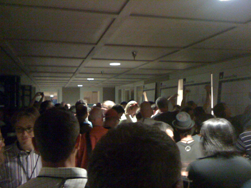
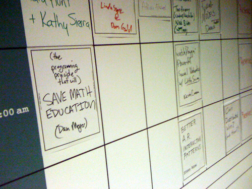
On the first night of Foo Camp, 250 attendees introduced themselves by name, affiliation, and three hashtags, and then descended on a gridded wall-tall conference schedule, scribbling down session titles, selecting venues, folding similar sessions into one another, scheduling roundtable discussions with people they had only met thirty minutes earlier over food.

The crowd was thick so I commandeered a Segway and steered it full-bore into the scrum, scattering people long enough to slide a session onto the closing day’s schedule: The Programming Principle That Will Save Math Education.

That’s three opportunities in three months (counting the webinar I’m conducting in October) that my patrons at O’Reilly have given me to throw a half-baked idea casserole at a bunch of really, really smart people and walk away with something quite a bit tastier.

The debate at an earlier session on the future of education was idealistic and high-minded with participants from all sectors trying to reach consensus (in sixty minutes) on merit pay, standardized testing, class size, unschooling, home schooling, charter schooling, public schooling, and probably several other intractable issues I’m now forgetting. I tried to approach my session, then, from two more assailable angles:

  1. math curriculum, which, for whatever it does right, doesn’t a) put students in any kind of place to apply mathematical reasoning to the world around them, or b) do anything to encourage patience with problems with complicated inputs and messy outputs, which is to say, most problems worth solving. Math curriculum, speaking generally, does the opposite of those two things.
  2. after we develop a model for good math curriculum, we don’t know how to share it.

The outcomes of merit pay and standardized testing will be decided in protracted, gruesome battles between various unions, legislators, and chancellors. The challenge of sharing good math curriculum, however, is one that the people attending my session โ€“ an intimidating array of talent, knowledge, and funding โ€“ could solve over lunch.

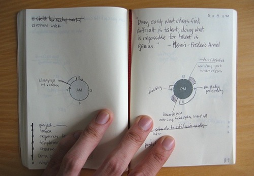
O’Reilly gave a blank notebook to the weekend’s participants. Not lined. Not quad-ruled. Blank. We talked about how you’d only give out lined or quad-ruled paper if you were sure the average attendee wouldn’t want to doodle.

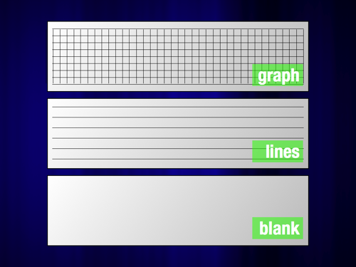
I showed the participants how the Muji chronotebook shuns calendars and hour-blocks, opting instead for the least constrained approach to scheduling possible, a small clock in the middle of the page. This is the rule of least power, the programming principle that can save math education.

I won’t waste space here recapping my session notes. I drew heavily from these six posts:

  1. The Rule of Least Power: An Initial Approach
  2. Why I Don’t Use Your Textbook
  3. WCYDWT: Glassware
  4. WCYDWT: 2008 World Series of Poker
  5. Flight Control / Lesson Plan
  6. BetterLesson Reviewed

But I realized this: I flog WCYDWT media from whatever forum I’m offered not because I think WCYDWT media is the evolutionary pinnacle of math instruction. I do think WCYDWT is leagues better than the curricular norm, particularly compared to the kind of curriculum offered by the largest textbook publishers. More crucially, though, WCYDWT is the best model I know for classroom math instruction that can also leverage Internet distribution. I can use global publishing tools to infect other math teachers with these videos and photos. I can’t do the same thing with netbooks. I can’t do the same thing with physical manipulatives. I don’t know a better model of math instruction that I can also aerosolize so easily.

[Muji notebook photo credit]

OSCON 2009: What Are Your Session Dealbreakers?

The 4:30PM Wednesday slot was packed at OSCON. I’m talking about three sessions I was either “eager” or “very eager” to attend at a conference where 95% of the conference titles were outright inscrutable. (eg. “Sun GlassFish (OpenSolaris) Web Stack – The Next Generation Open Web Infrastructure” โ€“ see what I mean?) One session concerned graphic design. Another risk models. The third session listed as “Antifeatures,” a title which was tough to resist in its own right.

I told myself I’d pick one and sit through the first five minutes. If, at that point, it had met certain criteria, I’d bail on it for one of the other sessions.

If you are loathe to leave a session under any circumstances, consider yourself exempt from this writing prompt. Otherwise, if you value your time and you vote with your feet, how do you judge a session by its first five minutes? Again, it’s possible the session turned into a winner exactly six minutes in. Under these constraints, though, we don’t have the luxury of patience.

I’ll post my own criteria to the comments shortly.

OSCON 2009: My Ignite Presentation

I was constrained by twenty slides at fifteen seconds apiece for a lean five minutes to talk about whateva to a crowd of open source software-types. I talked about a) teaching, b) why my first two years were miserable, c) the difference between teaching math and teaching citizenry, and d) what excites me lately.

[Click through to view embedded content.]

If any other pecha kucha survivors want to commiserate over the format, which required (for me) 400% more rehearsal and 90% less slidework than I’m accustomed to, the comments are all yours.

BTW: A couple of people have asked for a YouTube embed. I tried, but the audio stopped tracking with the video. Here, instead, is a link to a high-quality file.

Redesigned: Darren Draper

Darren Draper posts a slide for review:

Michelle Baldwin, dissenting from the comments:

In considering Dan Meyer’s arguments, I don’t really agree with him. At all. It’s all about finding the “right” photo to enhance the text.

Is that what presentation is all about? Witty aphorisms and inspiring photos?

You have a thesis. Let’s assume there are very real, really real real-world implications to your thesis. Why not cut to that chase? Why make an abstract matter like edutechnology even more abstract with dramatic photography and 140-character pullquotes from your Twitter feed?

  1. Show me something real.
  2. Give me a space to interact with it.
  3. Let me have your thoughts on it.

In this case, if learning really is social, please show me examples of that social learning. Or show me examples of how dangerous it is when that learning is taken out of a social context. If you find it difficult to connect your thesis to video or screenshots or sound clips (“multimedia,” basically) then it’s possible you are chasing down the wrong thesis or that your thesis doesn’t lend itself to a presentation mediumI caught David Jakes’ Black Coffee presentation on Slideshare last week and was impressed that something like 95% of its 63 slides were screenshots, archival photos, YouTube videos, newspaper clippings, etc., etc. Jakes had done his groundwork..

I like that Darren modified the stock photography (adding the “Learning Is Social” placard) to connect it better to his thesis than the average stock photo slide but I wonder if we’re approaching the question, “What is presentation?” along two different vectors.