Category: presentation

Total 45 Posts

Slides Then / Slides Now

a/k/a Redesigned: Dan Meyer

Then

Now

Something I have been completely wrong about is the best way to use slide software in a math class. A few years ago I wrote a design series explaining how I use color theory, grid systems, etc., to clarify complex procedures, but the whole thing turns out to be simultaneously a) a lot more fun and b) a lot less time-consuming than that.

My reversal in slide design reflects a shift in my math pedagogy also. Far more important to me now than “developing fluency with complex procedures” is “developing a strong framework for interpreting unfamiliar mathematics and the world.”

I’m not trying to set up a false dichotomy here. We do both. Both are important. But all too often slides like that first one, with the classroom dialogue and solution method predetermined, cordon off classroom dialogue and student reflection onto very narrow paths. That kind of pedagogy does nothing to unify mathematics, tending, instead, to position complex procedures in isolation from each other, which is a very confusing way to learn math and a very laborious way to teach it.

Instead, I want my students to focus without distraction on a) how new questions are similar to old questions, b) how tougher questions demand tougher procedural skills, asking themselves c) which of their older tools can they adapt to these tougher questions?

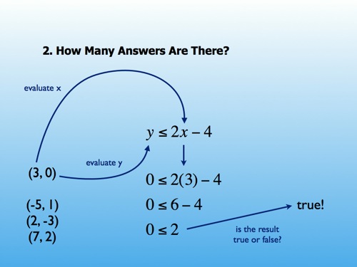
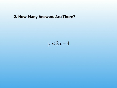
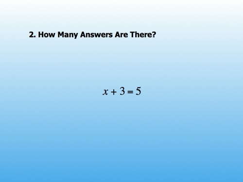
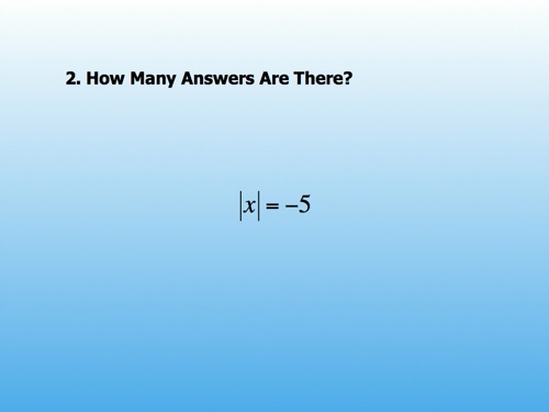
For example, I put six equations on separate slides, equations we have seen. I asked, “how many answers are there?” One. Two. Zero. Etc.

Then I put up an inequality, tweaking the problem slightly, and quickly.

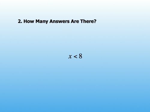
They told me there were lots of answers. I asked my students to start listing them. “7, 6, 5, 4.2, 4.1, 4,” etc.This became tiresome quickly and made the introduction of a graph โ€“ a picture of all those answers โ€“ clear and necessary.

Slide software makes it easy to sequence these mathematical objects, ordering and re-ordering them to promote contrasts and complements. Slide software lets me sequence these mathematical objects quickly, from anywhere on the globe, from photos and videos I take, from movies my students watch, from textbooks too. Graphic design is useful to mathematics, but I am happy to have discovered certain constraints on that usefulness and, simultaneously, higher fruit hanging elsewhere.

It is the curation of this mathematical media that interests me now, though I reserve the right to return to this space shortly and reverse myself again.

Picking Up The Gauntlet

If you read nothing else, my summary judgment on stock photography closes the post.

Tom Woodard

Ten minutes after I threw down the gauntlet Tom Woodward picked it back up and whacked me with it:

Once again, help me make this better. That goes for images, argument, facts – whatever.

My response.

John Pederson

John Pederson, apropos of nothing I wrote, has developed a sudden, sloppy crush on typography, one of the artistic disciplines that hasn’t changed in several centuries, so that’s great. Because if you don’t know how to work with type, Prezi and CoolIris won’t save you.

Darren Draper

Darren Draper posted two variations on the same theme, asking would I really prefer a white background to a stock fast-food worker.


vs.

My answer is no, I prefer the stock photo, though I am glad there are a few other options besides those two. If those were your only options then go with stock photography. But carefully. The trappings of stock photos are a) exaggerated lighting, b) exaggerated framing, and c) exaggerated content, all of which give the content of your slide a lot of competition for attention.

I saw recently, for one example, a frightened kid shot under harsh lights with Scrabble tiles spelling out F-E-A-R censoring his mouth. The accompanying quote concerned Internet filtering or something. The quote was interesting and provocative but completely overwhelmed by the stock photo.

Dean Shareski

Dean perplexes me, saying I’m “stirring up trouble” with my last post. I realize this is just Dean’s usual Canadian bonhomie but, come on. Here is Dean’s commenter, Mark Kowalski. Take it away, Mark:

Even as a teacher, public critique of a personโ€™s work is an odd experience. Maybe our social norms on feedback and politeness have gone too far one way?

If that “one way” is toward norms equating “criticism” with “insensitivity,” then I agree.

Angela Maiers

Angela has linked up a Slideshare presentation and asked for feedback.

Credit where credit is due. Y’all have taken Garr Reynold’s style and run with it for quite some distance. I have two concerns.

First, there are instances when the stock photography is so exaggerated or stylized that it distracts from the purpose of the presentation. In this example, I promise you I am not pondering the consequences of Angela’s quotation. I am scared to death of that toddler. Someone sign that kid to the Lakers but get him away from me.

Second, there are instances when the stock photography Angela has selected a) interprets the quotation for me or b) tips me to Angela’s interpretation when she’d probably rather I develop my own interpretation and add it to the discussion or presentation wiki or whateverTo cite my recent obsession, stock photography can easily be too helpful..

I didn’t mind this next one at all, an understated image that doesn’t constrain audience interpretation. The fact that I’m reduced to judging stock photography on how little it hurts a presentation oughtta concern us, however.

Alice Mercer

Alice has linked up her presentation files and asked for feedback. Take it away, people.

Summary Judgment On Stock Photography

Ditch it. Show me something real, not artificial. Serve the quotation up on a simple background with good typography and then show me some video or a photo or some audio captured naturally, in the wild, that hints at but doesn’t clonk me over the head with your point. And then let’s talk about it.

In Darren’s case, I would look for video of high school dropouts interviewed about their career paths since they left school, including, for the sake of intellectual honesty, some success stories. Find that. Or make that. Embed that. Let’s talk about that. Not about some Google Image or FlickrCC search I could have performed myself.

I realize this is several hundred times harder than typing keywords into a search engine but, as with personal hygiene, you get out of it what you put inMaybe y’all think I’m some sort of crank in these posts. But when someone uses their digital projector to curate and build conversations around interesting media they captured or aggregated themselves you really can’t imagine my enthusiasm..

Just One Example: Stock Photography

It would be interesting to open the floor up for discussion of one of the hottest memes in education presentation: the stock photo / quote combo. They’re inspirational. They’re ominous. They’re ironic. You can find them from the highest-trafficked level of edublogging to the lowest.

We collectively obsess over the tools to create these imagesPhoto source. Quote source. And, incidentally, yes, stock photography adds extra artifice to your image and, consequently, weakens your thesis. (Unless, for example, your thesis is that stock photography adds distracting artifice to a thesis.). We obsess over the technology that lets us publish them globally. Yet, if someone has asked the essential question, “Do these images distract from or enhance our theses,” I haven’t seen it.

I realize that, in the stadium of Essential Skills For Educators, visual literacy sits somewhere up in the mezzanine. There are many more important things to discuss than how best to use an image in the service of a thesis. But it sits much, much closer to the field than any of the publishing tools which depend on and amplify your existing visual literacy.

I’m trying to convey my frustration that you’re somewhere on the order of ten times more likely to find a post in the edublogosphere celebrating SlideRocket or Prezi than you are a post soliciting feedback on your pre-existing visual literacy condition which these presentation apps utterly depend upon.

Want to shut me up? Let me see you not just post the slidedeck of your last education presentation, but the audio also. Next, don’t just tell yourself that you’re open to visual literacy instruction but tell that to your readership explicitly. Ask for feedback. Describe your thesis โ€“ what were you aiming for with those slides? โ€“ and ask for criticism. Ask people to post alternative visual approaches to your own thesis. And then โ€“ because a lot of people equate “criticism” with “hurting someone’s feelings” โ€“ reward their criticism. Thank them.

And then hype whatever new tool lets you publish your slides through Twitter’s API (or whatever) with my blessing.

But first things first.

[photo credit: Francis Yannick De Ocampo]

My Shortest-Ever Post On Presentation

The conversation in my ILC recap has taken a few predictable turns, namely the one where I expect too much of presentations, that I need to lighten up on the presenters. I don’t know how to relax my standards or if that’s even a good idea. I do know how to distill everything I have ever enjoyed about any presentation into two steps. I don’t care what your presentation covers; if you manage these, I will love it.

  1. Unless your presentation is billed as “beginner-level” don’t include information I can easily Google. What I mean is, while I know nothing about Photo Story, it was painful spending seat-time on a tutorial for adding narration to Photo Story, which is Google’s top result for the same query. I can get that anytimeThis was the most dissonant element of ILC. Half the presenters told me not to tell my kids stuff their steroidal smart phones could tell them. The other half were doing the opposite..
  2. Instead, cover the stuff I can’t Google, that stuff that makes your presence worth my district’s money and my time. Here’s an easy outline: a) why Photo Story; what problem were you trying to solve? should I care about that problem? b) what complications did you encounter while implementing Photo Story? how did you overcome them? c) what did you learn?

This particular outline forces you to reckon with audience expectations and puts you in a position to satisfy them. It would have improved fourteen of the eighteen presentationsNone of which were about Photo Story, okay? I attended at ILCThough this outline is useless if you turn your back to the audience and read aloud from a slide titled “What I Learned.”.

ILC 2008

or: My First Ed-Tech Conference
also: My Last Ed-Tech Conference

I’m back now from the Innovative Learning Conference in San Jose, CA. When I first bumped into Alice Mercer, she said, “This doesn’t seem like your kind of thing.” She’s either right, and I’m just the wrong person for ILC, or else ILC should have stepped its game up in a lot of ways. Obviously, I’m biased toward the latter. Either way, I shouldn’t have missed class time for this.

Therefore, a brief preface of ILC’s good stuff and then my best advice for the presenters there. If you’re reading this and you presented at ILC, obviously I’m not talking about you, or your session, etc., and hopefully you all realize by now that I reserve my harshest criticism for myself.

Preface

It was nice meeting Collette, Rushton, Alice, Gail, and some other folks; CUE organized the conference well, with the right number of sessions per day (five) at the right length (an hour, though some presenters didn’t earn ten minutes); the catered lunch was fine, just fine.

That Said

In order to earn one seat-hour from a few dozen people, your presentation needs either:

  • a compelling personality behind it;
  • expertise, the sort of expertise DFW wrote about, the kind that has such a tight conceptual grasp, it can explain itself from any side, from any angle, from a macro- or microscopic lens;
  • a compelling narrative, something with an antagonist, with obstacles to overcome, even if they’re just stubborn network administrators; this is why I pinned my talk on math methods (back in the day) to a fictional student and gave her a photo;
  • illustrative, complementary visuals; video, PowerPoint, handouts, makes no difference to me so long as they’re pretty and useful;
  • empathy for audience expectations, the sort of clairvoyance where you know what your audience is wondering, what it’s waiting to see.

Fourteen of eighteen presentations I attended couldn’t manage one of those.

There was the usual PowerPoint plague, presenters standing for thirteen minutes stock-still in front of a bulleted slide, that flat text often describing a highly visual conceptThere is no excuse for describing student video production with text bullets. Show video!, those bullet points often disregarding basic mechanical Englishie. If you’re going to shame yourself with bullet points, they should read (eg.) “Noun; Noun; Noun; Noun” not (eg.) “Noun; Noun; Noun; Past-Tense Verb.”.

As a guy who teaches compulsory Algebra to kids who have hated Algebra, I don’t see how fourteen presenters managed to blow a scenario where an audience volunteered to attend their sessions. Where the audience is interested in the session (provided the presenter didn’t falsely bill it). Where the audience is pulling for the presenter. Where the audience is eager to be dazzled, fed, or inspired.

ILC was like walking into eighteen car dealerships, pockets bulging with cash, declaring to every salesperson, “I’m here to buy,” and discovering that fourteen of them couldn’t close the sale.

Equivocations

I don’t mean to be overly particular but what I saw this weekend was visual- and verbal illiteracy at a high level. I saw fourteen educated professionals put styrofoam on a plate, convinced it was steak. I want no part in that sorry transaction. I want to produce and consume the best I can while I still can.

I’m speaking at CMC-North in Monterey this December on how not to ruin entire classes with visual illiteracy. I realize it’ll serve me right to have some punk kid out there in the audience, snarking about me on his blog and on Twitter.

All I can do is hold myself to this same standard.

Promoting Quality

If you’re cool with some profanity and if you’re even a little invested in the state of online gaming, check out this presentation from NY Tech Meet-Up. It did more to inspire, educate, and illustrate in five minutes and change than did the median presentation at ILC 2008.


NY Tech Meetup Presentation from Charles Forman on Vimeo.