Category: lessons

Total 93 Posts

Linear Fun #1: Air Travel

We’re deep into linears

We’ve established “rate” as “something per one something” and the y-intercept as our initial condition, all without using the terms “slope” or “y-intercept” or the variables “y” or “x.”… or Graphing Stories, for that matter, which at the time seemed like the quintessential introduction to linears, dammit. I can’t decide if I hate or love this part of my job.

Maybe you frown at that kind of corner cutting but a) you have no idea how gradually you’ve gotta introduce those abstractions at the level I teach, and b) that’s why I don’t read your blog.

So watch as I take my kids through this tech-drenched project-based assignment. Squint through crossed eyes and I might look like someone you’d see at NECC.

  1. Set It Up

    If I fly 300 miles out of San Francisco, is the duration of my flight predictable? Is the cost? Would the graphs look predictable or random?

  2. Give Them Laptops

    We have a mobile lab of 15 MacBooks. That’ll do.

  3. Fly Out Of United Airlines

    Send them out of the same airport. (SFO is our local hub.) Have them pick fifteen one-way, non-stop destinations. Ask them if they have any international YouSpace or FaceTube friends they’d like to visit, thereby cementing your digital street cred.

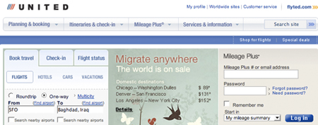
    Baghdad, as many curious students found out, is somewhat inaccessible.

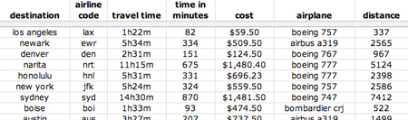
  4. Record Flight Data In Hard Copy

    Have them record:

    • airport codes,
    • departure times,
    • arrival times,
    • flight durationsHave fun explaining why a flight takes off from San Francisco at 9:00 AM, lands in Honolulu at 11:30 AM, and lists a 5.5 hour flight time.,

    and most crucially:

    • distance in miles,
    • time in minutes, and
    • cost in dollars.
  5. PDFs here! Getcher PDFs right he-ah!

  6. Enter Flight Data Into Excel

    If you want to skip past the hard copy step straight to this one, just know you’ll need a continuous two hours.
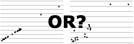
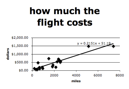
  7. Graph!

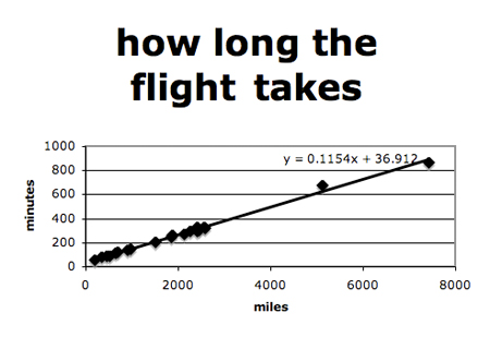
    Marvel a bit at how well Time v. Distance fits a regression line and how terribly Cost v. Distance does.

  8. Discuss
    1. What does the rate mean for each? The plane flies at .11 minutes per mile, roughing out to 545 miles per hour. Each flight costs 22 cents per mile.
    2. What does the initial condition mean for each? This one’s truly fantastic, as you’d expect the initial condition for time to be zero. (A flight of zero miles oughtta last zero minutes.) Instead, that 36.9 minutes is the time the airline builds in for sitting on the deck, waiting to take off. Elsewhere, that $51.19 initial condition is the charge just for stepping onto the plane.
    3. What does it mean if a dot is above / below the line? The flight is longer / shorter than you’d expect for that distance. The flight is costlier / cheaper than you’d expect for that distance.
    4. Why is cost v. distance such a terrible fit? What does cost depend on if not distance? Why, for instance, does a short flight to podunk li’l Eureka, CA, cost more than a flight to LA at double the distance? TFJ pulled the answer to that one outta thin air, eyes darting back and forth, putting it all together in what has gotta be one of the most satisfying moments of my career, a moment in which I was pretty much wholly uninvolved: “There’re only one or two flights to Eureka.”

Renewing My Math Credential

Occasionally I need to reassert myself as a math teacher, on this particular day because I realized Math Bloggers doesn’t include me in their tracker. Look! I am so a math blogger. So here’s what’s good lately:

Don’t Steal Nickels

I run this interlude in every age group. Awhile back some thieves got busted with a lot of nickels. The conversation on this one can’t be beat and eventually wraps itself around the idea that high cash value is great but has to balanced against the weight of a coin.

So you head over to Wikipedia and pick up coin images, then over to the treasury page detailing coin weights and you’re asking questions and taking bets constantly:

  • Which would you steal right now? Knee-jerk reaction.
  • Who’s on the face of a half dollar?
  • Which is the lightest coin?
  • [etc]

Then you have them calculate the ratios and you notice that one fantastic thing about the dime, quarter, and half dollar (consulting Slate if you’ve gotta) and you preface the whole thing with, “Let’s become smarter thieves.” Riveting.

Pick’s Theorem

Pick’s Theorem calculates the area of irregular, weird shapes using a grid for reference. I realized as the class bell rang I was only using boring irregular shapes (quadrilaterals that didn’t shake down into the usual categories) so I ran online, searched up Google Images for a fossilized footprint, put one dot down, and then copied-and-pasted-and-distributed-space-evenly the hell out of it until I had the picture above. All in a coupla minutes.

No image credit. I suck at that.

Fabulous Opener Numero Uno

Cherish the openers which a) span but one question, b) inspire fifteen minutes of sturdy work & discussion, c) incorporate real-world visuals, and e) play off their self-regard as savvy consumers.

Fabulous Opener Numero Dos

Those scamps took this one farther than even I wanted to, talking about subtracting the door’s and the window’s area from the surface area of each room, etc., etc.

Also, the third question didn’t show prices until I advanced the slide, so for a few seconds, we all argued violently over nothing more than carpet swatches, namecalling over color and texture.

Alright:

Well hopefully that settles that. I’ll see you all in a year or so.

The Feltron Project

[BTW: the post-mortem.]

At the start of winter semester, maybe a month ago, I told them they’d have homework every night, even weekends.

I called it The Feltron Project. I showed ’em mine and asked them to identify the mathematical forms. I told them we were going to take their lives and make math out of them.

Track Your Life In Four Ways

I told them they had to track four variables this semester. I shared with them my ownAnyone crazy enough to try this with me: it’s essential you play along with your students.:

  • where I’ve been [cities per day]
  • text messages sent / received [quantity per person per day]
  • movies I’ve watched [title per medium (dvd, theater, ipod) per day]
  • coffee drinks i’ve purchased [accessory per drink per location per day]

The Feltron Notebook

While they thought on it, we made Feltron notebooks: graph paper, folded, cut into quarters, and bound with repurposed file folders the last teacher left behind.

I showed them how I designed my own Feltron notebook (Coudal’s Field Notes, natch) to maximize page use.

How Do We Grade Your Life?

We discussed grading. What would an A look like? An F? A C? I steered the conversation towards three criteria:

  • the interesting-ness of the variables chosen
  • their consistent tracking
  • their clear & pretty design

We discussed interesting and un-interesting variables. Some students are rocking this thing all semester long, counting calories, tracking everyone they text over a semester, tallying every ounce of everything they drink.

Other students are skating, tracking the number of days they’re late to school, tracking the number of times they sneeze, etc.

We conferenced, each student and I, and I suggested changes, both to add value to their final project and to make the assignment easier for themFor instance, 100 kids decided to track “TV Watched.” “What does that mean?” I’d ask. “Uh.” they’d reply. “So make it min/channel/day or min/show/day, whichever you prefer.”.

Checkpoints

This thing runs on bi-weekly checkpoints [pdf] where I move around the class and verify that everyone’s keeping up.

One Indication This Assignment Wasn’t Stupidly-Conceived

Not one student has taken exception to the workload. Several students, without my prompting, have integrated a notebook update into their daily classroom routine.

The Moment I Fell In Love With The Thing

One freshman decided to track the cigarettes she smoked each day. Not because she wanted to scandalize me or her classmates. She just “always kinda wondered.”

One Month Later

I surveyed 99 students last week: “how much time do you spend updating your Feltron notebook each day?”

The average response was 5.5 minutes with a maximum of 31 minutes and a minimum of 0 minutesNo idea what the minimum’s about..

Next Steps

  • I ordered a hard copy of Nicholas Felton’s annual report (to which my assignment pays seeerious homage). We’ll pass pages around and develop a written narrative of his year.
  • Then I’ll fabricate entire data sets. eg. some girl’s caffeine intake over the course of a semester. We’ll run through several infodesigns and discuss which ones tell the most effective, truthfulAll better? story. We’ll use other data sets (eg. hours spent studying) to introduce some superficial correlation.
  • Uh. That’s all I have.

The Big Questions

  • Do we make the graphs in Excel or work out the math by hand? One option gets ’em dirty with the math. One is more useful to their post-grad experience.
  • What do I do when a student comes to class a month into the project and claims her dog ate her Feltron notebook? The question, as of first period today, ain’t hypothetical.

The Regret

I should’ve collaborated with someone here. I don’t know another teacher, period, who’s out there sweating the connection between language and math like I am here which makes The Feltron Project something of a blind jump off the high dive when it ain’t altogether obvious that the pool is filled with water, thumbtacks, or nothing.

Be The Molotov Cocktail

TMAO loosens the knot on his bag of tricks, detailing some strategies for turning not-readers into readers. He inspires commenter, math teacher, and dy/dan blogroller, H., to turn in her math credential:

Glorious. Makes you want to convert to teaching English so you can read the Onion in class. I’ll pass it on.

At the end of a strong list he writes:

These things take time — time to plan, time to gather realia, time out of lessons and periods that we sometimes feel is slipping away, time when either folks who don’t get it or our own internal clocks yell at us to get on with it already. This time is more than paid back in increased student interest and understanding, more than paid back when kids start getting far more out of text than before.

Which is absolutely true. There is no substitute for imaginative, thoughtful planning โ€“ no manipulative, no incentive, and no web app that will work as well as when someone sits, agonizes, and finally devises engaging activities for it.

Snowflake Math

[BTW: Mimi Yang’s remix is highly recommended.]

I’m about to give you what I’m convinced are good blueprints even though the house I built off of them today was pretty raggedy.

Here, three days before winter break, I wanted an activity that injected math into something mindless. I thought about snowflakes, you know, how you fold some paper, cut it here and there, and open it up only to discover you’ve recreated The Storming of the Bastille.

So here’s (what I’m convinced is) an awesome exercise in spatial intelligence for you and your students: predict what the snowflake will look like before you open it up.

I’m tempted to leave it there and let you decide how this oughtta shake out, encouraging you to please get back to me and let me know. Because what I did today didn’t have the same loose-limbed energy my best stuff usually does. This was second-rate but maybe we can spin something better out of it โ€“ you and me:

  • I passed out a sheet of standard letter paper and some scissors to each student.
  • I had them square the paper and fold it into fourths โ€“ now a smaller square.
  • I put up a series of slides. Each one asked them to make one cut.
  • They made the cuts and I said, before you open up the snowflake, sketch what you think the snowflake will look like.
  • They sketched it.
  • I walked around, observing, sometimes making comments.
  • They opened it up and checked themselves.

Then, without passing out more paper, we went backwardsWorking backwards from a solution to the problem, incidentally, is the most reliable way to carry your kids a few rungs up Bloom’s Taxonomy..

  • I gave them the result and asked them what cuts had been made to get it.
  • I called up five volunteers to the board to show their solutions, most of which differed only slightly from each other, a fact which offered up some good conversations starting with words like “compare” and “contrast.”

Then I passed out this worksheet, which asked for eight visualizations, the second half doubling in complexity by adding one fold to the snowflake.

Typing all that here at the end of the day, it’s kinda obvious to me that this was too much even for my Geometry sophomoresNine of whom apparently read this thing so, hey, team, no disrespect.. The spatial learners had a blast but I didn’t manage to transcend that division and pull the other intelligences over the wall like my better stuff tends to. This thing lacked a certain scaffolding. In other words, buyer beware.

Attachments: