The Task
What I Did
- Change the context. I’m generally pessimistic about the effect of grafting different real-world contexts onto a task that is rotten at its core. But we have to correct pseudocontext when we see it or students will come to believe that this math thing is a lie. This isn’t the only change we’ll make, though.
- Put students in the shoes of the person who might actually experience this problem. It’s striking to me that the question “Which company should you choose?” only emerges at the end of the problem when that’s probably the first thing someone would wonder when presented with two competing plans.
- Lower the floor on the task. The task starts at a very abstract level with the construction of linear equations and then proceeds down the ladder of abstraction to a very concrete level by asking students to evaluate their plans for 20 hours of Internet use each month. It’s like asking someone to lift less weight the more they exercise. We need to turn that around.
- Raise the ceiling on the task. The task quits too early. We can develop the concept further.
- Provoke an intellectual need for the solution. The finale of the task asks students which plan they’d choose if they used the Internet for 20 hours each month, a question that requires none of the work preceding it. Seriously, you just evaluate both plans for x = 20 and you’re done. We need to provoke some kind of need for creating and graphing a system of equations.
When they come into class ask them to write down any number between 1 and 25. Then show them this flyer (courtesy Frank Noschese):

Tell them, “If you were going to workout for that many months, and all you cared about was cost, which plan should you pick?”
Now they’re doing the concrete step first, the easier evaluation, and we’re setting ourselves up to need a generalization.
As they finish, ask them to come up and write their answer on a number line above their number of months. If students finish quickly, ask them to double check a few of their classmates. Assessment should be fairly straightforward here, after which the board will look something like this:
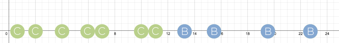
The clumping of answers will be expected for some students but surprising to others. “It seems like there’s a point where the plans switch over.” Finding that point will make linear equations seem like more of a necessity than they do in the original task.
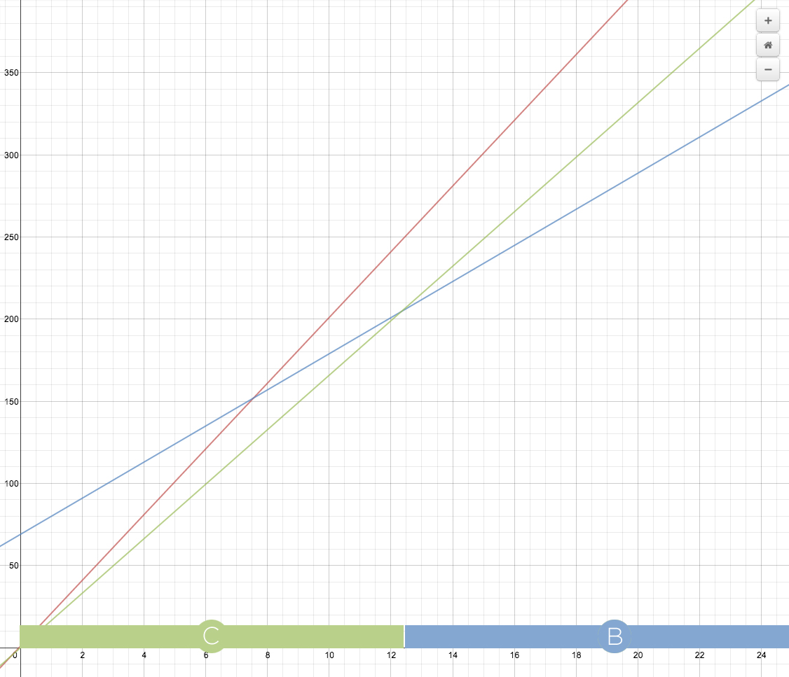
Graphing the equations is the least essential aspect of this task. (What purpose does it serve?) Those graphs become more interesting, however, once we’ve located the switch-over point.
I’ll try to position my students as hired experts for some consumer who needs their expertise. So when they write down “x = 12.3” and circle it, I can say, “Come on, man. They’re never going to understand that. You have to spell it out for them. And tell them why plan A will never be the better deal, also, or they’ll get confused.”
We can extend the task by asking students to come up with two plans that switch over only after two years. Now they’re exercising a little more creativity and working their algorithms in reverse.
What You Did
Over on the blogs:
- Beth Ferguson swaps the context over to smartphones.
- Glenn Waddell makes the task over using a questioning technique called “What-If-Not.”
- Phil Aldridge personalizes the context of the problem.
- Jonathan Claydon lifts 3D coordinates off the printed page and into his classroom space.
Twitter is just the wrong medium for this kind of writing prompt, I’m finding. With only 140 characters, a lot of people default to “less helpful” stances like, “Well I wouldn’t give them anything except the subject of internet cafes and then see where they took it!” But the “unhelpfulness” I’m diagramming here is kind of a lot of work and takes more than 140 characters.
That said, I think Nicholas Chan managed to fit something actionable and important into the tight space:
@ddmeyer Have students first guess which cafe is cheaper for some hours (1, then 10, then 100?)? Change context to 2 different paying jobs?
— NC (@SergtPeppa) July 8, 2013
Call for Submissions
You should play along. I post Monday’s task on Twitter the previous Thursday and collect your thoughts. (Follow me on Twitter.)
If you have a textbook task you’d like us to consider, you can feel free to e-mail it. Include the name of the textbook it came from. Or, if you have a blog, post your own makeover and send me a link. I’ll feature it in my own weekly installment. I’m at dan@mrmeyer.com.
2013 Jul 9. Eric Biederbeck reminds me of Kyle Pearce’s Detention Buy Out lesson, which is a perfectly functional makeover in its own right.
Featured Comments
I think these comments illustrate what’s fun, useful, and difficult about modeling. I respond below.
The equation for plan A doesn’t take into account the possibility of working out “More than 24”³ days in a month
Plan C is a one-time charge of $199 and you get to go for 12 months, right? I think I would graph that as a straight line at y=199 (for 0-12 months) and then a straight line at $398 for 13-24 months.
Note the fine print which says you can’t sign up for less than 12 months on plan A. All three plans also seem to have a $29 maintenance fee per-year and a $10 card fee.
The fitness decision depends a lot on how much value you place on the different add-ons for each plan. These details are harder to quantify and not incorporated into the graphical model (the model stinks).
we only graph them as nice continuous linear equations because it makes our lives easier, but we should really graph them as piecewise linear?
I mean, it’s not like you can pay for pi months (although how awesome would that be?) and so evaluating the equation at pi is not going to give an output that’s meaningful. Maybe that’s the next step for students?


