[See part one.]
Can you help me shuffle my thoughts on teacher data dashboards?
The Current State of Teacher Data Dashboards
Generalizing from my own experience and from my reading, teacher data dashboards seem to suffer in three ways:
-
They confuse easy data with good data. It’s easy to record and report the amount of time a student had a particular webpage open, for instance, but that number isn’t indicative of all that much.
-
They aren’t pedagogically useful. They’ll tell you that a student got a question wrong or that the student spent seven minutes per problem but they won’t tell you why or what to do next beyond “Tell the student to rewind the lecture video and really watch it this time.”
-
They’re overwhelming. If you’ve never managed a classroom with more than 30 students, if you’re a newly-minted-MBA-turned-edtech-startup-CEO for instance, you might have the wrong idea about teachers and the demands on their time and attention. Teaching a classroom full of students isn’t like sitting in front of a Bloomberg terminal with a latte. The same volume of statistics, histograms, and line graphs that might thrill a financial analyst with few other demands on her attention might overwhelm a teacher who’s trying to ensure her students aren’t setting their desks on fire.
If you have examples of dashboards that contradict me here, I’d love to see screenshots.
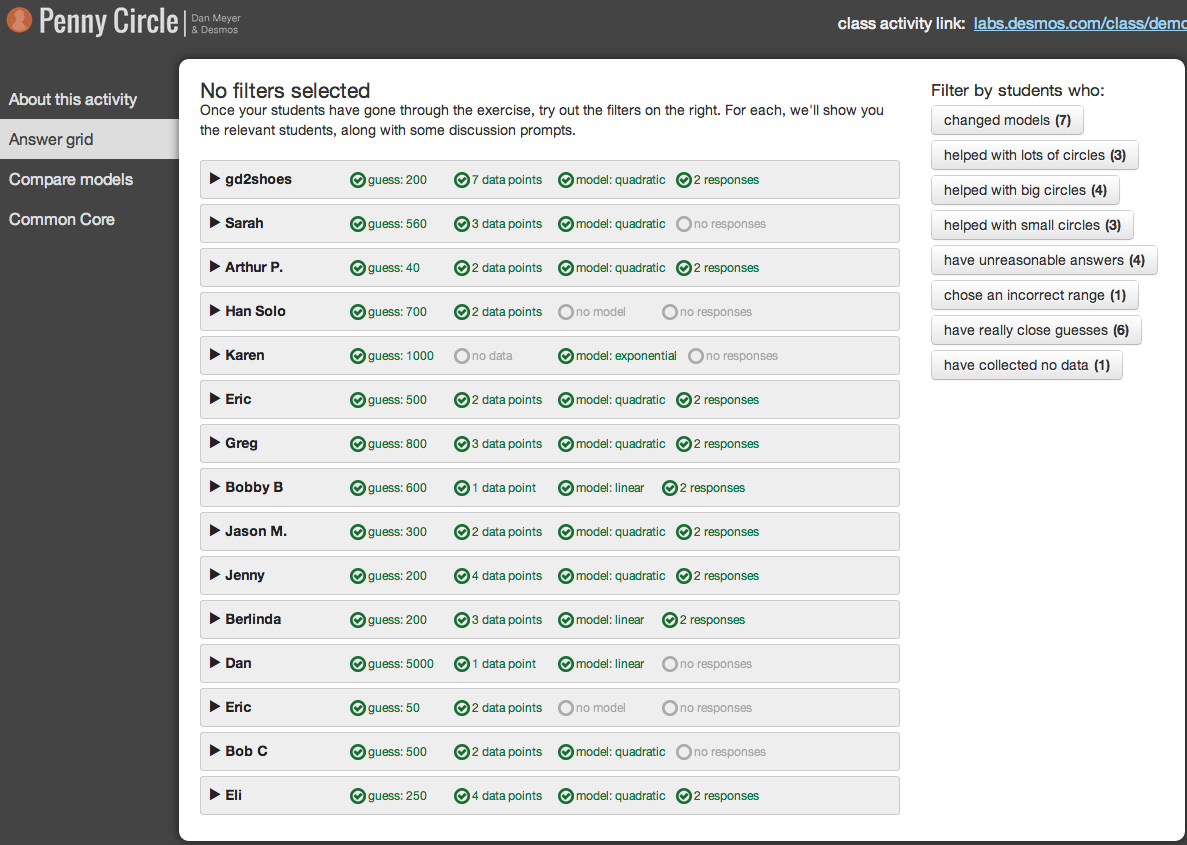
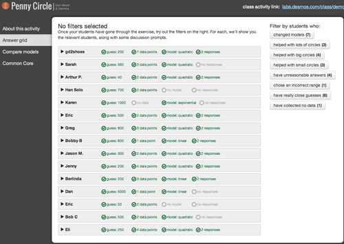
We Tried To Build A Better Data Dashboard
With the teacher dashboard on our pennies lesson, the Desmos team and I tried to fix those three problems.
We attempted to first do no harm.
We probably left some good data on the table, but at no point did we say, “Your student knows how to model with quadratic equations.” That kind of knowledge is really difficult to autograde. We weren’t going to risk assigning a false positive or a false negative to a student, so we left that assessment to the teacher.
We tailored the dashboard to the lesson.
We created filters that will be mostly useless for any other lesson we might design later.
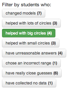
We filtered students in ways we thought would lead to rich teacher-student interactions. For example:
- If a student changed her pennies model (say from a linear to a quadratic or vice versa) we thought that was worth mentioning to a teacher.
- We made it easy to find out which students filled up large circles with pennies and which students found some cheap and easy data by filling up a small circle.
- We made it easy to find out which students had the closest initial guesses.
These filters don’t design themselves. They require an understanding of pedagogy and a willingness to commit developer-hours to material that won’t scale or see significant reuse outside of one lesson. That commitment is really, really uncommon for edtech startups. It’s one reason why the math edublogosphere gets so swoony about Desmos.

Contrast that with filters from Khan Academy, which read, “Struggling,” “Needs Practice,” “Practiced,” “Level One,” “Level Two,” and “Mastered.” Broadly applicable, but generic.
We suggested teacher action.
For each of those filters, we gave teachers a brief suggestion for action. For students who changed models, we suggested teachers ask:
Why did you change your model? Why are you happy with your final choice instead of your first choice?
For students who filled up large circles, we suggested teachers say something like:
A lot of you filled small circles with pennies but these students filled large circles with pennies. That’s harder and it’s super useful to have a wide range of data when we go to fit our model.
For students who filled up small circles, we suggested teachers say something like:
Big data help us come up with a model, but so do small data. A zero-inch circle is really easy to draw and fill with circles so don’t forget to collect it.
Even with this kind of concise, focused development, one teacher, Mike Bosma, still found our dashboard difficult to use in class:
While the students were working, I was mostly circulating around the classroom helping with technology issues (frozen browsers) and also clarifying what need to be done (my students did not read directions very well). I was hoping to be checking the dashboard as students went so I could help those students who were struggling. The data from the dashboard were helpful more so after the period for me. As I stated above, I was very busy during the period managing the technology and keeping students on track so I was not able to engage with what they were doing most of the time.
So we’d like to hear from you. Have you used the pennies task in class? Have you used the dashboard? What works? What doesn’t? What would make a dashboard useful —Â actually usable — for you?
Featured Comments
Tom Woodward, arguing that these platforms are tougher to customize than the usual paper-and-pencil lesson plan:
The other piece I worry about is the relatively unattainable nature of some of the skills needed for building interesting/useful digital content for most teachers. I really want to provision content for teachers and then be able to give them access to changing/building their own content. While many are happy consuming what’s given, there are people who will want to make it their own or it will spark new ideas. I hate the idea that the next step would be out of reach of most of that subset.
And there’s Eric Scholz looking for exactly that kind of customization:
I would add a “bank” of variables at the top of the page that teachers from when building their lesson plan the night before. This would allow for a variety of objectives for the lesson.
Bob Lochel, being helpful:
While many adaptive systems propose to help students along the way, they are often mis-interpreted as summative assessments, through their similarities to traditional grading terms and mechanisms.
Tom Woodward, also being helpful:
There could/should be some value to a dashboard that guides formative synchronous action but it’d have to be really low on cognitive demand.