Category: design

Total 257 Posts

Keynote Camp #1: Vignettes

I realized awhile ago that Keynote is the best tool I own. It’s powerful. It’s simple. It has crashed once in the six years I’ve used it (no exaggeration) even though my file sizes routinely run up to half a gigabyte. I use it for workshops, for keynotes, for classes, for mocking up web pages and web apps.

In Florida and Atlanta, a couple of people asked for some behind-the-scenes details on the presentations themselves. I promised those people I’d explain some of the techniques here.

In this first tutorial, I describe an effect I use frequently to highlight various parts of a slide.

Keynote Camp #1: Vignette from Dan Meyer on Vimeo.

2011 Nov 27. Here’s another application of this technique. I wanted to excerpt some text from Polya’s How to Solve It by moving up and down a page of his book and fading those sentences in and out. If you want to pull apart the Keynote file itself, you can have at it.

2011 Nov 27. And one more application: Endless Lists.

[3ACTS] Some Really Obscure Geometry Problem

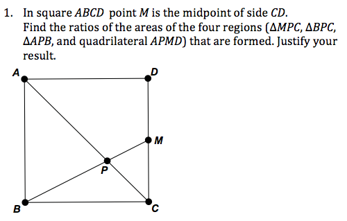
At the NCTM Institute last month, we broke into task groups to discuss reasoning and sensemaking (the conference themes) in content focus groups. I slipped into Geometry a little late and found a seat. The group was discussing approaches to this problem:

This was the session immediately following my keynote and the difference between the tasks I had described and the task they had just finished was stark. Someone asked, “How would we apply Dan Meyer’s approach to this problem?”

I ducked.

It isn’t fair. It’s apples and oranges. Paper is a great medium for a lot of math problems. Paper is a terrible medium for representing how people apply math to the world outside the math classroom. My techniques for one problem type have limited use for the other. My enthusiasm for one problem type shouldn’t be mistaken for a lack of enthusiasm for the other.

That said, I don’t find myself terribly enthusiastic when I think about assigning this problem to Geometry classes I have taught. As a challenge problem or extra credit, sure, but in its current form – with the abstract mathematical language and symbology smacking you right in the face – students are going to wonder, “Who comes up with these problems, seriously?”

If we make a better first act, though, we can engage, I dunno, 17.2% more students without any cost to the math. That’s empirical, friend.

Here’s the redesign:

  1. Show how this new, difficult problem arises from an old, easy problem.
  2. Make an appeal to student intuition.
  3. Introduce abstraction (labels, notation, etc.) only as a necessary part of solving a problem that interests us.

Act One

Some Really Obscure Geometry Problem from Dan Meyer on Vimeo.

  1. Start with a square.
  2. Draw the diagonals of the square.
  3. Ask students to tell you what percent each of those regions is of the whole. This is insultingly easy and that’s the point.
  4. Drag the endpoint of one diagonal halfway down the side of the square.
  5. Ask them, “How about now?”
  6. Ask them to guess the percents again.

Watch the video. Basically, we’re applying pressure to their confidence, which is how I try to approach pure math problems. Start from what they know. Then mess with it in some trivial way (eg. we just dragged the endpoint down a little) that requires math that is anything but trivial.

Act Two

You and your students will begin to find it very difficult to talk about all these different segments and regions without labels. So add them. A recurring point around here is that if you want to disengage a lot of students who might otherwise be engaged in the math, simply start the problem with as much abstraction as possible. If you want to engage those students, don’t introduce that abstraction until students know why they should care about it.

Act Three

You’ve been walking around and taking note of different solution strategies, right? Have students come up and explain those different strategies. Then show use this Geogebra applet to show the percentages changing, in case anyone still needs convincing.

Sequel

The sequels here are really, really great.

Suppose M cuts side CD so that MD = n – CM. What are the ratios of the areas of the four regions?

Send n to infinity and watch the fireworks.

Again, though: print-based media require you to keep everything on the same page – the sequels in the same visual space as the original problem. I realize that math teachers by nature don’t mind that. Do students?

Featured Comment

J Michael Shaughnessy, President of the National Council of Teachers of Mathematics and designer of the problem under discussion in this post:

Not all math problems have to be posed everytime in a a high tech environment. Sure, it’s ‘cooler’ that way, but i completely disagree with your comment on this one, about ‘how the problem was posed.’ It’s only boring in the beholder’s eyes, depends on how it’s pitched to a group.

2011 Aug 29: My response here.

Free Video Timer Hack

When I’m designing digital math tasks, I feel the most ridiculous when I fire up Adobe AfterEffects – a special-effects juggernaut – to lay a simple timer over some footage for the second act.

Print Job – Act Two from Dan Meyer on Vimeo.

Here’s a neat hack if all you have is Keynote or PowerPoint.

  1. Download this video. It’s just a timer that runs to sixty seconds. (Sixty seconds, of course, is the constraint on #anyqs video.)
  2. Drag the video you want to time into Keynote or PowerPoint.
  3. Drag the timer video on top of that video. Resize and reposition it as you like.
  4. Set its animation to start with a click and stop with the next click..

Now when you play your slideshow you just click and the timer starts. Click it again and it stops. One caveat: this timer won’t do you any good if your video is slow or fast. It’s calibrated for 29.97 frames per second, which is what comes off most consumer cameras. Here’s an example of the effect in Keynote:

Timer Tutorial from Dan Meyer on Vimeo.

Drop me a line in the comments if you wind up using this.

BTW: Alternately, you could have your students get their own measurements using their phones for timers. That one’s nice because the answers spread across the measurement error a little bit. Everyone owns a slightly different answer.

BTW: I’ll be traveling over the next three weeks. My intern, Giuseppe, will be posting material for me throughout my absence and I’ll check in with the comments when I’m back.

The Three Acts Of A (Lousy) Mathematical Story

This is one of the most tragic math problems I’ve ever seen. (Click for larger.) Not because it’s awful, though it is, but because the awfulness conceals something amazing. I mean, how great is it that we can drop a rock in a well and the sound of the splash tells us how deep the well is. That’s wizardry!

I find it completely amazing we get to offer that power to our students. If my goal were to conceal that amazingness, though, to ensure my students would be less interested in mathematical wizardry thanks to my efforts, I’m not sure I could do any better than this problem.

Problems

  1. The student experiences act one and act two at the same time. Act one is supposed to hit you in the gut; act two in the head. The only reason your textbook tries to do both at the same time is because printing the same problem on two different pages is logistically impossible. Luckily, you aren’t bound by the same constraints.
  2. The problem starts in the second act. And what a second act. Your students have no idea why they’re wading through that long, thickety paragraph outlining the tools, information, and resources (act two) they’ll need to solve the hook (act one) which shows up long after they’ve stopped caring.
  3. And what a hook. Seriously, could someone please explain to me which interest group or political constituency is served by slurring what should have been concise, obscuring what should have been clear, and jargoning what should have been conversational. Seriously, how would a human phrase that hook? Would a human need twenty-six words?
  4. The act one visual is cheap. Again, we’re dealing with cheap clip art here only because of the constraints on an industry that’s taking on water. Don’t go down with that ship. Can you think of a better visual, one that would make students wonder, “Wow. How deep is that?” without you lifting a finger?
  5. The act three payoff is weak. Imagine all the intensity of the final assault on the Death Star in Star Wars. A planet’s survival hinges on an unimaginably long shot. Luke takes that shot as the clock winds down, a shot right at the guts of the Death Star. What if at that moment we cut to some Rebellion functionary announcing in a slow monotone, “The Rebels were successful. They destroyed the Death Star.” That’s what it’s like to read the answer to a visually compelling problem in the back of the book. Show that thing explode.

Solutions

It turns out that Hollywood occasionally makes math problems for us. Click through and have a look.

  1. Journey to the Center of the Earth (2008)
  2. The Descent

With Brendan Fraser, you get a fun check on your own answer and an explanation of why his team even cares how deep the cave is. With the Descent team, you get a much deeper cave and a stronger separation between the first and second acts. Both represent massive improvements over our status quo.

To be clear, I’m not saying you can just play act one and two and your students will trot merrily to an answer in act three, deriving that thorny equation for projectile motion all on their own while stopping periodically to smell the constructivism flowers. I’m not saying that. This problem is tricky and will likely require lots of help on your part. What I’m saying for sure is that it makes no sense to offer that mountainous paragraph of helpful text without your students knowing (to say nothing of caring) why you’re offering it.

Related: