Category: futuretext

Total 21 Posts

[Makeover] Boat Race

The Task

130715_5lo

This is another task from MathWorks 10.

What Dave Major And I Did

I don’t have any huge beef with this task. I like that students get to pick their own route. Those kind of self-determined moments are tough to come by in math class. Here, the buoys are pre-determined but students get to make their own path around them. So we get the motivation that comes with self-determination but feedback isn’t the chore it would be if students got to choose the placement of the buoys also.

Establish a need for the bearing format. We’re going to take a cue from the research of Harel, et al. Rather than just introducing the bearing format as the next new thing we’re doing in math class, we’ll put students in a position to see why it’s necessary.

Offer an incentive for more practice. We’re going to make it really easy and enticing for students to try different routes, learning more about degree measure and bearings with each new route they try.

Raise the ceiling on the task. Rather than moving along to another context and another question, let’s stay right here in this one and do more.
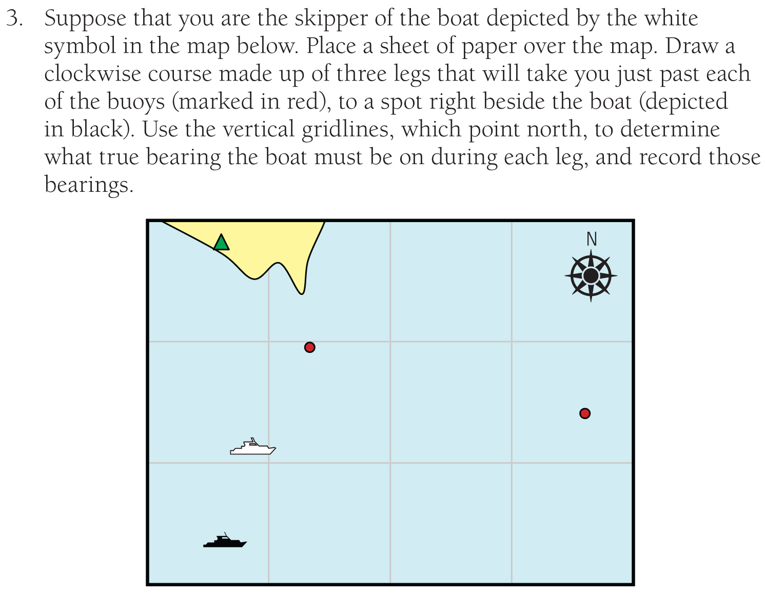
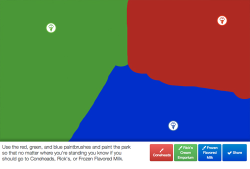
Show this image.

130818_1

Ask students to write down some instructions that tell the boat’s blind skipper how to navigate around the buoys and return to its original position. Don’t let this go on all that long. Whenever we’d like students to learn new vocabulary or notation, it’s useful for them to experience what it’s like to communicate without that vocabulary and notation, if only briefly.

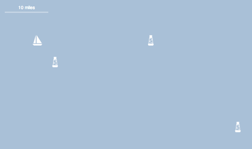
Write the notation “50 miles at 60° South of East” on the board and ask them what they think it means. After some brief theorizing, send them to this website where they can test out their theories.

Then they can create a series of bearings that carry them around the buoys.

130818_3

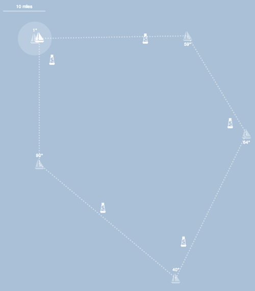
We’ve timed the boat’s path. But this isn’t the kind of timing you find on timed multiplication worksheets that freaks kids out for no discernible benefit. The timer here gives students feedback on their routes. The feedback is also easy to remediate and change. Feel free to try again and do better than your previous time. Or, if you’re feeling competitive, perhaps you want to try for the best time in class. (Or the worst time. That isn’t simple.)

Move on to the next page where we give you a series of bearings and ask you where the boat will come to rest. I find it tough to get inside 10 miles worth of error here.

If we wanted to draw this out even further, we might have:

  • featured multiple courses.
  • let students create their own courses and challenge their classmates.

What You Did

  • Frédéric Ouellet animated the boat in Geogebra. As with the work of a lot of expert Geogebraists, it seems as though the interesting mathematics is in making the animations or the sliders and has been done by the teacher, not the student.
  • L Hodge offers another Geogebra applet, one that puts more of the math onto the student.
  • Lindsay also asks her students to describe the path of the boat without yet knowing the vocabulary.

2013 Aug 21. It strikes me that some useful questions for provoking an understanding of degree measure would include:

  • What do you think “-20° North of East” means? Is there another way to write it?
  • What do you think “120° South of West” means? Is there another way to write it?

[Makeover] Shipping Routes

As the summer winds down and #MakeoverMonday comes to an end, we’re going to crank up the difficulty around here. For the final three makeovers, I’ve commissioned work from some of the best people I know working in math, education, and technology: Dave Major, Evan Weinberg, and the team from Desmos.

The Task

130715_2lo

This task is from McDougal Littell Middle School Math Course 1, 2005. [via Chris Robinson]

What Dave Major & I Did

TLDR: Here’s the 101questions page.

Lower the floor. The task currently jumps straight to the question of calculation. We should head in that direction but start with other interesting, easier questions also.

Enable pattern-matching. I could tell students what to look for here and how to approach the problem. I could show a few worked examples. For example, ones where:

  • one boat’s time is a factor of the other. (eg. 2 seconds and 4 seconds.)
  • the boats’ times are coprime. (eg. 3 seconds and 11 seconds.)
  • the boats’ times have a common factor. (eg. 6 seconds and 10 seconds.)

Two problems there:

  1. Some students will need more than just three examples to determine a pattern.
  2. My selection of those particular examples — that is, my decomposition of the entire solution space into just three categories — did a lot of the intellectual heavy lifting for my students. They need to decide on those three categories and come up with a rule that takes them all into account.

That isn’t to say I’d just “let them figure it out.” If a student just tries the first example and says, “It’s easy. It’s always the longer of the two times.” I can then say, “Great. But try that on several more examples and make sure it works.” (It won’t.) Or I can suggest one of the other two categories. But I’d rather not offer those categories before the student has even considered why she might need them, or even the fact that there are different categories.

Raise the ceiling. Our textbooks need fewer tasks and they need deeper tasks. The second fix would enable the first. Rather than jumping to another arbitrary context for another arbitrary example of cofactors, let’s stay in this context and extend it, developing the concept more for students who are ready for it.

Prove math works. It’s one thing to solve the original task for 150 seconds and find that answer in the back of the book. It’s another thing to watch the answer play out in front of you.

I’d ask students to watch this video.

I’d ask them, first, if they thought the boats would ever return to shore at the same time. The task gives that answer away but, me, I’d rather get every possible conception on the table so long as it doesn’t cost me too much time. “If you think they’ll return at the same time,” I’d then ask them, “write down how long you think it’ll take to see that happen.”

Then I’d send them over to Dave Major’s Shipping Route Simulator™. “Make up some boat time examples for yourself. Watch what happens. Make a table. Tables are useful for organizing data like this.” (We’ve intentionally set up the simulator so the domain maxes out at 10 minutes.) Then I’d tell them to pick two boat times and try to figure out what the answer will be before they check it by running the simulator. Whenever they’re ready, I’d ask them to tell me how long it’ll take the original boats to return to shore together and how they know.

I’d ask students who finished quickly:

  • Could you create two boat times so that the boats would never return to shore at the same time? Prove it. (Incidentally, this is one way I try to “be less helpful” — an expression that drives a certain set of math educators and mathematicians up the wall. Why give away the fact that the boats have to meet again? That’s an interesting question. Don’t be so helpful.)
  • What if you had three boats? Four?
  • What if the boats didn’t have whole number shipping times? What if one boat made its route in 2.5 minutes and another boat made it in 8 minutes?

Then I’d show the answer:

What You Did

In the preview post, most commenters seemed content to add elements to the word problem itself — adding a sentence about refueling schedules for motivation or turning the whole thing into a debate between two people about whether or not the boats will both return within the hour.

I’m sure that’ll have some effect on motivation and cognition but I’m not sure how large of an effect it’ll have or in which direction.

William Carey took a different approach:

I wonder whether a video of two bouncing balls or two oscillating springs or two swinging metronome hands would capture the idea of factoring to figure out when two cyclic phenomena will be in sync? That seems like it’s the perplexing bit of the problem.

Jim Pardun:

It reminds me of sitting in the left hand turn lane trying to figure out how often the turn signals will match up on the cars.

Not for nothing, I gave Jim’s example a shot some time ago and abandoned it. With most cars, the frequencies are so close that they converge again rather quickly. Part of the appeal with the ships is that it takes a really long time for them to converge.

If you’d like to see what goes into my rubbish bin, here’s what would have been “Turn Signals,” with two cars, three cars, and eleven cars.

2013 Aug 13. I don’t say this enough, but students should walk away from this lesson with a definition of “coprime” and “cofactor” written in their notes and, more ideally, stuck in their heads. Those definitions should come in the debrief of this conceptualizing activity, though, not in its introduction.

Great Lessons: Evan Weinberg’s “Do You Know Blue?”

If you and I have had a conversation about math education in the last month, it’s likely I’ve taken you by the collar, stared straight at you, and said, “Can I tell you about the math lesson that has me most excited right now?”

There was probably some spittle involved.

Evan Weinberg posted “(Students) Thinking Like Computer Scientists” a month ago and the lesson idea haunted me since. It realizes the promise of digital, networked math curricula as well as anything else I can point to. If math textbooks have a digital future, you’re looking at a piece of it in Evan’s post.

Evan’s idea basically demanded a full-scale Internetization so I spent the next month conspiring with Evan and Dave Major to put the lesson online where anybody could use it.

That’s Do You Know Blue?

Five Reasons To Love This Lesson

It’s so easy to start. While most modeling lessons begin by throwing information and formulas and dense blocks of text at students, Evan’s task begins with the concise, enticing, intuitive question “Is this blue?” That’s the power of a digital math curriculum. The abstraction can just wait a minute. We’ll eventually arrive at all those equations and tables and data but we don’t have to start with them.

Students embed their own data in the problem. By judging ten colors at the start of the task, students are supplying the data they’ll try to model later. That’s fun.

It’s a bridge from math to computer science. Students get a chance to write algorithms in a language understood by both mathematicians and the computer scientists. It’s analogous to the Netflix Prize for grown-up computer scientists.

It’s scaffolded. I won’t say we got the scaffolds exactly right, but we asked students to try two tasks in between voting on “blueness” and constructing a rule.

  1. They try to create a target color from RGB values. We didn’t want to assume students were all familiar with the decomposition of colors into red, green, and blue values. So we gave them something to play with.
  2. They guess, based on RGB values, if a color will be blue. This was instructive for me. It was obvious to me that a big number for blue and and little numbers for red and green would result in a blue color. I learned some other, more subtle combinations on this particular scaffold.

This is the modeling cycle. Modeling is often a cycle. You take the world, turn it into math, then you check the math against the world. In that validation step, if the world disagrees with your model, you cycle back and formulate a new model.

160518_3

My three-act tasks rarely invoke the cycle, in contrast to Evan’s task. You model once, you see the answer, and then you discuss sources of error. But Evan’s activity requires the full cycle. You submit your first rule and it matches only 40% of the test data, so you cycle back, peer harder at the data, make a sharper observation, and then try a new model.

The contest is running for another five days. The top-ranked student, Rebecca Christainsen, has a rule that correctly predicts the blueness of 2,309 out of 2,594 colors for an overall accuracy of 89%. That’s awesome but not untouchable. Get on it. Get your students on it.

[Future Text] Ice Cream Stand

a/k/a Dave Major Goes Bananas

Shorter: Dave Major and I are experimenting again with what math textbooks could look like on devices that are digital and networked. Our most recent experiment is Ice Cream Stand.

Longer: Last September, Kate posted this image to Twitter attached to the tweet, “Worst geometry problem ever: can’t be solved until after you solve it.”

Clever bit, right? Classic Kate.

We could print that out and have students use a compass and straightedge to construct the circumcenter (the point that’s equidistant from all three coffee shops). That’d be a fine summative assessment. Very “real world,” etc.

But if you’d like to use Kate’s tweet to motivate the need for the circumcenter, to give students a reason to care about the circumcenter, we’ll need to start much lower on the ladder of abstraction. We’ll need to throw out formal vocabulary and formal operations for a few minutes. We’ll need to start with intuition.

So we changed the domain from coffee to ice cream. We changed the environment from a roadway (a complicated space) to a park (an open space). And we gave students a few easy choices. “Which ice cream stand would you pick, given where you’re standing right now?

130318_1

Students see that they’re basically painting the field one dot at a time.

130318_2

So we ask them to extend that metaphor and paint the entire field so that someone else can see which stand is the closest no matter where they are in the park.

130318_3

This is a task that a lot of students can complete regardless of their mathematical knowledge. It’s expensive, but not impossible, to provide this task on paper. It’s impossible to do on paper what comes next.

We combine the entire class’ park paintings.

130318_4

That’s a composite from three dozen people on Twitter.

Dave and I then asked students for some preliminary thoughts about how we could calculate the right painting. But that’s where we finished. The point is, students now want to know, “Who’s right? Who’s closest?” And what’s weird is that our intuition validates the math to a degree.

That is to say, you can see areas where Twitter agreed with itself. You can see areas where Twitter disagreed with itself. When you construct the circumcenter from the perpendicular bisectors, you’ll find that they overlay rather neatly on the areas of disagreement.

130318_5

That’s the ladder of abstraction. It isn’t impossible to climb it with print-based tasks, but a digital networked device makes it a lot easier.

Open Questions

  • Q: Where does this activity go next? We could add some expository text about the circumcenter. We could leave that to the teacher. We could calculate which student took the best guess in her painting of the field. A huge open question throughout these projects is, “What role does the teacher play here?”
  • Q: Another huge, open question is, “What happens to the first student who runs through this activity?” Her composite painting is just her own painting. Dave and I are developing activities that exploit the network effect. They get better and more interesting when more students use them. So again: what happens to the first student through?

BTW. Dave Major wrote his own post about this project.

Featured Comments

Alexandre Muniz:

The burning question I have after looking at this is, why is the average line a bit wrong? (Especially the blue/green line.)

Evan Weinberg:

The line of uncertainty shows where the intuitive power of the brain breaks down. This is where the power of mathematical tools can step in to hone in on a more precise answer. What strikes me here is that the mathematical tools don’t do that much better of a job.

Jason Dyer:

If you allow the first student through to see the picture as it gets revised (via a reload button or some auto-update), I don’t see a terrible problem (except for the usual classroom dilemma of what you do with any student that finishes fast).

Better Best Squares & The Future Of Math Textbooks

a/k/a Dave Major Rides Again

It turned out to be productive and fun arguing over who among the four contestants in this video did the best job drawing a square. Video served us well. It gave us something to look at, argue about, and abstract. But video is still a static medium in many ways. The pictures are moving but it doesn’t edit well. It doesn’t personalize. It doesn’t reflect the learner in any way.

So Dave Majors and I partnered up again to kick around an idea of what this task would look like in code, in a web browser, and came up with better best squares.

He’s written a post describing some of his technical innovations. I’m going to use this space to point out our pedagogical innovations.

  1. The most obvious difference here is that instead of watching four people attempt to draw a square, you get to attempt to draw a square yourself.
    130112_1lo
  2. That quadrilateral then follows you throughout the text. Rather than using a generic example to illustrate a mathematical concept, we use the example you created. We talk about its perimeter. We talk about its area. The diagrams in the margins change. The text in the textbook changes.
    130112_1lo
  3. You see your classmates’ quadrilaterals and make an intuitive ranking of their square-ness. When we formalize the concept of square-ness later, we’ll refer back to our initial rankings. Ideally, the mathematics will validate the student’s intuition and vice versa.
    130112_1lo
  4. You can revise and skip most questions. We’re deviating here from our last experiment where each question had to be completed before you could move on. In a print textbook, you can always flip forward and see what’s next or move onto a new task if you don’t want to complete the current one. So you can leave an answer blank. You can go back and revise your answers. The textbook doesn’t judge you. It doesn’t say, “You’re wrong.” It reports your response (or non-response) to your teacher and lets your teacher make the pedagogical judgement there.
  5. The teacher’s edition is so useful. I asked Dave to let me see all responses disaggregated a) by student and b) by question. I want to click on Mike’s name and see all his progress throughout this unit – everything he drew, everything he wrote. Then I want to click on each question and see every response. Dave went above and beyond here. You see every student response but you also see the revision history on those responses. You can trace the student’s thinking. You can also flag student responses to show the class. I’m such a fan of Dave’s work here.
    130112_1lo
  6. Don’t like our definition of “best square” as being the ratio of areas? Submit your own. The system will accept your formula, send it to the teacher, and then use it to rank the entire class’ quadrilaterals.
    130112_1lo

Dave and I both agreed this problem is a little too obscure and weird to justify all the effort we put into it. But critique the digital pedagogies rather than the task itself. These pedagogies can transfer to other, better tasks. Critique this definition of personalized learning.

Previously. Dave Major Shows You The Future Of Math Textbooks.

2013 Mar 27. A UK teenager codes the algorithm for judging the best circle. Be sure to stick around for the part where the cat judges you.